Tuesday, 6 October 2020

Should I run my trading system at a fixed expected volatility target?

 This is a blog post which has been coming for a while. It relates to a lot of themes I've discussed before, and a recurring conversation I've had with a few people.

As most regular readers will know, I run my trading strategy to hit a particular risk target. That risk target is expressed as an annual standard deviation of percentage returns, and happens to be 25%. But those details aren't that important here. What is important is that it is a long run average risk target. Over the long run the expected risk in my backtest should be (pretty close to) 25% on average. If I can do a reasonable job of forecasting risk (and I usually can), then the actual ex-post standard deviation of returns in my backtest should also be 25% on average.

The important word here is on average. On a given day, my actual expected risk may be quite different from 25%. As I've discussed before, this is for two reasons. The first is something that I'm quite keen on: forecasting. A higher forecast means we have higher conviction in our trades, and thus our expected risk should be higher. The second thing is more of an annoyance: the relative correlation factor. It reflects the fact that my system is calibrated to size positions based on average historic correlations between market returns and positions. But on any given day these could be quite different, resulting in radically different expected risk.

There is no law saying you have to construct a trading strategy in this way. You could, for example, adjust your positions so that your expected risk is constant. Indeed this is common amongst long/short equity neutral funds which have historically tended to follow the classic Fama/French style factor model. Typically they go long the top quintile of their stock universe and go short the bottom quintile*. There is only a coarse link between forecast and position size here; everything is eithier in the portfolio as a long or short, or not in the portfolio at all (more formally, the relationship between forecast and position size is a thresholded binary mapping). The expected risk of this portfolio will depend only on todays covariance matrix. It makes perfect sense then to adjust the sizes of the resulting positions to target a fixed risk level. 

* I've clearly simplified things a lot here; most funds will adjust positions to hit a zero net Beta and may also neutralise sector and/or certain factor exposure.

Could we then apply such an approach to a system like mine that does use forecasts? Clearly, the main disadvantage of this approach is that you lose any information provided by the forecasts. In a period when forecasts were generally low, we'd gear up our positions to hit the target risk, and the converse would be true when forecasts were low. But that might not matter: if our portfolio is diversified enough then the range of dispersion in aggregate forecasts might not be that big. And another benefit could plausibly be an improvement in the characteristics of the portfolio. After all, vol targeting makes sense on a position level, so why not a portfolio level?

In this post I'll explore the idea of fixing ex-ante portfolio risk, and also propose a possible 'best of both worlds' compromise to this binary argument.

As I've already noted this post links to several previous posts:

  • It's part three of a four(?) part series on forecasting, which started with this post. In that post I showed that forecasting mostly 'works' for individual instruments, with the caveat that there was some non linearity in the response of risk adjusted expected returns to forecasts (part of which can be explained by biased vol forecasting).
  • In this older post I looked at volatility targeting on a position sizing level. Not quite the same, but interesting nonetheless. I found that vol targeting improved Sharpe Ratio and kurtosis, but reduced positive skew. I'll be looking at higher moment effects in this post as well.
  • I'll draw heavily on this post I did on risk management to explain how forecasts influence expected risk, and where I also showed to calculate portfolio risk in pysystemtrade.


Why does expected risk vary?

This section is a direct copy from this post I did on risk management, so feel free to skip it if you remember something I wrote 5 whole months ago (I don't!).

The expected risk of my portfolio todaywill be wSw', where w are the current weights (basically position as % of capital) and S is my current estimate of the covariance matrix composed of instrument standard deviations and the correlation between instrument returns.

The position measured as a percentage of capital is a product of a lot of different numbers, but it simplifies to this:


position as % of capital = (instrument forecast / average instrument forecast)* (target risk / instrument risk) * instrument weight * IDM

Where the IDM (Instrument Diversification Multiplier) is the factor applied to positions to account for the correlation between trading subsystems (i.e. the trading strategies we run for each instrument and the returns they product, not the underlying instrument returns we use for S).

In a very handwaving way, it can be shown that the current expected portfolio risk will then be equal to:

Expected risk = target risk * (relative forecast strength) * (relative correlation factor)

Relative forecast strength is a measure of how strong aggregate forecasts are relative to the average; it is equal to the absolute forecasts for each instrument, weighted by instrument weight and divided by the average forecast (set to 10 in pysystemtrade).

All other things being equal, if your forecasts are all +20, and the average is +10, then your expected portfolio risk would be twice the average risk, or roughly twice the target risk (50% in the example I've been using).

This assumes that we want risk to vary according to aggregate forecast strength. Otherwise we'd have exactly the same risk on even if our forecasts were all +0.001, as if they were +20 (the maximum allowed under forecast capping). I'll check this assumption later in the post.

The relative correlation factor (RCF) is a bit more complicated. It is equal to the ratio between the IDM (which accounts for the average correlation across subsystem returns), and the IDM that would be appropriate today given the current set of positions and current correlation between instrument returns.

So for example, if you normally trade two subsystems (say US 10 year and S&P 500) with corelation between subsystems of zero then your IDM will be equal to square root of 2: 1.414

Now imagine that for some reason your system has a long average sized position in US 10 years, and a short average sized position in S&P 500 futures, and also that the correlation between these two instruments is -1. A quick calculation shows that the expected risk here will be 2.82 times the average. If the correlation was zero, then the expected risk would be twice the average; and if the correlation was +1 then the expected risk would be zero. The relevant RCF would be 2.82/1.41, 2/1.41, and zero.

Clearly the RCF can vary quite a lot depending on what the current positions are, and the current correlation matrix. You might argue that positions and correlations of this kind are unlikely given the average correlation between subsystems is zero. They are unlikely, but they aren't impossible. In particular, correlations do vary especially in the kind of market conditions we saw in March 2020.

The RCF is more of an annoyance in terms of expected risk; we wouldn't neccessarily want our risk to be a lot higher just because the positions we happen to have on are especially toxic given what todays correlations just happen to be.

... and if you've skipped, the rest of this post is original material.


Fixing portfolio risk

So we have a problem: the RCF means that our expected risk will move around quite a bit, regardless of our forecasts. And we have a possible solution, which is to fix the ex-ante expected portfolio risk. 

It's trivial to do this. Firstly we measure the expected risk of our portoflio Sp using the bolierplate portfolio risk calculation which is wSw', where w are the weights (basically position as % of capital) and S is the covariance matrix composed of instrument standard deviations and the correlation between instrument returns (different from that used for IDM).

We then calculate a risk adjustment factor, f = St / Sp where St is our risk target. Finally we multiply all our positions by f.

And this solution itself creates another problem! As I said above:

Expected risk = target risk * (relative forecast strength) * (relative correlation factor)

This means that f will be equal to:

f = 1/ [(relative forecast strength) * (relative correlation factor)]

Our adjusted expected risk, after applying f, will be:

Expected risk = target risk 

We've dealt with the dirty bathwater which the RCF is floating in, but we've also thrown out the baby that is the relative forecast strength. Is this a bad idea, or not?


How variable are forecasts at an aggregate level?


If relative forecast strength is a constant value of 1, then the only thing entering into our risk adjustment will be the RCF:

f = 1/ relative correlation factor


This is good! However, how realistic is this assumption? We know it's unrealistic for a system with a single instrument, since the forecast will usually range between -20 and +20. But what about for a portfolio of instruments? If the portfolio was sufficiently diversified, might changes in forecasts cancel each other out enough to produce an aggregate that was pretty much constant?

Let's check out the range of relative forecasts, using code from my previous post:

def forecast__strength_for_system(system):
list_of_instruments = system.get_instrument_list()
forecasts = [system.combForecast.get_combined_forecast(instrument_code)
for instrument_code in
list_of_instruments]
forecasts = pd.concat(forecasts, axis=1)
forecasts.columns = list_of_instruments
forecasts = forecasts / system.config.average_absolute_forecast
instrument_weights = system.portfolio.get_instrument_weights()

weighted_forecast = instrument_weights.ffill() * forecasts.abs().ffill()
forecast_strength = weighted_forecast.sum(axis=1)

return forecast_strength
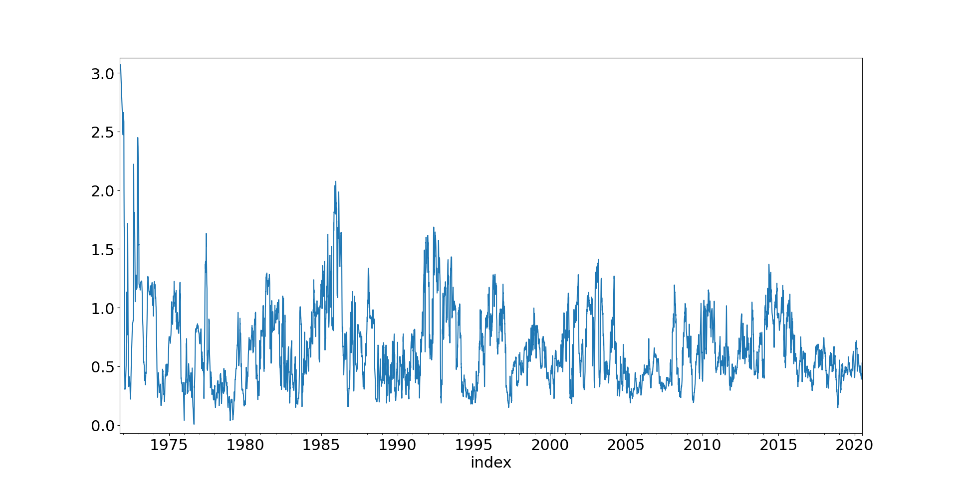
Aggregate absolute forecast weighted by instrument weights

That's certainly quite a range! Even after 2013, once we all 20 instruments in the portfolio, the aggregate measure of forecast strength ranges between less than 0.2 and above 1.3; a sixfold change in magnitude.


Do forecasts have forecasting power at an aggregate level?


In this post I spent quite a bit of time plotting ex-post risk adjusted return versus ex-ante forecast value, in an attempt to prove that forecast strength was indeed an indicator of future performance. 

Let's test this out at the aggregate level.

I'm reusing the 'bin plotting' functions from the previous post but I've dropped them into this gist for your edification. I've tweaked them slightly since the aggregate forecast can't be negative, so it makes sense to centre the plot on the mean forecast rather than zero.

def get_future_portfolio_return(Ndays):
acc_curve = system.accounts.portfolio()
acc_curve_sum = acc_curve.cumsum()
period_returns = acc_curve_sum - acc_curve_sum.shift(Ndays)

# We apply a single risk adjustment
    stdev = acc_curve.std()

scaled_returns_vol = stdev * (Ndays**.5)
normalised_return = period_returns / scaled_returns_vol

future_normalised_return = normalised_return.shift(-Ndays)

return future_normalised_return

Ndays = 30
future_norm_return = get_future_portfolio_return(Ndays)
agg_forecast = forecast_strength_for_system(system)
pd_result = pd.DataFrame(dict(x=agg_forecast, y = future_norm_return))
plot_results_for_bin_size(6, pd_result, centre_on_mean=True)
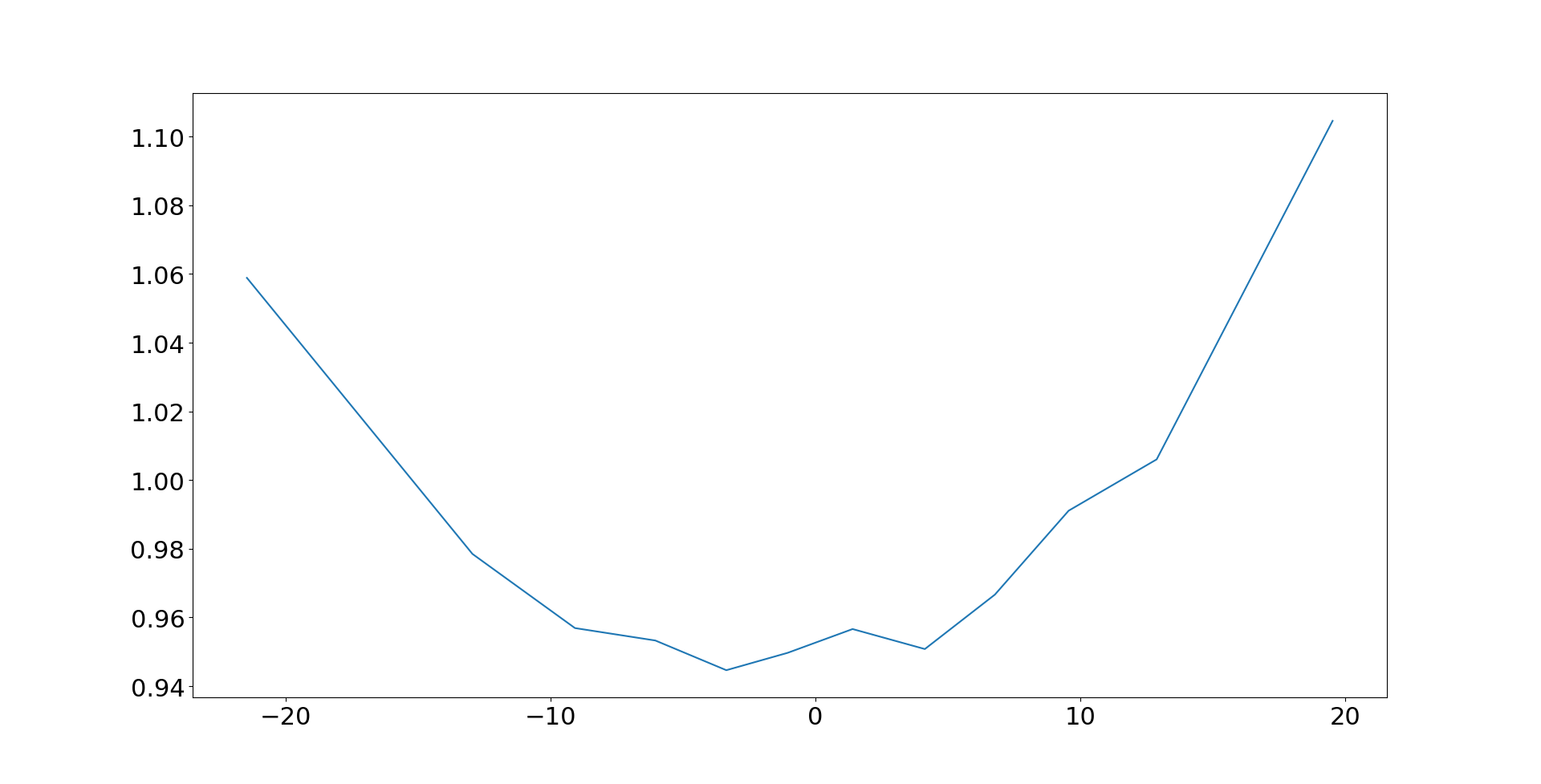
Y-axis: risk adjusted ex-post portfolio return. X-axis: 

If fixed risk targets made sense and aggregate forecast levels were unimportant, then this would be a horizontal line. But it isn't; although it shows the weird noise we've come to expect from plots like this, it's definitely upward sloping. Bigger aggregate forecasts today mean higher expected returns in the future.


What effect does imposing a fixed risk target have on portfolio returns?

Let's implement a fixed risk target and see what effect it has on our portfolio returns. 

acc_curve = system.accounts.portfolio()

risk_series = get_expected_risk_for_system(system)
risk_series = risk_series.ffill()
# zero risk is bad because infinity
risk_series[risk_series==0]=np.nan
risk_vs_target = 100*risk_series / system.config.percentage_vol_target
risk_multiplier = 1/risk_vs_target
# let's not get carried away here guys
risk_multiplier[risk_multiplier>3.0] = 3.0

acc_curve_with_risk_multiplier = acc_curve * risk_multiplier
acc_curve.cumsum().plot()
acc_curve_with_risk_multiplier.cumsum().plot()

Again, the code for get_expected_risk is from a previous post, but here it is in a gist to avoid you having to dig it out (I'm feeling super generous today). Note that because we're just multiplying all positions by a fixed scalar, we see the results of this approximately just by multiplying the portfolio returns for the underlying system, rather than implementing some fancy function inside the backtesting engine.

This does mean that costs might be slightly wrong, since one system will have more trading than the other.

Red line: Account curve without fixed risk targeting. Blue curve: Account curve with fixed risk targeting

As we might expect from our findings so far, fixed risk targeting is not an unmitigated success. The Sharpe Ratio drops from a princely 0.93 to a measly 0.64; a gap big enough to be statistically significant. The only light in this especially dark tunnel is that the underperformance isn't quite as bad in the last couuple of decades.

But remember that vol targeting on individual instruments affects both SR but also higher moments. What about skew and kurtosis? Meh. Skew is actually worse with fixed risk targeting (at daily, weekly, and monthly horizons becoming significantly more negative), but on the bright side kurtosis is better. The 1% tail of returns is much worse with fixed risk targets at a daily frequency, but pretty similar for monthly and weekly returns. 

Bear in mind that the parameter uncertainty for skew and kurtosis is quite high.
 
There must be some good news! How well does fixed vol targeting do at targeting vol? Let's plot the 3 month rolling vol estimate for both systems:

Y-axis: Rolling 6 month realised daily standard deviation of returns. Blue line: Original System. Orange line: Fixed risk target

The fixed risk system does what it says on the tin; mostly realised vol hovers around the target, with an exception in around 2013. So if predictable risk is more important to you than performance (or skew!), then by all means fix your risk target. 

Of course it's possible that a more sophisticated version of fixed risk targeting could be more successful here. We could for example run a Markowitz style optimisation, using the expected returns implied by our forecasts and standard deviation estimates, with a classical maximum risk constraint (that we'd end up hitting, since we'd be maximising return). 

However that would be a radical departure for the way this kind of trading system worked. If it was successful, we wouldn't know whether it was the risk targeting that was good, or the optimisation that was good. 

I'm not a big fan of optimisation (understatement!) so this isn't something I'd want to try in practice anyway.


Can we use forecasts but account for changes in correlation and positions?

Let's return again to this equation:

Expected risk = target risk * (relative forecast strength) * (relative correlation factor)

What we really want is something that does something like this:

Expected risk = target risk * (relative forecast strength)
We've tried targeting a fixed risk, which means multiplying all our positions by f: 
f= St / Sp 
(where St is our risk target and Sp is our portfolio risk)

f = 1/ [(relative forecast strength) * (relative correlation factor)]

And that didn't go well. But what if we multiplied our positions by f*, which is f multiplied by the relative forecast strength:
f= (relative forecast strength)*St / Sp 
f* = (relative forecast strength)/ [(relative forecast strength) * (relative correlation factor)]
 = 1 / (relative correlation factor)]
Now we're cooking with some kind of petroleum vapour! f* only corrects for the relative correlation factor, leaving forecast strength to be unaffected.
What does this look like in code:
risk_multiplier_forecasts = (agg_forecast/agg_forecast.mean())*risk_multiplier
acc_curve_with_forecast_risk_multiplier = acc_curve * risk_multiplier_forecasts
Since the aggregate forecast measure isn't guaranteed to have a mean of 1, we account for this.
Red line: Account curve without fixed risk targeting. Blue curve: Account curve with fixed risk targeting, accounting for forecast magnitude


Now we have something! Cumulatively on returns alone the new risk targeting actually beats the raw system, if only by a little bit. The Sharpe Ratio is actually a little bit lower than originally: 0.87 rather than 0.93, but Sharpe Ratio isn't everything and that isn't a significant difference. 

Daily skew is a little worse than before, but both weekly and monthly skew are better with the new target. On the downside, kurtosis is higher using f* than for the original system; and the 1% tail is also worse.


Conclusion

The simpler fixed risk target idea, where we target 25% annualised risk or whatever every single day, is a non-starter. It dramatically reduces performance with no clear benefit to other characteristics of the strategy, apart from the more predictable realised risk. And the reason why is clear; it throws away the information provided by aggregate forecast strength, which is a clear predictor of future risk adjusted return.

A more complicated risk target which takes aggregate forecast strength into account looks better, with performance that's on par with the original system depending on what metric you look at. But I probably wouldn't implement this in my trading system as it is, it's not a clear improvement in returns and there is a substantial increase in complexity. 

It isn't clear whether this makes the system safer; yes there will be times when the positions we have on and the current correlations coincide to create much higher ex-ante risk than we would normally want; something the fixed risk target deals with (although the risk model discussed here also does this at least for extremes). 

But there will be other times when our position appears to be ex-ante low risk because of where correlations are, and the risk targeting will leverage up, but then correlations break down in a crisis and we suddenly have much higher ex-post risk than we expected.

However, the idea of targeting a fixed risk level with an adjustment for aggregate forecast strength is quite a neat one and it may make sense for other types of trading systems. Feel free to steal it!

This is part three of a four part series on forecasting. Parts one and two are available. Part four is yet to be written.


Tuesday, 1 September 2020

Forecast linearity and forecasting mean reverting volatility

This is a blog post about forecasting vol. This is important, since as sensible traders we make forecasts about risk adjusted returns (as in my previous post), which are joint forecasts of return and volatility. We also use forecasted vol to size positions. A better vol forecast should mean we end up with a trading strategy that has a nicer return profile, and who knows maybe make some more money.


Mean reverting vol, and it's effect on forecast accuracy

 In my previous post  I looked at the non linear response of risk adjusted returns to forecast values. There were many plots like this one:

Forecast and subsequent risk adjusted return for ewmac16_64 trading rule for Gold. Mean risk adjusted return for 12 buckets, conditioned on sign and distributional points of forecast.

What we expect is that as a forecast gets stronger, the risk adjusted return also gets stronger. This plot (with forecast on the x-axis, and subsequent risk adjusted return over the holding period of the trading rule) should then show a linear response. But we don't see that; instead we see this 'reversion to the wings' pattern: for strong forecasts (of eithier sign) the response is actually weaker than we'd expect. 

Although this is a particularly striking plot, there are is a similar effect if I pool results across all instruments. You may recall from the post that the effect is non existent for fast momentum, but relatively high in slower momentum (and also, though I didn't dig into it, carry).

This pattern is annoying, although one quick fix is to use a capped forecast, which essentially collapses the problem in the tails and makes things not quite as bad. Still, it's annoying: the previous post was about non binary forecasts being better than binary, and this effect narrows the gap somewhat by reducing the performance of non binary forecasting when forecasts get a bit heavy.

Here is a key paragraph from the previous post:

"This is a pretty well known effect in trend following, and there are a few different explanations. One is that trends tend to get exhausted after a while, so a very strong trend is due a reversal. Another is that high forecasts are usually caused by very low volatility (since forecasts are in risk adjusted space, low vol = high forecast), and very low vol has a tendency to mean revert at the same time as markets sharply change direction."

In this post I'm going to focus on the second part of this sentence. Let me explain a bit more clearly what I mean.

We know that forecast = expected return / expected volatility. I use a very simple measure of expected volatility, which is equal to historic volatility over the last month or so (actually exponentially weighted, but with an equivalent half life), so we actually have:  forecast = expected return / recent volatility. There are clearly two reasons why forecasts could be high: if expected return is relatively high, or if recent volatility is particularly low. 

Now the risk adjusted ex post return is similarly defined as return = actual return / actual volatility. Thus if actual volatility is much higher than expected volatility (hence mean reverting), even if we get the expected return spot on, we'll see lower ex post risk adjusted returns when forecasts are large because vol is lower.


Mean reverting vol, and it's effect on forecast accuracy

It's very easy to see if this is what is happening. We can do a similar plot as before, except now we're going to plot forecast on the x-axis, and the ratio of actual versus expected vol on the y-axis. Effectively then this is a measure of how good we are at forecasting vol, conditional on forecast strength.

Mostly this uses the same code as last time, but I replace get_forecast_and_normalised_return() with this: 

def get_forecast_and_normalised_vol(instrument, rule):
    # uncomment depending on which forecast to use
#forecast = system.forecastScaleCap.get_capped_forecast(instrument, rule)
forecast = system.forecastScaleCap.get_scaled_forecast(instrument, rule)

# holding period
Ndays = int(np.ceil(get_avg_holding_period_for_rule(forecast)))

forecast_vol = system.rawdata.get_daily_percentage_volatility(instrument)
future_vol = get_future_vol(instrument, Ndays)

ratio_vol = future_vol / forecast_vol
ratio_vol = ratio_vol.ffill()

pd_result = pd.concat([forecast, ratio_vol], axis=1)
pd_result.columns = ['forecast', 'ratio_vol']

pd_result = pd_result[:-Ndays]

return pd_result

def get_future_vol(instrument_code, Ndays):
    # Unlike the forecast vol (recent current vol) this isn't EWMA
returns = system.rawdata.get_percentage_returns(instrument_code)
stdev = returns.rolling(Ndays, min_periods = 3).std()
future_stdev = stdev.shift(-Ndays)

return future_stdev

I'm going to do these plots as before with 'bins=6' (to show the granularity of the response), over all my various trading rules, with data summed across all instruments.

Referring back again to the previous post we know that the 'reversion in the wings' for forecast responses is non existent for faster momentum, but for slow momentum we know the reversion is pretty fat, so let's plot the vol forecasting ratio and see what it looks like for ewmac_64_256:

Vol forecast accuracy conditioned on risk adjusted return forecast values, without capping. Rule 'ewmac64_256', data summed across all instruments. X-axis: forecast value, Y-axis: actual volatility over holding period divided by expected volatility when forecast was made 


If we were as good as forecasting vol, irrespective of forecast, this would be a flat line intercepting the y-axis at y=1 (assuming our vol forecasts were generally unbiased). But we don't see that! When forecasts are large, actual vol turns out to be relatively high compared to expected vol (ratio>1). When forecasts are small, actual vol is a little lower than expected. This is exactly what we'd expect if vol was mean reverting.

I think you will agree, that's a massive effect. What's more, it persists even if we apply capping:

Vol forecast accuracy conditioned on risk adjusted return forecast values, with capping. Rule 'ewmac64_256', data summed across all instruments. X-axis: forecast value, Y-axis: actual volatility over holding period divided by expected volatility when forecast was made 


So if a forecast is reasonably extreme, then our volatility forecast could easily be 10 or 20% too low, and therefore our expected risk adjusted return would be 10 or 20% too high. These numbers are large: not quite large enough to explain all of the 'reversion at the wings' we saw in the last post, but they do account for quite a bit of it.


Is this a conditional effect, or are we just bad at vol forecasting?

There are a couple of explanations for what we've seen. One is that vol is indeed mean reverting, regardless of risk adjusted return forecast value. The other is that we get uniquely bad at forecasting vol when forecasts are really big. 

It's important to distinguish between these two effects, because our fix will be different. If the effect is related to forecast size, then we should probably fit some kind of smoothed line through the vol ratio plots, and use that to adjust our vol forecasts (and hence our risk adjusted return forecast), conditional on the current forecast level.

If however the effect is entirely down to vol mean reverting, then we should probably try and do a better job of vol forecasting, independent of forecasting risk adjusted returns. And indeed, doing a better job of vol forecast seems like a noble goal in itself.

Here's some code:


def get_forecast_vol_and_future_vol(instrument, Ndays):
vol = system.rawdata.get_daily_percentage_volatility(instrument)
future_vol = get_future_vol(instrument, Ndays)

ratio_vol = future_vol / vol
ratio_vol = ratio_vol.ffill()

slow_vol = vol.ewm(2500).mean()

adj_vol = (vol / slow_vol)-1.0

pd_result = pd.concat([adj_vol, ratio_vol], axis=1)
pd_result.columns = ['historic_vol', 'ratio_vol']

pd_result = pd_result[:-Ndays]

return pd_result

'ratio_vol' we have seen before, but the conditioning variable now is 'adj_vol' which is the ratio of current (ex-ante) volatility and a very slow moving average of that, minus 1. So 'adj_vol' is equal to 0, then current volatility is at a similar level to what we have seen over the last 10 years or so. If it's strongly negative, then current volatility is low relative to recent history, and if it's strongly positive then vol is relatively high.

Let's do our usual plot, using a holding period ('Ndays') of 40 (roughly the same as ewmac64_256), but this time we plot the vol forecast ratio (ex-post vol / ex-ante vol) on the y-axis conditioned on the adjusted vol level (ex-ante vol / historic vol) on the x-axis:

Vol forecast accuracy conditioned on current level of volatility, data summed across all instruments. X-axis: (actual volatility / 10 year average volatility)-1, Y-axis: actual volatility over holding period divided by expected volatility when forecast was made 


If our vol forecasts were unbiased regardless of whether vol is high or low, we'd expect to see a flat horizontal line here, intercepting the y-axis at 1.0. Instead however, the vol ratio is above 1 when vol is currently low, and below 1 when vol is currently high. In other words, when vol is low we'll tend to understimate what it will be in the future (vol ratio>1: ex-post vol>ex-ante vol), and when vol is high we will over estimate it. 

We have vol mean reversion, and the quantum of the effect is pretty much what we saw earlier in the post. So on the face of it, the error in forecasting vol conditioned on expected return forecast could plausibly be down to different vol regimes having different vol forecasting biases, rather than some weird connection between risk adjusted forecasts and volatility forecasting. 

To reiterate, this means that the correct approach is now to first try and improve our vol forecast to account for this mean reversion effect, rather than trying to do some weird non linear adjustment to our forecast response.


Improving our vol forecast

As I tell anyone who will listen, we are pretty good at forecasting vol using historic data compared to trying to predict eithier returns or risk adjusted returns. Consider for example this simple scatter plot, with recent volatility on the x-axis, and ex-post vol over 30 days on the y-axis (for S&P 500):


That's a reasonably good forecast compared to the extremely noisy scatter plot we saw in the previous post for expected risk adjusted return versus forecats. Regressing these kinds of things tends to come out with R^2 in the region of 0.8, which is extremely good .

Nevertheless, we can see even in the simple plot that there is some reversion to the mean. When vol is low (say below 1.5% a day), there are a lot of points above the line (vol forecast too low). When vol is high (say above 1.5% a day), nearly all the plots are below the line (vol forecast too high).

I can think of several ways of improving our vol forecast; including using implied vol (a lot of work!), and using higher frequency data (which costs money and requires a fair bit of work). We could also use a better model for vol, so something like GARCH for example, or the Heston model, noth of which incorporate reversion to the mean.

But let's not get carried away here. We're only interest in predicting vol as a second order thing, we're not trading options and trying to predict vol for it's own sake. 

A really simple thing we can do, instead, is replace our vol forecast with:

expected vol = (1-p)current_vol + p*slow_vol

Where current vol is the usual measure of recent vol, and slow_vol is the 10 year average for vol I used earlier. p is to be determined.

If you divide by current vol, you get the vol ratio versus current vol:

expected vol / current_vol = (1-p) + p*(slow_vol/current_vol)

A quick perusal of the earlier plot of the vol forecast ratio (ex-post vol / ex-ante vol)  conditioned on the adjusted vol level (ex-ante vol / historic vol), suggests that p should be around 0.333. 

So if current_vol/slow_vol is around 0.5 (very low vol), then our forecast for expected vol would be current vol * 1.33. If current vol/slow vol is around 2 (high vol) then our forecast for expected vol would be current_vol * 0.83

(Strictly speaking we ought to fit this parameter on a rolling out of sample basis, and I'll do that in a moment)

What happens if we plot the vol ratio (realised vol/forecast vol) but this time use a forecast incorporating slow_vol, conditioned on the relative level of vol (current vol / slow vol minus one):

Vol forecast accuracy conditioned on current level of volatility, data summed across all instruments. X-axis: (actual volatility / 10 year average volatility)-1, Y-axis: actual volatility over holding period divided by expected volatility when forecast was made 


That isn't a perfect horizontal line (as we'd expect if our vol forecast was always perfectly unbiased, regardless of the level of vol). We now slightly underestimate vol if it is currently relatively large or small, but the size of the forecast ratio error is much smaller, and we no longer have the assymetric bias of before.


Let the econometrics commence!

It seems a bit arbitrary to use just a mixture of 10 year vol and current vol to predict future vol; and even more arbitrary to do so with a 30/70 ratio plucked from the sky. 

We'll confine ourselves to moving averages of historic vol estimates; and it seems reasonable to use the following:

  • "Current" (roughly vol from the last 30 days)
  • 3 month span moving average of vol estimates
  • 6 month MA
  • 12 month MA
  • 2 year MA
  • 5 year MA
  • 10 year MA

Since these are all highly correlated, I setup the regression with the future vol as the y variable, and the following as the x variables:

  • "Current" (roughly vol from the last 30 days)
  • 6 month MA - 3 month MA
  • 1 year MA - 6 month MA
  • 2 year MA - 12 month MA
  • 5 year MA - 2 year MA
  • 10 year MA - 5 year MA
  • 10 year MA - current vol

I won't bother repeating all the results here, but the following simple model did just as well as the others:

  • "Current" (roughly vol from the last 30 days)
  • 10 year MA - current vol


                                OLS Regression Results                                

=======================================================================================

Dep. Variable:             future_vol   R-squared (uncentered):                   0.884

Model:                            OLS   Adj. R-squared (uncentered):              0.884

Method:                 Least Squares   F-statistic:                          9.798e+05

Date:                Tue, 01 Sep 2020   Prob (F-statistic):                        0.00

Time:                        15:09:30   Log-Likelihood:                     -1.4724e+05

No. Observations:              256717   AIC:                                  2.945e+05

Df Residuals:                  256715   BIC:                                  2.945e+05

Df Model:                           2                                                  

Covariance Type:            nonrobust                                                  

==============================================================================

                 coef    std err          t      P>|t|      [0.025      0.975]

------------------------------------------------------------------------------

vol            0.9797      0.001   1368.273      0.000       0.978       0.981

0              0.4119      0.002    230.556      0.000       0.408       0.415

==============================================================================

Omnibus:                   200002.003   Durbin-Watson:                   0.033

Prob(Omnibus):                  0.000   Jarque-Bera (JB):         14041173.364

Skew:                           3.211   Prob(JB):                         0.00

Kurtosis:                      38.657   Cond. No.                         2.75

==============================================================================

Notes:

[1] R² is computed without centering (uncentered) since the model does not contain a constant.

[2] Standard Errors assume that the covariance matrix of the errors is correctly specified.

"""

Note that the coefficient of (pretty much) 1 on current vol, and 0.41 on the vol difference (10 year vol - current vol) is equivalent to a weight of 0.59 on current vol and 0.41 on 10 year vol. This is pretty close to the 'fit by eye' I did earlier.

The coefficient is also stable enough across time that fitting it on a rolling out of sample basis would not make any difference.

Incidentally, the R^2 versus the original model (just current vol) isn't much higher (0.884 versus 0.84). But as we have already seen, the prediction now longer has the systematic bias of before (under estimation when vol is low, over estimation when vol is high).


Have we solved all our problems?

What happens if we plot our vol forecast ratio against (risk adjusted return) forecast strength, but this time using our improved forecast of vol? Remember before we saw a clear convex fit; extreme forecasts meant we tended to underestimate ex-post vol.

Here is the plot for ewmac64_256, first with uncapped forecasts:

Vol forecast accuracy conditioned on risk adjusted return forecast values, without capping. Rule 'ewmac64_256', data summed across all instruments. X-axis: forecast value, Y-axis: actual volatility over holding period divided by expected volatility when forecast was made. Forecast for vol uses current vol and 10 year vol. Risk adjusted trading rule forecasts modified to reflect change in vol measure.


The effect is still there, but it's much less pronounced (vol ratio is out by less than 5%, rather than the 10 to 20% we saw earlier). Now with capping:

Vol forecast accuracy conditioned on risk adjusted return forecast values, without capping. Rule 'ewmac64_256', data summed across all instruments. X-axis: forecast value, Y-axis: actual volatility over holding period divided by expected volatility when forecast was made. Forecast for vol uses current vol and 10 year vol. Risk adjusted trading rule forecasts modified to reflect change in vol measure.


Roughly two thirds of the effect from earlier has gone, but there is still some residual effect. 

Finally let's return to the problem of non linear forecast response, 'reversion in the wings' for slower momentum. If we use our updated vol forecast, accounting for mean reversion, does it go away?

Here's a repeat of the plot from last time round, where I'm looking at the out turn of risk adjusted return versus forecast, for ewmac64_256 without capping. The blue line shows the original plot, and the orange line shows the data with an improved forecast using a blend of slow and current vol:

Forecast accuracy conditioned on risk adjusted return forecast values, without capping. Rule 'ewmac64_256', data summed across all instruments. X-axis: forecast value adjusted for vol forecast, Y-axis: risk adjusted return over holding period. Forecast for vol uses current vol and 10 year vol. Risk adjusted trading rule forecasts modified to reflect change in vol measure.

Some small improvement there, but not much. Let's look at the capped forecasts:
Forecast accuracy conditioned on risk adjusted return forecast values, with capping. Rule 'ewmac64_256', data summed across all instruments. X-axis: forecast value adjusted for vol forecast, Y-axis: risk adjusted return over holding period. Forecast for vol uses current vol and 10 year vol. Risk adjusted trading rule forecasts modified to reflect change in vol measure.

Essentially no serious change here.


Summary

This has been quite a dense post, and in many ways it's been a failure. I started with a problem: forecasts reverting in the wings, and I seemed to find a valid explanation: high risk adjusted return forecast values were associated with vol forecasts that were systematically too low. And the explanation for this seemed to be mean reverting vol.

However once I improved my vol forecast to account for mean reversion, the problem did not go away. I did manage to remove most of the bias in vol forecasts conditioned on risk adjusted return forecasts, but the reversion in the wings of risk adjusted return forecasts did not go away.

This suggests that the effect is also caused by (from my earlier quote) "trends tend to get exhausted after a while, so a very strong trend is due a reversal."

To deal with this would require something more complicated, involving a non linear response between raw and final forecast. The simplest possible solution would be something like capping forecast strength at 10 for slower momentum, after first doubling the forecast to make sure the average absolute forecast value was roughly correct.

I am worried about overfitting and time wasting, so this is one rabbit hole I will probably not go down in the near future.

Still the improved vol forecast is a nice to have. In particular it is potentially a replacement for part of my exogenous risk overlay:

"... we use our standard estimate of portfolio risk, but replace our standard deviation estimates with '99vol'. This rather catchily named value is the 99th percentile of the standard deviation estimate distribution, measured over the last 10 years. It's the standard deviation we'll get 1% of the time."

If the vol forecast is replaced by a blend of 10 year vol and current vol, it's impossible for it to be below the 99vol level. So this element of the risk overlay could be dropped.

It's also possible that the improved vol forecast will improve returns. The improvements will probably come in higher moments of the distribution, principally I'd hope for lower kurtosis. I doubt the result will be statistically significant, so I don't plan to test it. 

This is part two in a series on forecasting. Here is part one, and part three is here.


Friday, 3 July 2020

Do non binary forecasts work?


This is a post about forecasts in trading systems. A forecast is a calibrated expectation for future risk adjusted returns. In more layman like terms, it is a measure of how confident we are about a bullish (positive forecast) or bearish (negative forecast).

Perhaps it is easiest to think about forecasts if we compare them to what is not: a forecast is non binary. A binary trading system will decide whether to go long, or short, but it does not get more granular than that. It will buy, or sell, some fixed size of position. The size of the position may vary according to various factors such as risk or account size (enumerated in this recent post) but importantly it won't depend on the level of forecast conviction.

In my two books on trading ('Systematic' and 'Leveraged' Trading) I confidently stated that non binary forecasts work: in other words that you should scale your positions according to the conviction of your forecasts, and doing so will improve your risk adjusted returns compared to using binary forecasts. 

I did present some evidence for this in 'Leveraged Trading', but in this post I will go into a lot more detail of this finding, and explore some nuances.

This will be the first in a series of four broadly related posts. The second post will explore volatility forecasting, and whether it improving it can improve forecasting.

In the third post I explore the issue of whether it makes sense to fix your expected portfolio risk (a question that was prompted by a comment on a recent post I did on exogenous risk management).  This is related to forecasting, because the use of forecasts imply that you should let your expected risk vary according to how strong your forecasts are. If forecasting works, then fixing your risk should make no sense.

The final post (as yet unwritten) will be about the efficient use of capital for small traders. If forecasts work, then we can use capital more efficiently by only taking positions in instruments with large forecasts. I explored this to some degree in a previous post where I used a (rather hacky) non linear scaling to exploit this property. I have recently had an idea for doing this in a fancier way that will allow very large portfolios with very limited capital. This might end up being more than one post... and may take a while to come out.

Let us begin.

<UPDATE 6th July: Added 'all instruments' plots without capping>


Forecasts and risk adjusted returns


Econometrics 101 says that if you want to see wether there is a relationship between two variables you should start off by doing some kind of scatter plot. Forecasts try and predict future risk adjusted returns, so we'll plot the return for the N days, divided by the daily volatility estimate for the return. We get N days by first estimating the average holding period of the forecast. On the x-axis we'll plot the forecast, scaled to an average absolute value of 10.


# pysystemtrade code:
from syscore.pdutils import turnover
import numpy as np
from systems.provided.futures_chapter15.basesystem import futures_system
system = futures_system()

def get_forecast_and_normalised_return(instrument, rule):
forecast = system.forecastScaleCap.get_scaled_forecast(instrument, rule)

# holding period
Ndays = int(np.ceil(get_avg_holding_period_for_rule(forecast)))


raw_price = system.data.get_raw_price(instrument)
## this is a daily vol, adjust for time period
returns_vol = system.rawdata.daily_returns_volatility(instrument)
scaled_returns_vol = returns_vol * (Ndays**.5)

raw_daily_price = raw_price.resample("1B").last().ffill()
## price Ndays in the future
future_raw_price = raw_daily_price.shift(-Ndays)
price_change = future_raw_price - raw_daily_price
    # these normalised change will have E(standard deviation) 1
normalised_price_change = price_change / scaled_returns_vol.ffill()

pd_result = pd.concat([forecast, normalised_price_change], axis=1)
pd_result.columns = ['forecast', 'normalised_return']

pd_result = pd_result[:-Ndays]

return pd_result

def get_avg_holding_period_for_rule(forecast):
avg_annual_turnover = turnover(forecast, 10)
holding_period = 256 / avg_annual_turnover

return holding_period

Let's use the trading rule from chapter six of "Leveraged Trading", EWMAC 16,64*; and pick an instrument I don't know Eurodollar**. 
* That's a moving average crossover between two exponentially weighted moving averages, with a 16 day and a 64 day span respectively
** Yes I've cherry picked this to make the initial results look nice and bring out some interesting points, but I will be doing this properly across my entire universe of futures later

instrument="EDOLLAR"
rule = "ewmac16_64"

pd_result = get_forecast_and_normalised_return(instrument, rule)
pd_result.plot.scatter('forecast', 'normalised_return')
X-Axis forecast, Y-axis subsequent risk adjusted return over average holding period of 17 weekdays

That is quite pretty, but not especially informative. It's hard to tell whether the trading rule even works, i.e. is a positive forecast followed by a positive return over the next 17 business days (which happens to be the holding period for this rule), and vice versa? We can check that easily enough by seeing what the returns are like conditioned on the sign of the forecast:
pos_returns = pd_result[pd_result.forecast>0].normalised_return
neg_returns = pd_result[pd_result.forecast<0].normalised_return
print(pos_returns.mean())
print(neg_returns.mean())

print(stats.ttest_ind(pos_returns, neg_returns, axis=0, equal_var=True))

The returns, conditional on a positive forecast, are 0.21 versus 0.02 for a negative forecast. The t-test produces a T-statistic of 7.6, and the p-value is one of those numbers with e-14 at the end of it so basically zero. Incidentally there were more positive forecasts than negative by a ratio of ~2:1, as Eurodollar has generally gone up.


Is the response of normalised return linear or binary?


So far we have proven that the trading rule works, and that a binary trading rule would do just fine thanks very much. But I haven't yet checked whether taking a larger forecast would make more sense. I could do a regression, but that could produce the same result if the relationship was linear or if it was binary (and the point cloud above indicates that the R^2 is going to be pretty dire in any case).

Let's do the above analysis but in a slightly more complicated way:

from matplotlib import pyplot as plt

def plot_results_for_bin_size(size, pd_result):
bins = get_bins_for_size(size, pd_result)
results = calculate_results_for_bins(bins, pd_result)
avg_results = [x.mean() for x in results]
centre_bins = [np.mean([bins[idx], bins[idx - 1]]) for idx in range(len(bins))[1:]]

plt.plot(centre_bins, avg_results)
    ans = print_t_stats(results)

return ans

def print_t_stats(results):
t_results = []
for idx in range(len(results))[1:]:
t_stat = stats.ttest_ind(results[idx], results[idx-1], axis=0, equal_var=True)
t_results.append(t_stat)
print(t_stat)
    return t_results
def get_bins_for_size(size, pd_result):
positive_quantiles = quantile_in_range(size, pd_result, min=-0.001)
negative_quantiles = quantile_in_range(size, pd_result, max=0.001)
return negative_quantiles[:-1]+[0.0]+positive_quantiles[1:]

def quantile_in_range(size, pd_result, min=-9999, max=9999):
forecast = pd_result.forecast
signed_distribution = forecast[(forecast>min) & (forecast<max)]
quantile_ranges = get_quantile_ranges(size)
quantile_points = [signed_distribution.quantile(q) for q in quantile_ranges]
return quantile_points

def get_quantile_ranges(size):
quantile_ranges = np.arange(0,1.0000001,1.0/size)
return quantile_ranges

def calculate_results_for_bins(bins, pd_result):
results = []
for idx in range(len(bins))[1:]:
selected_results = pd_result[(pd_result.forecast>bins[idx-1]) & (pd_result.forecast < bins[idx])]
results.append(selected_results.normalised_return)
return results

Typing plot_results_for_bin_size(1, pd_result) will give the same results as before, plotted on the worlds dullest graph:


Forecast and subsequent risk adjusted return for ewmac16_64 trading rule for Eurodollar. Mean risk adjusted return for two buckets, conditioned on sign of forecast.

Ttest_indResult(statistic=7.614065523409865, pvalue=2.907839550447572e-14)

Now let's up the ante, and use a bin size of 2, which means plotting 4 'buckets'. This means we're looking at normalised returns, conditional on forecast values being in the following ranges: [-32.3,-6.6], [-6.6, 0], [0, 9.0], [9.0, 40.1]. These might seem random but as the code shows the positive and negative region have been split, and then split further into 2 'bins' with 50% of the data put in one sub-region and 50% in the next. Roughly speaking then 25% of the forecast values will fall in each bucket (although we know that is not the case because there are more positive than negative forecasts).

Each point on the plot shows the average return within a 'bucket' on the y-axis, with the x-axis point in the centre of the 'bucket'.

Forecast and subsequent risk adjusted return for ewmac16_64 trading rule for Eurodollar. Mean risk adjusted return for 4 buckets, conditioned on sign and distributional points of forecast.


What crazy non-linear stuff is this? Negative forecasts sure are bad (although this is Eurodollar, and it normally goes up so not that bad), and statistically worse than any positive forecast. But a modestly positive forecast is about as good as a large positive forecast. We can see a little more detail with 12 buckets (bins=6):
Forecast and subsequent risk adjusted return for ewmac16_64 trading rule for Eurodollar. Mean risk adjusted return for 12 buckets, conditioned on sign and distributional points of forecast.


It's clear that, ignoring the wiggling around which is just noise, that there is indeed a roughly linear and fairly monotonic positive relationship between forecast and subsequent risk adjusted return, until the final bin (which represents forecast values of over 17). The forecast line reverts at the extremes.

This is a pretty well known effect in trend following, and there are a few different explanations. One is that trends tend to get exhausted after a while, so a very strong trend is due a reversal. Another is that high forecasts are usually caused by very low volatility (since forecasts are in risk adjusted space, low vol = high forecast), and very low vol has a tendency to mean revert at the same time as markets sharply change direction. Neithier of these explain why the result is assymetric; but in fact it's just that positive trends are more common in Eurodollar.

Here's the plot for Gold for example:

Forecast and subsequent risk adjusted return for ewmac16_64 trading rule for Gold. Mean risk adjusted return for 12 buckets, conditioned on sign and distributional points of forecast.

There is clear reversion in both wings. And here's Wheat:

Forecast and subsequent risk adjusted return for ewmac16_64 trading rule for Wheat. Mean risk adjusted return for 12 buckets, conditioned on sign and distributional points of forecast.


Here there is reversion for negative forecasts, but not for extreme positive forecasts.


Introducing forecast capping


There are different ways to deal with this problem. At one extreme we could fit some kind of cubic spline to the points in these graphs, and create a non linear response function for the forecast. That smacks of overfitting to me. 

There are slightly less mad approaches, such as creating a fixed sine wave type function or a linear approximation thereof. This has very few parameters but still leads to weird behaviour: when a trend reverses you initially increase your position unless you introduce hysteresis into your trading system (i.e. you behave differently when your forecast has been decreasing than when it is increasing). 

A much simpler approach is to do what I actually do: cap the forecasts at a value of -20,20 (which is exactly double my target absolute value of 10). This also makes sense from a risk control point of view.

There are some other reasons for doing this, discussed in both my books on trading.

We just need to change one line in the code:
forecast = system.forecastScaleCap.get_capped_forecast(instrument, rule)

And here is the revised plot for Eurodollar with a bin size of 2:

Capped forecast and subsequent risk adjusted return for ewmac16_64 trading rule for Eurodollar. Mean risk adjusted return for 4 buckets, conditioned on sign and distributional points of forecast.


That's basically linear, ish. With bin size of 6:

Capped forecast and subsequent risk adjusted return for ewmac16_64 trading rule for Eurodollar. Mean risk adjusted return for 12 buckets, conditioned on sign and distributional points of forecast.


There is still a little reversion in the wings, but it's more symmetric and ignoring the wiggling there is clearly a linear relationship here. I will leave the problem of whether you should behave differently in the extremes for another day. 


Formally testing for non-binaryness


We'll focus on a bin size of 2 (i.e. a total of 4 buckets), which is adequate to see whether non binary forecasts make sense or not without having to look at a ton of numbers, many of which won't be significant (as the bucket size gets more granular, there is less data in each bucket, and so less significance).

We have the following possibilities drawn on the whiteboard. There are four points in each figure and thus 3 lines connecting them. From top to bottom:
  • binary forecasts make sense
  • linear forecasts make sense
  • reverting forecasts make sense

In black are the results we'd get if the forecast worked (a positive relationship between normalised return and forecast). In red are the results if the forecast didn't work.


So we want a significantly positive slope for the first and third lines as in the middle black plot. But we'd also get that if we had a reverting incorrect forecast (bottom plot in red). So, I add an additional condition that a line drawn between the first and final points should also be positive.  We don't test the slope of the second line. This means that we'd ignore a response with an overall positive slope, but which has a slight negative 'flat spot' in the middle line.

Note: the first and third T-test comparisions are (by construction) between buckets of exactly the same size, which is nice.

The lines will be positive if the T-test statisics are positive (since they're one sided tests), and they will be significantly positive if the T-statistics give p-values of less than 0.05.

Let's modify the code so it reports the difference between the first and final points as well:

def print_t_stats(results):
t_results = []
print("For each bin:")
for idx in range(len(results))[1:]:
t_stat = stats.ttest_ind(results[idx], results[idx-1], axis=0, equal_var=True)
t_results.append(t_stat)
print("%d %s " % (idx, str(t_stat))
print("Comparing final and first bins:")
t_stat = stats.ttest_ind(results[-1], results[0], axis=0, equal_var=True)
t_results.append(t_stat)
print(t_stat)

return t_results

Here is the output for Eurodollar

>> plot_results_for_bin_size(2, pd_result)
For each bin:
Ttest_indResult(statistic=4.225710114631642, pvalue=2.44857998636189e-05)
Ttest_indResult(statistic=1.814973164207728, pvalue=0.06959073262053131)
Ttest_indResult(statistic=1.9782202453688769, pvalue=0.04795295675153716)
Comparing final and first bins:
Ttest_indResult(statistic=7.36610843915252, pvalue=2.1225843317794611e-13)

The key numbers are in bold: we can see that with a p-value of 0.0479 the third line just passes the test. But the first line and the overall slope tests are passed easily.


Pooling data across instruments


Looking at one trading rule for one instrument is sort of pointless. We have quite a lot of price history for Eurodollar and we only just get statistical significance, for plenty of other instruments we wouldn't. 

Earlier I openly admitted that I cherry picked Eurodollar; readers of Leveraged Trading will know that there are 8 futures markets in my dataset for which the test would definitely fail as this particular trading rule doesn't work (so we will be on one of the 'red line' plots). 

I should probably have cherry picked a market with a clearer linear relationship, but I wanted to show you the funky reversion effect.

Checking each market is also going to result in an awful lot of plots! Instead I'm going to pool the results across instruments. Because the returns and forecasts are all risk adjusted to be in the same scale we can do this by simply stacking up dataframes. Note this will give a higher weight to instruments with more data.

instrument_list = system.data.get_instrument_list()
all_results = []
for instrument_code in instrument_list:
pd_result = get_forecast_and_normalised_return(instrument_code, rule)
all_results.append(pd_result)

all_results = pd.concat(all_results, axis=0)
plot_results_for_bin_size(6, all_results)
Capped forecast and subsequent risk adjusted return for ewmac16_64 trading rule pooled across all instruments. Mean risk adjusted return for 12 buckets, conditioned on sign and distributional points of forecast.

We didn't need to do this plot for the formal analysis, but I thought it would be instructive to show you that once the noise for individual instruments is taken away we basically have a linear relationship, with some flattening in the extremes for forecasts out of the range [-12,+12]. 

For the formal test we want to focus on the bin=2 case, with 4 points:
plot_results_for_bin_size(2, all_results)

Capped forecast and subsequent risk adjusted return for ewmac16_64 trading rule pooled across all instruments. Mean risk adjusted return for 4 buckets, conditioned on sign and distributional points of forecast.


1 Ttest_indResult(statistic=10.359086377726523, pvalue=3.909e-25)
2 Ttest_indResult(statistic=13.502334211993352, pvalue=1.617e-41)
3 Ttest_indResult(statistic=15.974961084038702, pvalue=2.156e-57)
Comparing final and first bins:
Ttest_indResult(statistic=35.73832257341082, pvalue=3.421-e278)

Remember: we want a significantly positive slope for the first and third lines: yes without question. We also want a significantly positive slope between the first and final bins, again no problems here.

For the overall slope, I didn't even know python could represent a p-value that small in floating point. Apparently we can get down to 1.79e-308!

Note that if the first and third T-tests statistics were zero, that would indicate a binary rule would make sense. If they were negative, it would indicate reversion. Finally, if the final comparision between the last and first bins was negative, then the trading rule wouldn't work 

I think we can all agree that for this specific trading rule, a non binary forecast makes sense.


Testing all momentum rules


We can extend this to the other momentum rules in our armoury. For all of these I'm going to plot the bins =6 case with and without capping (because they're usually more fun to look at, and because <spolier alert> they show an interesting pattern in the tails which is more obvious without capping), and then analyse the bins=2 results with capping using the methodology above. Let's start at the faster end with ewmac2_8. 

Forecast without capping and subsequent risk adjusted return for ewmac2_8 trading rule, pooled across all instruments.

Forecast with capping and subsequent risk adjusted return for ewmac2_8 trading rule, pooled across all instruments.

Notice that for this very fast trading rule (too expensive indeed to trade even for many futures), the behaviour in the tails is quite different: the slope definitely does not revert. We can see how people might be tempted to start fitting these response functions, but let's move on to the figures. We want all the T-statistics in bold to be positive and well above 2:

Ttest_indResult(statistic=3.62040542155758, pvalue=0.00029426)
Ttest_indResult(statistic=7.166027593239416, pvalue=7.761585-13)
Ttest_indResult(statistic=2.735993316153726, pvalue=0.006220)
Comparing final and first bins:
Ttest_indResult(statistic=12.883660014469108, pvalue=5.9049-38)

A resounding pass again. Here's ewmac4_8:

Forecast without capping and subsequent risk adjusted return for ewmac4_16 trading rule, pooled across all instruments


Forecast with capping and subsequent risk adjusted return for ewmac4_16 trading rule, pooled across all instruments

We have a pretty smooth linear picture again. I won't bore you with the T-tests, which are all above 6.0 and positive.

Forecast without capping and subsequent risk adjusted return for ewmac8_32 trading rule, pooled across all instruments


Forecast with capping and subsequent risk adjusted return for ewmac8_32 trading rule, pooled across all instruments

The t-statistics are now above 9. To keep things in order, and so you can see the pattern, here is the plot for ewmac16_64 (without capping, and with capping which we've already seen):

Forecast without capping and subsequent risk adjusted return for ewmac16_64 trading rule, pooled across all instruments


Forecast with capping and subsequent risk adjusted return for ewmac16_64 trading rule, pooled across all instruments

Can you see the pattern? Look at the tails. In the very fastest crossover we saw a linear relationship all the way out. Then for the next two plots as the rule slowed down it became more linear. Now we're seeing the tails start to flatten, with strong reversion at the extreme bullish end (although this goes away with capping). 

We already know this rule passes easily, so let's move on.
Forecast without capping and subsequent risk adjusted return for ewmac32_128 trading rule, pooled across all instruments

Forecast with capping and subsequent risk adjusted return for ewmac32_128 trading rule, pooled across all instruments

Now there is a clear flat spot in both tails, so the pattern continues. Oh and the t-statistics are all well above 12. 

One more to go:

Forecast without capping and subsequent risk adjusted return for ewmac64_256 trading rule, pooled across all instruments


Forecast with capping and subsequent risk adjusted return for ewmac64_256 trading rule, pooled across all instruments

It's a pass in case you haven't noticed. And there is some evidence that the flattening/reversion is continuing to become more pronounced on the negative end.

Anyway to summarise, all EWMAC rules have non binary responses.


What about carry?


Now let's turn to the carry trading rule. Again I will plot the bin=6 case, and then analyse the statistics based on bin=2.

Forecast without capping and subsequent risk adjusted return for carry trading rule, pooled across all instruments. Note that the x-axis has been truncated as carry signals without capping are in the range [-220,+160]


Forecast with capping and subsequent risk adjusted return for carry trading rule, pooled across all instruments


That is pretty funky to say the least, and exploring it could easily occupy another post, but let's be consistent and stick to the methodology of analysing the bins=2 results:

Ttest_indResult(statistic=5.3244949302972255, pvalue=1.0147-07)
Ttest_indResult(statistic=36.3351610955016, pvalue=1.4856-287)
Ttest_indResult(statistic=14.78654199081023, pvalue=2.004e-49)
Comparing final and first bins:
Ttest_indResult(statistic=40.85442806158974, pvalue=0.0)

Another clear pass. The carry rule also has a non binary response.


Summary


I hope I've managed to convince you all that non binary is better: the stronger your forecast, the larger your position should be.  Along the way we've uncovered some curious behaviour particularly for slower momentum rules where it looks like the forecast response is dampened or even reverts at more extreme levals. This suggests some opportunties for gratuitous overfitting of a non linear response function, or at the very least a selective reduction in the forecast cap from 20 to 12, but we'll return to that subject in the future. 

Non binary means that we should change our expected risk according to the strength of our forecasts. In the next post I'll test whether this means that fixing our ex-ante risk is a bad thing.

A disadvantage of non binary trading is it needs more capital (as discussed here and in Leveraged Trading). At some point I'll explore how we can exploit the non binary effect to make best use of limited capital. 

This is part one in a series of posts on forecasting. Part two is here.