Showing posts with label Equities. Show all posts

Tuesday, 12 December 2023

Portfolio optimisation, uncertainty, bootstrapping, and some pretty plots. Ho, ho, ho.

Optional Christmas themed introduction

Twas the night before Christmas, and all through the house.... OK I can't be bothered. It was quiet, ok? Not a creature was stirring... literally nothing was moving basically. And then a fat guy in a red suit squeezed through the chimney, which is basically breaking and entering, and found a small child waiting for him (I know it sounds dodgy, but let's assume that Santa has been DBS checked*, you would hope so given that he spends the rest of December in close proximity to kids in shopping centres)

* Non british people reading this blog, I could explain this joke to you, but if you care that much you'd probably care enough to google it.

"Ho ho" said the fat dude "Have you been a good boy / girl?"

"Indeed I have" said the child, somewhat precociously if you ask me.

"And what do you want for Christmas? A new bike? A doll? I haven't got any Barbies left, but I do have a Robert Oppenheimer action figure; look if you pull this string in his stomach he says 'Now I am become Death destroyer of worlds', and I'll even throw in a Richard Feynman lego mini-figure complete with his own bongo drums if you want."

"Not for me, thank you. But it has been quite a long time since Rob Carver posted something on his blog. I was hoping you could persuade him to write a new post."

"Er... I've got a copy of his latest book if that helps" said Santa, rummaging around in his sack "Quite a few copies actually. Clearly the publisher was slightly optimistic with the first print run."

"Already got it for my birthday when it came out in April" said the child, rolling their eyes.

"Right OK. Well I will see what I can do. Any particular topic you want him to write about in this blog post?"

"Maybe something about portfolio optimisation and uncertainty? Perhaps some more of that bootstrapping stuff he was big on a while ago. And the Kelly criterion, that would be nice too."

"You don't ask for much, do you" sighed Santa ironically as he wrote down the list of demands.

"There need to be really pretty plots as well." added the child. 

"Pretty... plots. Got it. Right I'll be off then. Er.... I don't suppose your parents told you to leave out some nice whisky and a mince pie?"

"No they didn't. But you can have this carrot for Rudolf and a protein shake for yourself. Frankly you're overweight and you shouldn't be drunk if you're piloting a flying sled."

He spoke not a word, but went straight to his work,And filled all the stockings, then turned with a jerk. And laying his finger aside of his nose, And giving a nod, up the chimney he rose! He sprang to his sleigh, to his team gave a whistle, And away they all flew like the down of a thistle. But I heard him exclaim, ‘ere he drove out of sight,

"Not another flipping protein shake..."

https://pixlr.com/image-generator/ prompt: "Father Christmas as a quant trader"

Brief note on whether it is worth reading this

I've talked about these topics before, but there are some new insights, and I feel it's useful to combine the question of portfolio weights and optimal leverage into a single post / methodology. Basically there is some familar stuff here but now in a coherent story, plus some new stuff.

And there are some very nice plots.

Somewhat messy python code is available here (with some data here or use your own), and it has no dependency on my open source trading system pysystemtrade so everyone can enjoy it.


Bootstrapping

I am a big fan of bootstrapping. Some definitional stuff before I explain why. Let's consider a couple of different ways to estimate something given some data. Firstly we can use a closed form. If for example we want the average monthly arithmetic return for a portfolio, we can use the very simple formula of adding up the returns and dividing by the number of periods. We get a single number. Although the arithmetic mean doesn't need any assumptions, closed form formula often require some assumptions to be correct - like a Gaussian distribution. And the use of a single point estimate ignores the fact that any statistical estimate is uncertain. 

Secondly, we can bootstrap. To do this we sample the data repeatedly to create multiple new sets of data. Assuming we are interested in replicating the original data series, the new set of data would be the same length as the original, and we'd be sampling with replacement (or we'd just get the new data in a different order). So for example, with ten years of daily data (about 2500 observations), we'd choose some random day and get the returns data from that. Then we'd keep doing that, not being bothered about choosing the same day (sampling with replacement), until we had done this 2500 times. 

Then from this new set of data we estimate our mean, or do whatever it is we need to do. We then repeat this process, many times. Now instead of a single point estimate of the mean, we have a distribution of possible means, each drawn from a slightly different data series. This requires no assumptions to be made, and automatically tells us what the uncertainty of the parameter estimate is. We can also get a feel for how sensitive our estimate is to different variations on the same history. As we will see, this will also lead us to produce estimates that are more robust to the future being not exactly like the past.

Note: daily sampling destroys any autocorrelation properties in the data, so it wouldn't be appropriate for example for creating new price series when testing momentum strategies. To do this, we'd have to sample larger chunks of time period to retain the autocorrelation properties. For example we might restrict ourselves to sampling entire years of data. For the purposes of this post we don't mind about autocorrelation, so we can sample daily data.

Bootstrapping is particularly potent in the field of financial data because we only have one set of data: history. We can't run experiments to get more data. Bootstrapping allows us to create 'alternative histories' that have the same basic character as our actual history, but aren't quite the same. Apart from generating completely random data (which itself will still require some assumptions - see the following note), there isn't really much else we can do.

Bootstrapping helps us with the quant finance dilemma: we want the future to be like the past so that we can use models calibrated on the past in the future, but the future will never be exactly like the past. 

Note: that bootstrapping isn't quite the same as monte carlo. With that we estimate some parameters for the data, making an assumption about it's distribution. Then we randomly sample from that distribution. I'm not a fan of this. We have all the problems of making assumptions about distribution, and of uncertainty about the parameter estimates we use for that distribution. 


Portfolio optimisation

With all that in mind, let's turn to the problem of portfolio opimisation. We can think as this as making two decisions:

  • Allocating weights to each asset, where the weights sum to one
  • Deciding on the total leverage for the portfolio
Under certain assumptions we can seperate out these two decisions, and indeed this is the insight of the standard mean variance framework and the 'security market line'. The assumption is that enough leverage is available that we can get to the risk target for the investor. If the investor has a very low risk tolerance, we might not even need leverage, as the optimal portfolio will consist of cash + securities.

So basically we choose the combination of asset weights that maximises our Sharpe Ratio, and then we apply leverage to hit the optimal risk target (since SR is invariant to leverage, that will remain optimal). 

To begin with I will assume we can proceed in this two phase approach; but later in the post I will relax this and look at the effect of jointly allocating weights and leverage.

I'm going to use data for S&P 500 and 10 year Bond futures from 1982 onwards, but which I've tweaked slightly to produce more realistic forward looking estimates for means and standard deviations (in fact I've used figures from this report- their figures are actually for global equities and bonds, but this is all just an illustration). 

My assumptions are:
  • Zero correlation (about what it has been in practice since 1982)
  • 2.5% risk free rate (which as in standard finance I assume I can borrow at)
  • 3.5% bond returns @ 5% vol
  • 5.75% equity returns @ 17% vol
This is quite a nice technique, since it basically allows us to use forward looking estimates for the first two moments (and first co-moment - correlation) of the distribution, whilst using actual data for the higher moments (skew, kurtosis and so on) and co-moments (co-skew, co-kurtosis etc). In a sense it's sort of a blend of a parameterised monte-carlo and a non parameterised bootstrap.


Optimal leverage and Kelly

I'm going to start with the question of optimal leverage. This may seem backwards, but optimal leverage is the simpler of the two questions. Just for illustrative purposes, I'm going to assume that the allocation in this section is fixed at the classic 60% (equity), 40% (bonds). This gives us vol of around 10.4% a year, a mean of 4.85%, and a Sharpe Ratio of 0.226

The closed form solution for optimal leverage which I've written about at some length, is the Kelly Criterion. Kelly will maximise E(log(final wealth)) or median(final wealth), or importantly here it will maximise the geometric mean of your returns.

Under the assumption of i.i.d. Gaussian returns optimal Kelly leverage is achieved by setting your risk target as an annual standard deviation equal to your Sharpe Ratio. With a SR of 0.226 we want to get risk of 22.6% a year, which implies running at leverage of 22.6 / 10.4 = 2.173

That of course is a closed form solution, and it assumes that:
  • Return parameters are Guassian i.i.d. (which financial data famously is not!)
  • The return parameters are fixed
  • That we have no sampling uncertainty of the return parameters
  • We are fine running at fully Kelly, which is a notoriously aggressive amount of leverage
Basically that single figure - 2.173 - tells us nothing about how sensitive we would be to the future being similar to, but not exactly like, the past. For that we need - yes - bootstrapping. 


Bootstrapping optimal leverage 

Here is the bootstrap of my underlying 60/40 portfolio with leverage of 1.


Each point on this histogram represents a single bootstrapped set of data, the same length as the original. The x-axis shows the geometric mean, which is what we are trying to maximise. You can see that the mean of this distribution is about 4.1%. Remember the arithmetic mean of the original data was 4.85%, and if we use an approximation for geometric mean that assumes Gaussian returns then we'd get 4.31%. The difference between 4.1% and 4.31% is because this isn't Guassian. In fact, mainly thanks to the contribution of equities, it's left tailed and also has fat tails. Left fat tails result in lower Geometric returns - and hence also a lower optimal leverage, but we'll get to that in a second.

Notice also that there is a fair bit of distributional range here of the geometric mean. 10% of the returns are below 2%, and 1% are below 0.4%.

Now of course I can do this for any leverage level, here it is for leverage 2:


The mean here is higher, as we'd probably expect since we know the optimal leverage would be just over 2.0 if this was Gaussian. It comes in at 4.8%; versus the 7.2% we'd expect if this was the arithmetic mean, or the 5.04% that we would have for Gaussian returns.

Now we can do something fun. Repeating this exercise for many different levels of leverage, we can take each of the histograms that are producing and pull various distributional points off them. We can take the median of each distribution (50% percentile, which in fact is usually very close to the mean), but also more optimistic points such as the 75% and 90% percentile which would apply if you were a very optimistic person (like SBF, as I discussed in a post about a year ago), and perhaps more usefully the 25% and 10% points. We can then plot these:


How can we use this? Well, first of all we need to decide what our tolerance for uncertainty is. What point on the distribution are you optimising for? Are you the sort of person who worries about the bad thing that will happen 1 in 10 times, or would you instead be happy to go with the outcome that happens half the time (the median)?

This is not the same as your risk tolerance! In fact, I'm assuming that your tolerance for risk is sufficient to take on the optimal amount of leverage implied by this figure. Of course it's likely that someone with a low tolerance for risk in the form of high expected standard deviation would also have a low tolerance for uncertainty. And as we shall see, the lower your tolerance for uncertainty, the lower the standard deviation will be on your portfolio.

(One of the reasons I like this framing of tolerance is that most people cannot articulate what they would consider to be an appropriate standard deviation, but most people can probably articulate what their tolerance for uncertainty is, once you have explained to them what it means)

Next you should focus on the relevant coloured line, and mentally remove the odd bumps that are due to the random nature of bootstrapping (we could smooth them out by using really large bootstrap runs - note they will be worse with higher leverage since we get more dispersion of outcomes based on one or two bad days eithier being absent or repeated in the sample), and then find the optimium leverage.

For the median this is indeed at roughly the 2.1 level that theory predicts (in fact we'd expect it to be a little lower because of the negative skew), but this is not true of all the lines. For inveterate gamblers at 90% it looks like the optimum is over 3, whilst for those who are more averse to bad outcomes at 10% and 25% it's less than 2; in fact at 10% it looks like the optimium could easily be 1 - no leverage. These translate to standard deviations targets of somewhere around 10% for the person with a 10% risk tolerance . 

Technical note: I can of course use corrections to the closed form Kelly criterion for non Gaussian returns, but this doesn't solve the problem of parameter estimation uncertainty - if anything it makes it worse.

The final step, and this is something you cannot do with a closed form solution, is to see how sensitive the shape of the line is to different levels of leverage, thus encouraging us to go for a more robust solution that is less likely to be problematic if the future isn't exactly like the past. Take a slightly conservative 25% quantile person on the red line in the figure. Their optimium could plausibly be at around 1.75 leverage if we had a smoother plot, but you can see that there is almost no loss in geometric mean from using less leverage than this. On the other hand there is a steep fall off in geometric mean once we get above 1.75 (this assymetry is a property of the geometric mean and leverage). This implies that the most robust and conservative solution would be to choose an optimal leverage which is a bit below 1.75. You don't get this kind of intuition with closed form solutions.


Optimal allocation - mean variance

Let's now take a step backwards to the first phase of solving this problem - coming up with the optimal set of weights summing to one. Because we assume we can use any amount of leverage, we want to optimise the Sharpe Ratio. This can be done in the vanilla mean-variance framework. The closed form solution for the data set we have, which assumes Gaussian returns and linear correlation, is a 22% weight in equities and 78% in bonds. That might seem imbalanced, but remember the different levels of risk. Accounting for this, the resulting risk weights are pretty much bang on 50% in each asset. 

As well as the problems we had with Kelly, we know that mean variance has a tendency to produce extreme and not robust outcomes, especially when correlations are high. If for example the correlation between bonds and equities was 0.65 rather than zero, then the optimal allocation would be 100% in bonds and nothing in equities.

(I actually use an optimiser rather than a single equation to calculate the result here, but in principal I could use an equation which would be trivial for two assets - see for example my ex colleague Tom's paper here - and not that hard for multiple assets eg see here).

So let's do the following; boostrap a set of return series with different allocations to equities (bond allocation just 100% - equity allocation), then measure the Sharpe Ratio of each allocation/bootstrapped return series, and then measure the distribution of those Sharpe Ratios for different distributional points.


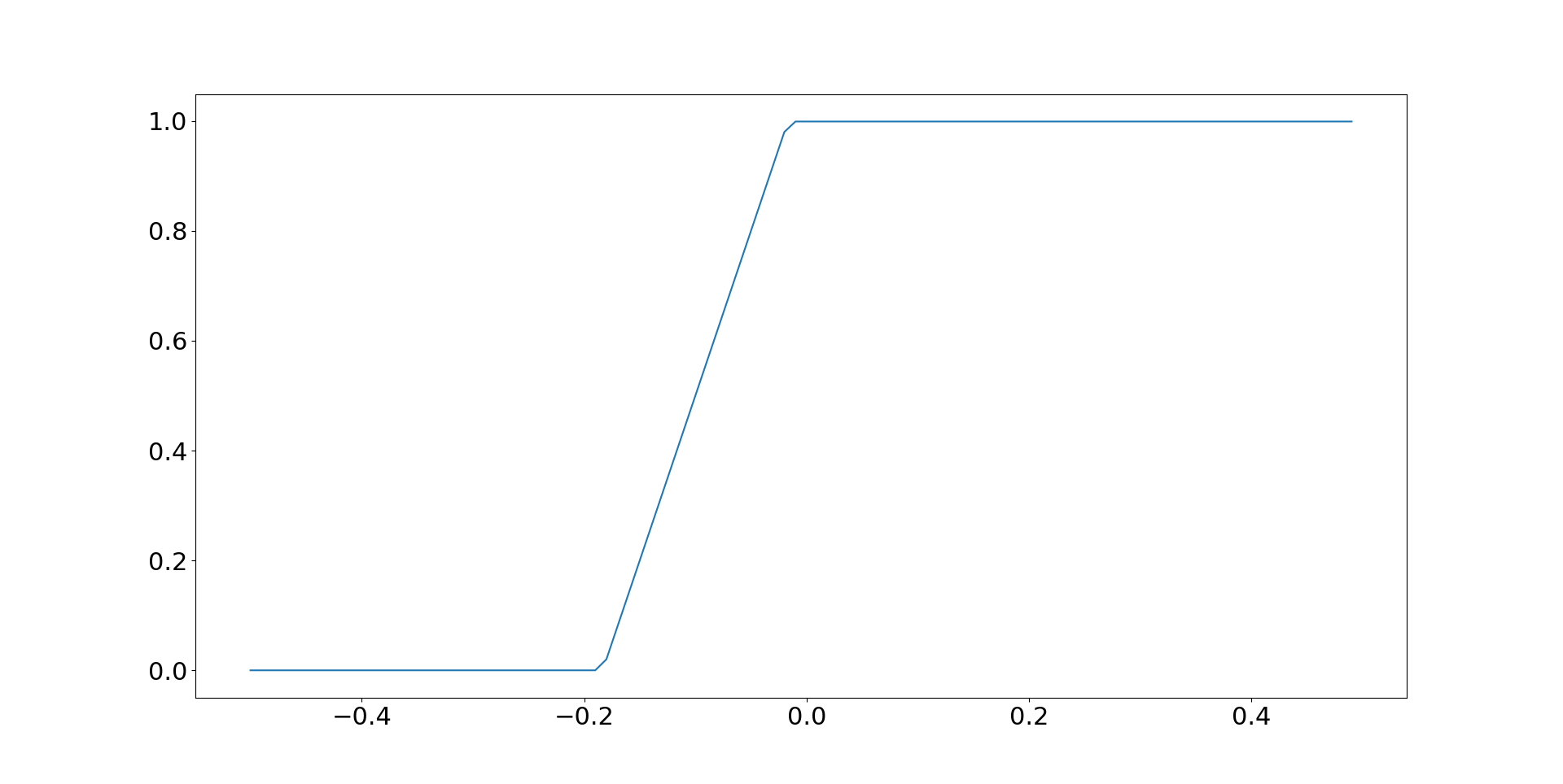
Again, each of these coloured lines represents a different point on the distribution of Sharpe Ratios. The y-axis is the Sharpe Ratio, and the x-axis is the allocation to equities; zero in equities on the far left, and 100% on the far right. 
Same procedures as before: first work out your tolerance for uncertainty and hence which line you should be on. Secondly, find the allocation point which maximises Sharpe Ratio. Thirdly, examine the consequences of having a lower or higher allocation - basically how robust is your solution.
For example, for the median tolerance (green line) the best allocation comes in somewhere around 18%. That's a little less than the closed form solution; again this is because we haven't got normally distributed assets here. And there is a reasonably symettric shape to the gradient around this point, although that isn't true for lower risk tolerances.
You may be surprised to see that the maximum allocation is fairly invarient to uncertainty tolerance; if anything there seems to be a slightly lower allocation to equities the more optimistic one becomes (although we'd have to run a much more granular backtest plot to confirm this). Of course this wouldn't be the case if we were measuring arithmetic or even geometric return. But on the assumption of a seperable portfolio weighting problem, the most appropriate statistic is the Sharpe Ratio. 
This is good news for Old Skool CAPM enthusiasts! It really doesn't matter what your tolerance for uncertainty is, you should put about 18% of your cash weight - about 43% of your risk weight in equities; at least with the assumption that future returns have the forward looking expectations for means, standard deviations, and correlations I've specified above; and the historic higher moments and co-moments that we've seen for the last 40 years.


Joint allocation

Let's abandon the assumption that we can seperate our the problem, and instead jointly optimise the allocation and leverage. Once again the appropriate statistic will be the geometric return. We can't plot these on a single line graph, since we're optimising over two parameters (allocation to equities, and overall leverage), but what we can do is draw heatmaps; one for each point on the return distribution.
Here is the median:


The x-axis is the leverage; lowest on the left, highest on the right. The y-axis is the allocation to equities; 0% on the top, 100% on the bottom. And the heat colour on the z-axis shows the geometric return. Dark blue is very good. Dark red is very bad. The red circle shows the highest dark blue optimum point. It's 30% in equities with 4.5 times leverage: 5.8% geometric return.
But the next question we should be asking is about robustness. An awful lot of this plot is dark blue, so let's start by removing everything below 3% so we can see the optimal region more clearly:


You can now see that there is still quite a big area with a geometric return over 5%. It's also clear from the fact there is variation of colour within adjacent points that the bootstrapped samples are still producing enough randomness to make it unclear exactly where the optimium is; and this also means if we were to do some statistical testing we'd be unable to distinguish between the points that are whiteish or dark blue. 
In any case when we are unsure of the exact set of parameters to use, we should use a blend of them. There is a nice visual way of doing this. First of all, select the region you think the optimal parameters come from. In this case it would be the banana shaped region, with the bottom left tip of the banana somewhere around 2.5x leverage, 50% allocation to equities; and the top right tip around 6.5x leverage, 15% allocation. And then you want to choose a point which is safely within this shape, but further from steep 'drops' to much lower geometric returns which means in this case you'd be drawn to the top edge of the banana. This is analogous to avoiding the steep drop when you apply too much leverage in the 'optimal leverage' problem. 
I would argue that something around the 20% point in equities, leverage 3.0 is probably pretty good. This is pretty close to a 50% risk weight in equities, and the resulting expected standard deviation of 15.75% is a little under equities. In practice if you're going to use leverage you really should adjust your position size according to current risk, or you'd get badly burned if (when) bond vol or equity vol rises.
Let's look at another point on the distribution, just to get some intuition. Here is the 25% percentile point, again with lower returns taken out to better intuition:


The optimal here stands out quite clearly, and in fact it's the point I just chose as the one I'd use with the median! But clearly you can see that the centre of gravity of the 'banana' has moved up and left towards lower leverage and lower equity allocations, as you would expect. Following the process above we'd probably use something like a 20% equity allocation again, but probably with a lower leverage limit - perhaps 2.


Conclusion

Of course the point here isn't to advocate a specific blend of bonds and equities; the results here depend to some extent on the forward looking assumptions that I've made. But I do hope it has given you some insight into how bootstrapping can give us much more robust outcomes plus some great intuition about how uncertainty tolerance can be used as a replacement for the more abstract risk tolerance. 
Now go back to bed before your parents wake up!


Thursday, 9 February 2023

Equities, Bonds and maximising CAGR

Lots of things have changed in the last year. Many unthinkable things are now thinkable. A war in Europe. The UK coming 2nd in the Eurovision song contest rather than the usual dismal 'null points'. And of course, the correlation of stocks and bonds has recently gone more positive than it has been for over 20 years:

Rolling 12 month correlation of weekly returns for S&P 500 equity and US 10 year bond futures

I thought it would be 'fun' to see how the optimal stock/bond portfolio is affected by correlation and expected return assumptions.

In my second book, Smart Portfolios, I noted that a 100% equity portfolio made no sense under the Kelly criteria (AKA maximising CAGR), and that pretty much everyone should have some exposure to bonds regardless of their risk tolerance, even though they will have a lower expected arithmetic return due to their lower risk. For a while my own strategic risk weighting has been 10% in bonds, equating to cash weights of around 80/20.

I am currently reviewing my long only portfolio and it seems as good a time as any to check that 80/20 still makes sense.

Simple python code is liberally scattered throughout.


Assumptions and base case

I'm assuming a two asset, fully invested portfolio with two assets: a global stock, and a global bond (including both government and corporates). Both assets are Gaussian normal and have a linear relationship, so I can use an approximation for geometric return.

I assume that the standard deviation of the stocks is around 20% and the bonds around 10% (it's gone up recently, can't think why). Furthermore, I assume that my central case for the expected return in stocks is around 8%, and 5% in bonds. That corresponds to a simple SR (without risk free rate) of 0.4 and 0.5 respectively; eg a SR advantage for bonds versus the average SR of 0.05.

(Real return expectations are taken from AQR plus an assumed 3% inflation)

My utility function is to maximise real CAGR, which in itself implies I will be fully invested. Note that means I will be at 'full Kelly' - something that isn't usually advised. However we're determining allocations here, not leverage, so it's probably not as dangerous as you might think.


import numpy as np
import pandas as pd


def calculate_cagr(
correlation, equity_weight, mean_eq, mean_bo, stdev_eq=0.2, stdev_bo=0.1
):
bond_weight = 1 - equity_weight
mean_return = (equity_weight * mean_eq) + (bond_weight * mean_bo)
variance = (
((equity_weight**2) * (stdev_eq**2))
+ ((bond_weight**2) * (stdev_bo**2))
+ 2 * bond_weight * equity_weight * stdev_bo * stdev_eq * correlation
)

approx_cagr = mean_return - 0.5 * variance

return approx_cagr


Effect of correlation varying with base case assumptions

I'm going to vary the correlation between stocks and bonds, between -0.8 and +0.8

list_of_weight_indices = list(np.arange(0, 1, 0.001))
def iterate_cagr(correlation, mean_eq, mean_bo):
cagr_list = [
calculate_cagr(
correlation=correlation,
equity_weight=equity_weight,
mean_bo=mean_bo,
mean_eq=mean_eq,
)
for equity_weight in list_of_weight_indices
]
return cagr_list


corr_list = list(np.arange(-0.8, 0.8, 0.1))
corr_list = [round(x, 1) for x in corr_list]
## plot correlation varying
results = dict(
[(correlation, iterate_cagr(correlation, 0.08, 0.05)) for correlation in corr_list]
)

results = pd.DataFrame(results)
results.columns = corr_list
results.index = list_of_weight_indices
results.plot()


So each line on this plot is a different correlation level. The x-axis is the cash weight on equities, and the y-axis is the geometric return / CAGR. You can see that as correlations get less negative and then positive, we get less diversification from bonds, and a higher weight to equities.

Let's look at the maximum CAGR in each case;

def weight_with_max_cagr(correlation, mean_eq, mean_bo):
cagr_list = iterate_cagr(correlation, mean_eq, mean_bo)
max_cagr = np.max(cagr_list)
index_of_max = cagr_list.index(max_cagr)
wt_of_max = list_of_weight_indices[index_of_max]

return wt_of_max


results = pd.Series(
[weight_with_max_cagr(correlation, 0.08, 0.05) for correlation in corr_list],
index=corr_list,
)


On the x-axis is the correlation, and on the y-axis is the weight to equities which maximises the CAGR. Remember, these are cash weights. You can see that with zero correlations my original cash weight of 80% in equities is about right. But if correlations go above around 0.4 there is no point owning any bonds at all.


Effect of SR varying 

Now let's see what happens when we tweak the relative SR. I'm going to vary the relative simple Sharpe Ratio (return/standard deviation) between -0.5 and +0.5, keeping the average at 0.45 (positive numbers mean that equities are better). Note that the base case abve is equivalent to a differential of -0.05, in favour of bonds. To begin with, let's keep the correlation fixed at zero. 

def means_from_sr_diff(sr_diff, avg_sr=0.45, stdev_eq=0.2, stdev_bo=0.1):
## higher sr_diff is better for equities
sr_eq = avg_sr + sr_diff
sr_bo = avg_sr - sr_diff

mean_eq = sr_eq * stdev_eq
mean_bo = sr_bo * stdev_bo

return mean_eq, mean_bo


def weight_with_max_cagr_given_sr_diff(correlation, sr_diff):
mean_eq, mean_bo = means_from_sr_diff(sr_diff)
return weight_with_max_cagr(correlation, mean_eq, mean_bo)


# fix corr at zero
sr_diff_list = list(np.arange(-0.5, 0.5, 0.01))
results = pd.Series(
[weight_with_max_cagr_given_sr_diff(0, sr_diff) for sr_diff in sr_diff_list],
index=sr_diff_list,
)
Just because CAGR isn't the mean return of standard mean variance optimisation, doesn't mean it won't suffer from the same problem of massive sensitivity to small differences in means (and Sharpe Ratios)! We wouldn't allocate *anything* to equities if the SR difference went below -0.2 (and which point the mean returns are 5% in equities and 6.5% in bonds), or anything to bonds if it's above -0.02 (8.7% in equities and 4.7% in bonds).  


Effect of SR and correlations varying 

sr_diff_list = list(np.arange(-0.25, 0.0501, 0.05))
sr_diff_list = [sr_diff.round(2) for sr_diff in sr_diff_list]
results = pd.DataFrame(
dict(
[
(
correlation,
[
weight_with_max_cagr_given_sr_diff(correlation, sr_diff)
for sr_diff in sr_diff_list
],
)
for correlation in corr_list
]
)
)

results.index = sr_diff_list
results.columns = corr_list
results = results.transpose()
results.plot()


Here again the x-axis is correlation, and the y-axis shows the weight to equities that maximises CAGR. 

Each of the lines on this plot is a different SR difference. The blue line has a SR advantage of 0.25 to bonds (label -0.25), and the light purple line (lillac?) is a small 0.05 SR advantage to equities. The brown line has no advantage to eithier asset class (misleadingly labelled -0.00 SR). The purple line is a -0.05SR advantage to bonds, which is equal to the base case I was using above - hence you can see the purple line matches the earlier plot of optimal weight versus correlation.

Notice that a SR advantage to bonds, SR difference = -0.1 (red line) results in 50% weights, irrespective of correlation. The lines above it, with a weaker advantage to bonds, put more in equities as correlations become more positive. The lillac line, SR difference 0.05, is 100% in equities, irrespective of correlations. The lines below the red line put less in equities as correlations become more positive.


Sensitivity

My usual base case is that expected SR differences between asset classes are zero, which implies I am somewhere on the brown line. Unless correlations are going to be somewhat negative, this implies 100% in equities. But the AQR base case figures for SR differences allow much more headroom for correlations. Even with correlations at the average 2022 level of around 0.30, one should still have a 10% cash weight in bonds.

How sensitive are my likely CAGR for the following 3 portfolios: 80% in equities, 90% and 100% in equities; over different assumptions of correlation and SR differential?


results = []
for correlation in [-0.4, 0, 0.4]:
for sr_diff in [-0.25, 0, 0.25]:
cagr80 = cagr_with_sr_diff(0.8, correlation, sr_diff)
cagr90 = cagr_with_sr_diff(0.9, correlation, sr_diff)
cagr100 = cagr_with_sr_diff(1, correlation, sr_diff)
loss80 = cagr100 - cagr80
loss90 = cagr100 - cagr90
results.append(
dict(
correlation=correlation,
sr_diff=sr_diff,
cagr100=round(cagr100 * 100, 1),
cagr90=round(cagr90 * 100, 1),
cagr80=round(cagr80 * 100, 1),
loss80=round(loss80 * 100, 2),
loss90=round(loss90 * 100, 2),
)
)

print(pd.DataFrame(results))

  correlation  sr_diff  cagr100  cagr90  cagr80  loss80  loss90
0 -0.4 -0.25 2.0 2.7 3.4 -1.43 -0.75
1 -0.4 0.00 7.0 7.0 6.9 0.07 0.00
2 -0.4 0.25 12.0 11.2 10.4 1.57 0.75
3 0.0 -0.25 2.0 2.7 3.3 -1.30 -0.68
4 0.0 0.00 7.0 6.9 6.8 0.20 0.07
5 0.0 0.25 12.0 11.2 10.3 1.70 0.82
6 0.4 -0.25 2.0 2.6 3.2 -1.17 -0.60
7 0.4 0.00 7.0 6.9 6.7 0.33 0.15
8 0.4 0.25 12.0 11.1 10.2 1.83 0.90

For different scenarios of correlation and SR differential (positive better for equities remember), we can see the expected CAGR for portfolios with 100%, 90% and 80% in equities. 10.0 means a CAGR of 10% a year. The final two columns show the loss for an 80% vs 100%, and 90% vs 100% portfolio. Positive numbers mean the lower % of equities is worse, negative means they have outperformed all equities. Eg 1.00 means that the relevant portfolio has a 1% lower CAGR than 100% equities would.


Conclusion


100% in equities is never going to wash for me. Even if correlations have risen, and even with equal SR differentials, I'd be uncomfortable running that. But my current strategic cash weighting of 80% in equities also feels a little low given that correlations are elevated; even if I buy the AQR differential in favour of bonds.

On balance I've decided to increase my strategic cash allocation to ~87% in equities, which corresponds to a risk weighting of 93%.


Wednesday, 2 November 2022

Optimal trend following allocation under conditions of uncertainty and without secular trends

Few people are brave enough to put their entire net worth into a CTA fund or home grown trend following strategy (my fellow co-host on the TTU podcast, Jerry Parker, being an honorable exception with his 'Trend following plus nothing' portfolio allocation strategy). Most people have considerably less than 100% - and I include myself firmly in that category. And it's probably true that most people have less than the sort of optimal allocation that is recommended by portfolio optimisation engines.

Still it is a useful exercise to think about just how much we should allocate to trend following, at least in theory. The figure that comes out of such an exercise will serve as both a ceiling (you probably don't want any more than this), and a target (you should be aiming for this). 

However any sort of portfolio optimisation based on historical returns is likely to be deeply flawed. I've covered the problems involved at length before, in particular in my second book and in this blogpost, but here's a quick recap:

  1. Standard portfolio optimisation techniques are not very robust
  2. We often assume normal distributions, but financial returns are famously abnormal
  3. There is uncertainty in the parameter estimates we make from the data
  4. Past returns distributions may be biased and unlikely to repeat in the future

As an example of the final effect, consider the historically strong performance of equities and bonds in a 60:40 style portfolio during my own lifetime, at least until 2022. Do we expect such a performance to be repeated? Given it was driven by a secular fall in inflation from high double digits, and a resulting fall in interest rates and equity discount rates, probably not. 

Importantly, a regime change to lower bond and equity returns will have varying impact on a 60:40 long only portfolio (which will get hammered), a slow trend following strategy (which will suffer a little), and a fast trend following strategy (which will hardly be affected). 

Consider also the second issue: non Gaussian return distributions. In particular equities have famously negative skew, whilst trend following - especially the speedier variation - is somewhat positive in this respect. Since skew affects optimal leverage, we can potentially 'eat' extra skew in the form of higher leverage and returns. 

In conclusion then, some of the problems of portfolio optimisation are likely to be especially toxic when we're looking at blends of standard long only assets combined with trend following. In this post I'll consider some tricks methods we can use to alleviate these problems, and thus come up with a sensible suggestion for allocating to trend following. 

If nothing else, this is a nice toy model for considering the issues we have when optimising, something I've written about at length eg here. So even if you don't care about this problem, you'll find some interesting ways to think about robust portfolio optimisation within.

Credit: This post was inspired by this tweet.

Some very messy code with hardcoding galore, is here.


The assets

Let's first consider the assets we have at our disposal. I'm going to make this a very simple setup so we can focus on what is important whilst still learning some interesting lessons. For reasons that will become apparent later, I'm limiting myself to 3 assets. We have to decide how much to allocate to each of the following three assets:

  • A 60:40 long only portfolio of bonds and equities, represented by the US 10 year and S&P 500
  • A slow/medium speed trend following strategy, trading the US 10 year and S&P 500 future with equal risk allocation, with a 12% equity-like annualised risk target. This is a combination of EWMAC crossovers: 32,128 and 64,256
  • A relatively fast trend following strategy, trading the US 10 year and S&P 500 future with equal risk allocation, with a 12% annualised risk target. Again this is a combination of EWMAC crossovers: 8, 32 and 16,64

Now there is a lot to argue with here. I've already explained why I want to allocate seperately to fast and slow trend following; as it will highlight the effect of secular trends.

The reason for the relatively low standard deviation target is that I'm going to use a non risk adjusted measure of returns, and if I used a more typical CTA style risk (25%) it would produce results that are harder to interpret.

You may also ask why I don't have any commodities in my trend following fund. But what I find especially interesting here is the effect on correlations between these kinds of strategies when we adjust for long term secular trends. These correlations will be dampened if there are other instruments in the pot. The implication of this is that the allocation to a properly diversified trend following fund running futures across multiple asset classes will likely be higher than what is shown here.

Why 60:40? Rather than 60:40, I could directly try and work out the optimal allocation to a universe of bonds and equities seperately. But I'm taking this as exogenous, just to simplify things. Since I'm going to demean equity and bond returns in a similar way, this shouldn't affect their relative weightings.

50:50 risk weights on the mini trend following strategies is more defensible; again I'm using fixed weights here to make things easier and more interpretable. For what it's worth the allocation within trend following for an in sample backtest would be higher for bonds than for equities, and this is especially true for the faster trading strategy.

Ultimately three assets makes the problem both tractable and intuitive to solve, whilst giving us plenty of insight.


Characteristics of the underyling data

Note I am going to use futures data even for my 60:40, which means all the returns I'm using are excess returns.

Let's start with a nice picture:


So the first thing to note is that the vol of the 60:40 is fairly low at around 12%; as you'd expect given it has a chunky allocation to bonds (vol ~6.4%). In particular, check out the beautifully smooth run from 2009 to 2022. The two trading strategies also come in around the 12% annualised vol mark, by design. In terms of Sharpe Ratio, the relative figures are 0.31 (fast trading strategy), 0.38 (long only) and 0.49 (slow trading strategy). However as I've already noted, the performance of the long only and slow strategies is likely to be flattered by the secular trends in equities and bonds seen since 1982 (when the backtest starts).

Correlations matter, so here they are:

         60:40  Fast TF  Slow TF
60:40 1.00 -0.02 0.25
Fast TF -0.02 1.00 0.68
Slow TF 0.25 0.68 1.00

What about higher moments? The monthly skews are -1.44 (long only), 0.08 (slow) and 0.80 (fast). Finally what about the tails? I have a novel method for measuring these which I discuss in my new book, but all you need to know is that a figure greater than one indicates a non-normal distribution. The lower tail ratios are 1.26 (fast), 1.35 (slow) and 2.04 (long only); whilst the uppers are 1.91 (fast), 1.74 (slow) and 1.53 (long only). In other words, the long only strategy has nastier skew and worst tails than the fast trading strategy, whilst the slow strategy comes somewhere in between.


Demeaning

To reiterate, again, the performance of the long only and slow strategies is likely to be flattered by the secular trends in equities and bonds, caused by valuation rerating in equities and falling interest rates in bonds. 

Lets take equities. The P/E ratio in September 1982 was around 9.0, versus 20.1 now. This equates to 2.0% a year in returns coming from the rerating of equities. Over the same period US 10 year bond yields have fallen from around 10.2% to 4.0% now, equating to around 1.2% a year in returns. I can do a simple demeaning to reduce the returns achieved by the appropriate amounts.

Here are the demeaned series with the original backadjusted prices. First S&P:

And for US10:


What effect does the demeaning have? It doesn't affect significantly standard deviations, skew, or tail ratios. But it does affect the Sharpe Ratio:


              Original       Demean     Difference

Long only       0.38          0.24        -0.14

Slow TF         0.49          0.41        -0.08

Fast TF         0.31          0.25        -0.06

This is exactly what we would expect. The demeaning has a larger effect on the long only 60:40, and to a lesser extent the slower trend following. 

And the correlation is also a little different:

         60:40  Fast TF  Slow TF
60:40 1.00 -0.06 0.18
Fast TF -0.06 1.00 0.66
Slow TF 0.18 0.66 1.00

Both types of trend have become slightly less correlated with 60:40, which makes sense.


The optimisation

Any optimisation requires (a) a utility or fitness function that we are maximising, and (b) a method for finding the highest value of that function. In terms of (b) we should bear in mind the comments I made earlier about robustness, but let's first think about (a).

An important question here is whether we should be targeting a risk adjusted measure like Sharpe Ratio, and hence assuming leverage is freely available, which is what I normally do. But for an exercise like this a more appropriate utility function will target outright return and assume we can't access leverage. Hence our portfolio weights will need to sum to exactly 100% (we don't force this to allow for the possibility of holding cash; though this is unlikely). 

It's more correct to use geometric return, also known as CAGR, rather than arithmetic mean since that is effectively the same as maximising the (log) final value of your portfolio (Kelly criteria). Using geometric mean also means that negative skew and high kurtosis strategies will be punished, as will excessive standard deviation. By assuming a CAGR maximiser, I don't need to worry about the efficient frontier, I can maximise for a single point. It's for this reason that I've created TF strategies with similar vol to 60:40.

I'll deal with uncertainty by using a resampling technique. Basically, I randomly sample with replacement from the joint distribution of daily returns for the three assets I'm optimising for, to create a new set of account curves (this will preserve correlations, but not autocorrelations. This would be problematic if I was using drawdown statistics, but I'm not). For a given set of instrument weights, I then measure the utility statistic (CAGR) for the resampled returns. I repeat this exercise a few times, and then I end up with a distribution of CAGR for a given set of weights. This allows us to take into account the effect of uncertainty. 

Finally we have the choice of optimisation technique. Given we have just three weights to play with, and only two degrees of freedom, it doesn't seem too heroic to use a simple grid search. So let's do that.


Some pretty pictures

Because we only have two degrees of freedom, we can plot the results on a 2-d heatmap. Here's the results for the median CAGR, with the original set of returns before demeaning:
Sorry for the illegible labels - you might have to click on the plots to see them. The colour shown reflects the CAGR. The x-axis is the weight for the long only 60:40 portfolio, and the y-axis for slow trend following. The weight to fast trend following will be whatever is left over. The top diagonal isn't populated since that would require weights greater than 1; the diagonal line from top left to bottom right is where there is zero weight to fast trend following; top left is 100% slow TF and bottom right is 100% long only.

Ignoring uncertainty then, the optimal weight (brightest yellow) is 94% in slow TF and 6% in long only. More than most people have! However note that there is a fairly large range of yellow CAGR that are quite similar. 

The 30% quantile estimate for the optimal weights is a CAGR of 4.36, and for the 70% quantile it's 6.61. Let's say we'd be indifferent between any weights whose median CAGR falls in that range (in practice then, anything whose median CAGR is greater than 4.36). If I replace everything that is statistically indistinguishable from the maximum with white space, and redo the heatmap I get this:

This means that, for example, a weight of 30% in long only, 34% in slow trend following, and 36% in fast trend following; is just inside the whitespace and thus is statistically indistinguishable from the optimal set of weights. Perhaps of more interest, the maximum weight we can have to long only and still remain within this region (at the bottom left, just before the diagonal line reappears) is about 80%.

Implication: We should have at least 20% in trend following.

If I had to choose an optimal weight, I'd go for the centroid of the convex hull of the whitespace. I can't be bothered to code that up, but by eye it's at roughly 40% 60/40, 50% slow TF, 10% fast TF.

Now let's repeat this exercise with the secular trends removed from the data.

The plot is similar, but notice that the top left has got much better than the bottom right; we should have a lower weight to 60:40 than in the past. In fact the optimal is 100% in slow trend following; zilch, nil, zero, nada in both fast TF and 60:40.

But let's repeat the whitespace exercise to see how robust this result is:

The whitespace region is much smaller than before, and is heavily biased towards the top left. Valid portfolio weights that are indistinguishable from the maximum include 45% in 60:40 and 55% in slow TF (and 45% is the most you should have in 60:40 whilst remaining in this region). We've seen a shift away from long only (which we'd expect), but interestingly no shift towards fast TF, which we might have expected as it is less affected by demeaning.

The optimal (centroid, convex hull, yada yada...) is somewhere around 20% 60:40, 75% slow TF and 5% in fast TF.


Summary: practical implications

This has been a highly stylised exercise, deliberately designed to shine a light on some interesting facts and show you some interesting ways to visualise the uncertainty in portfolio optimisation. You've hopefully seen how we need to consider uncertainty in optimisation, and I've shown you a nice intuitive way to produce robust weights.

The bottom line then is that a robust set of allocations would be something like 40% 60/40, 50% slow TF, 10% fast TF; but with a maximum allocation to 60/40 of about 80%. If we use data that has had past secular trends removed, we're looking at an even higher allocation to TF, with the maximum 60/40 allocation reducing considerably, to around 45%. 

Importantly, this has of course been an entirely in sample exercise. Although we've made an effort to make things more realistic by demeaning, much of the results depend on the finding that slow TF has a higher SR than 60:40, an advantage that is increased by demeaning. Correcting for this would result in a higher weight to 60:40, but also to fast TF.

Of course if we make this exercise more realistic, it will change these results:
  • Improving 60:40 equities- Introducing non US assets, and allocating to individual equities
  • Improving 60:40 bonds -  including more of the term structure, inflation and corporate bonds, 
  • Improving 60:40 by including other non TF alternatives
  • Improving the CTA offering - introducing a wider set of instruments across asset classes (there would also be a modest benefit from widening beyond a single type of trading rule)
  • Adding fees to the CTA offering 
I'd expect the net effect of these changes to result in a higher weight to TF, as the diversification benefits in going from two instruments to say 100 is considerable; and far outweights the effect of fees and improved diversification in the long only space.

Monday, 8 June 2020

A curated ETF list and a model portfolio


I set myself last year a goal of doing one blog post a month. I have an idea for an interesting series of posts related to forecast strength, which I'd hoped to find time to research and post about. However, I've been quite busy marking exams and pushing through the production trading code for pysystemtrade (it's now at the point where I can trade manually; auto trading is next. Expect a lot of posts once it's finished explaining how to use it for live trading).

So instead here's a post about systematic investing rather than trading. Although this blog is ostensibly for both traders and investors, I do tend to focus more on the former. To be fair this is because I try to only spend a few days a year rebalancing my long only investment portfolio, whereas I trade every day (or rather my computer does). 

However the recent activity in the markets, and resulting churning of my portfolio, made me realise that I needed to seriously update my long only investment toolkit. At some points during March I was trading my investing portfolio every day. Even now, I expect to be rebalancing monthly as I gradually get back to my strategic weighting. 

I though I might as well share with you the results of that updating.

So, in this post I:

  • Come up with a list of curated ETF's to match the major asset classes, regions and categories.
  •  Use the principles in my second book, Smart Portfolios, to create a model portfolio of these ETFs.
  • The model portfolio can be found in this google docs spreadsheet, and I hope to update it every month or so.

(I have to say this every time: This link is for a read only version of the spreadsheet. If you want to modify it then do not ask for edit permissions. Think about it - why would I allow anyone to do that? Instead download it or copy it inside google docs).

A curated list of ETFs


First a caveat: this is a list of UK listed ETFs. I am doing this for my own purposes, so it doesn't make sense for me to do a load more work for US or European readers. However hopefully you can use the principles here (and covered in more detail in Smart Portfolios) to choose equivalents. I used the excellent service, justetf.com, to research this list. Most of these ETFs are listed on European exchanges as well, so if you search the ticker you can find an alternative easily. In the US I would use etfdb.com. 


Which categories?


Using my top down methodology I decided to use the following categorisation:

  • Equities
    • US equities
      • Beta (the whole market), High yield, Value
    • European equities
      • Beta ....
    • UK equities
      • Beta ....
    • Asian equities
      • Beta ....
    • Emerging market equities
      • Beta ....
  • Bonds
    • US bonds
      • Government, Corporate IG, High yield
    • European bonds
      • Government...
    • UK bonds
      • Government...
    • Asian bonds
      • Government...
    • Emerging market bonds
      • Government...
There are no alternative assets here. In practice my alternative asset is effectively my trading account, which gives me exposure to a large variety of risk factors. This has a target allocation of 25% of my risk, but that isn't included here. I also have a ragtag of a few property and gold ETFs that I am excluding for simplicity.

I went for the Beta, High Yield, Value split because this is a particular bias I wanted in my equity portfolio. I did not want to go any deeper into the structure (eg down to equity sectors), as I didn't want this portfolio to end up requiring too much work on a regular basis. In practice I invest in individual UK equities and there may be other places in my real portfolio where I go into a more granular portfolio than implied here.

I also needed a global equity and global bond ETF to do my tactical asset allocation (of which more later).


Selection criteria


Here is how I selected the ETFs:

  • Select the appropriate category
  • AUM>£100m
  • Where possible, exclude accumulating funds (since I wanted to use dividend yield as a valuation metric. In practice I might choose to invest in the accumulated fund depending on whether the ETF was in a taxable or non taxable account)
  • Exclude leveraged funds
  • Where possible, exclude currency hedged funds (unless a hedged fund was much much cheaper). I explain the problem with these in the book
  • Choose the lowest TER (as readers of my book will know there is more to costs than just this single figure; nevertheless I didn't want to spend too much time on this exercise)
There are other selection criteria discussed in the book, but again in the interests of time I just stuck to the points above.

I was also interested in introducing a degree of diversification across providers, since historically my portfolio was very heavy in iShares and latterly Vanguard (thus creating some potential counterparty concentration risk). However I was pleasantly surprised by how much more competition there is in the market now. The 28 ETFs ended coming from 10 providers, and although iShares (7 funds) and Vanguard (5 funds) are still the most popular there is plenty of diversification here.

I was also pleasantly surprised by how cheap the market has become since I last did this for Smart Portfolios about 3 years ago. The average TER was just 0.22%, with 17 funds coming in at 0.2% or less. 


The list


Here is the list of funds. Note that there may be data errors here which I am not responsible for.

TickerVendorTER
BondsEMGovtVDETVanguard0.25%
BondsEMCorpEMCPIshares0.50%
BondsEMHigh yieldUnavailable`
BondsEuroGovtPRIRAmundi0.05%
BondsEuroCorpVECPVanguard0.09%
BondsEuroHigh yieldJNKESPDR0.40%
BondsGlobalGovtIAAAIshares0.20%
BondsGlobalGovt and CorpAGGGIshares0.10%
BondsGlobalCorpUSIXLyxor0.09%
BondsGlobalHigh yieldxhygX trackers0.20%
BondsUKGovtIGLTIshares0.07%
BondsUKCorpSLXXIshares0.20%
BondsUKHigh yieldUnavailable
BondsUSGovtTRXGInvesco0.06%
BondsUSCorpUC84UBS0.18%
BondsUSHigh yieldUnavailable
BondsAsiaUnavailable
EquityAsiaBetaVAPXVanguard0.15%
EquityAsiaHigh yieldPADVSPDR0.55%
EquityAsiaValueUnavailable
EquityEMBetaHMEFHSBC0.15%
EquityEMHigh yieldSEDYIshares0.65%
EquityEMValueUnavailable
EquityEuroBetaH50EHSBC0.05%
EquityEuroHigh yieldEUDVSPDR0.30%
EquityEuroValueIEFVIshares0.25%
EquityGlobalBetaVEVEVanguard0.12%
EquityGlobalHigh yieldVHYLVanguard0.29%
EquityGlobalValueXDEVXtrackers0.25%
EquityUKBetaHUKXHSBC0.07%
EquityUKHigh yieldUKDVSPDR0.30%
EquityUKValueUnavailable
EquityUSBetaSPXDInvesco0.05%
EquityUSHigh yieldFUSDFidelity0.30%
EquityUSValueUC07UBS0.20%

Unavailable indicates there was no suitable fund available with the given criteria. In some cases I've stretched the term 'Value' to include things like Quality if no pure value fund was available. 

Note: IEFV is an accumulating fund; the yield I use will be taken from the distributing fund (IEDL)  but do not buy this fund as it only has £2m AUM.


The model portfolio


Broadly speaking the portfolio will be done in my usual top down way, with the tactical weighting done using my favourite methods:

  • Equity / Bond with a strategic 90/10 allocation (which equates to about 80/20 in cash terms). Tactical weighting, relative momentum (discussed in this post as well as the book)
  • Regional allocation with strategic weights (equal split for bonds, less equal for equities). 
  • Intra-regional allocation with strategic weights (discussed below)
  • 'Intra-asset allocation done as a single process using relative dividend yields'

'Intra-asset allocation done as a single process' might need some explaining. Don't worry, I will explain everything.

Let's dive in to the google docs spreadsheet

In sheet 'ETF list' I include the information from the curated list above, but also add columns for the price and 1 year dividend history. I then calculate the yield. The reason I do this is that the just ETF site only includes dividends as a premium product. So every time I update the sheet, I just need to change the price and the yield will update automatically. Every now and then I will need to change the 1 year dividend history (these normally pay quarterly, so 4 times a year should do).

The 'calculations' sheets deducts the TER from the dividend yield to get a net dividend (a crude way of handling costs), and then converts that to a Sharpe Ratio (SR).

In the sheet 'returns' I put the one year total return for my global asset class ETFs (I don't actually invest in any global ETFs). These are used in the momentum model on the next sheet 'asset' to calculate the adjusted asset class risk weights (cash weights are also shown for information, but not used).

The 'bonds' and 'equity' sheets do the allocation within each asset class as described above. I calculate the strategic risk weights inside each asset class across and then within regions. At this point I have a risk weight for every ETF inside it's asset class. I then use the relative dividend yield SR within the asset class to adjust those risk weights. 

Finally in the sheet 'Total' I use the asset class risk weights (adjusted for momentum) to calculate my final risk weights for each ETF. These are then converted to cash weights.

Note: The SR scaling adjustments are different in each sheet. That's because I've recalibrated them so that they are more like my trading rules. Broadly speaking the SR differences have different meaning across different places. 

In the asset allocation section, it's not unusual for equities to go up by 30% a year (about 2 SR units) with bonds flat; a SR difference of about 2 units. But within bonds you would be surprised to see one corporate bond regional ETF with a yield of 10% (about 2 SR units) and another with a yield of 0%. Similarly, you'd rarely see a developed regional equity ETF with a yield of 44% (about 2 SR units) whilst another had a zero yield. So I've changed the SR adjustments to reflect this.


Using the model portfolio


My own monthly routine will now look something like this:

  • Update the ETF prices, and possibly the dividends
  • Compare my own portfolio weights
  • Consider selling and buying to match those weights if they are too far out of line with my current portfolio weights
The question of whether to buy or sell is complex and is covered in 80 or so pages of part four of Smart Portfolios, and I certainly won't be repeating it here!

At some point I hope to go back to annual rebalancing, but if the market moves a lot I can quickly fire up this spreadsheet and do an ad-hoc rebalance if required.


I realise I wrote this whole post without including a picture, so here's a picture of my second book.