Showing posts with label momentum. Show all posts

Saturday, 1 November 2025

R squared and Sharpe Ratio

 Here's some research I did whilst writing my new book (coming next year, and aimed at relatively inexperienced traders). Imagine the scene. You're a trader who products forecasts (a scaled number which predicts future risk adjusted returns, or at least you hope it does) who wants to evaluate how good you are. After all you've read Carver, and you know you should use your expected Sharpe Ratio to determine your risk target and cost budget.

But you don't have access to cutting edge backtesting software, or even dodgy home brew backtesting software like my own psystemtrade, instead you just have Excel (substitute for your own favourite spreadsheet, god knows I certainly don't use the Micros*it product myself). You're not enough of a spreadsheet whizz to construct a backtest, but you can just about manage a linear regression. But how do we get a Sharpe Ratio from a regression?

If that is to much of a stretch for the typical reader of this blog, instead imagine that you do fancy yourself as a bit of a data scientist, and naturally you begin your research by regressing your risk adjusted returns on your forecasts to identify 'features' (I'm given to understand this is the way these people speak) before going near your backtester because you've read Lopez De Prado. 

Feels like we're watching a remake of that classic scene in Good Will Hunting doesn't it "Of course that's your contention. You're a first year data scientist. You just finished some financial economist, Lopez De Prado prob'ly, and so naturally that's what you believe until next month when you get to Rob Carver and get convinced that momentum is a risk factor. That'll last until sometime in your second year..."

But you're wondering whether an R squared of 0.05 is any good or not? Unlike the Sharpe Ratio, where you know that 1 is good, 2 is brilliant, and 3 means you are eithier the next RenTech or more likely you've overfitted.

So I thought it would be 'fun' to model the relationship between these two measures of performance. Also, like I said, it's useful for the book. Which is very much aimed at the tech novice trader rather than the data scientist, but I guess the data scientist can just get the result for free from this blogpost as they're unlikely to buy the book.

There are three ways we can do this. We can use a closed form formula, we can use random data, or we can use actual data. I'm going to do all three. Partly to verify the formula works in the real world, and partly to 

There is code here; you'll need psystemtrade to run it though.

Edit notes: I'd like to thank LacertaXG1 and Vivek Rao for reminding me that a closed form formula exists for this problem.


Closed form formula

From the book known only as G&K we have one of my favourite laws, LAM - the law of active management. This is where the famous 'Sharpe Ratio (actually Information Ratio, but we're amongst friends) is proportional to sqrt active bets' comes from, a result we use in both portfolio size space (the IDM for a portfolio of N uncorrelated assets ought to be sqrt N) and in time space (for a given success rate the SR for a trading strategy with holding period T will be sqrt 2 times better if we halve our holding period). 

Anyway under LAM at an annual holding period an R squared of 0.01 equates to an IC/SR of 0.10. Under LAM we'd expect the same R squared to result in a sqrt(256) = 16, SR of 1.6 at a daily holding period. Let's see how well this is borne out by the data.


Real data and forecasts

This is the easiest one. We're going to get some real forecasts, for things like carry, momentum. You know the sort of thing I do. If not, read some books. Or if you're a cheapskate, the rest of this blog. And we get the price of the things the forecasts are for. And because I do indeed have fancy backtesting software I can measure the SR for a given forecast/price pairing*. 

* to do this we need a way of mapping from forecast to positions, basically I just do inverse vol position scaling with my standard simple vol estimate which is roughly the last month of daily returns, and the overall forecast scaling doesn't really matter because we're not interested in the estimated coefficients of the regression just the R squared.

And because I can do import statsmodel in python, I can also do regressions. What's the regression I do? Well since forecasts are for  predicting future risk adjusted returns, I regress:

(price_t+h - price_t)/vol_estimate_t = alpha + beta * (forecast_t) + epsilon_t 

Where t is time index, and h is the forecast horizon in calendar days, which I measure simply by working out the forecast turnover (by counting the typical frequency of forecast sign changes from negative to positive in a year), and then dividing 365 by the turnover. 

Strictly speaking we should remove overlapping periods as that will inflate our R squared, but as long as we consistently don't remove overlapping periods it then our results will be fine.

Beta we don't care about as long as it's positive (it's some arbitrary scaling factor that will depend on the size of h and the forecast scaling), and alpha will be any bias in the forecast which we also don't care about. All we care about is how well the regression fits, and for that we use R squared. 

Note: We could also look at the statistical significance of the beta estimate, but that's going to depend on the length of time period we have. I'd rather look at the statistical significance of the SR estimate once we have it, so we'll leave that to one side. 

Anyway we end up with a collection of SR and the counterpart R squared for the relevant regression. Which we'll plot in a minute, but let's get random data first.


Random data

This is the slightly harder one. To help out, let's think about the regression we're going to end up running:

(price_t+h - price_t)/vol_estimate_t = alpha + beta * (forecast_t)  + epsilon_t 

And let's move some stuff around:

 (forecast_t)  

     = ((1/beta)*(price_t+h - price_t)/vol_estimate_t) 

      + (alpha/beta) + (epsilon_t/beta) 

If we assume that alpha is zero, and we're not bothered about arbitrary beta scaling, then we can see that:

 (forecast_t)  

     = ((price_t+h - price_t)/vol_estimate_t) + noise

This means we can do the following:
  • Create a random price series, compounded gaussian random is fine, and scaling doesn't matter
  • Measure it's backward looking vol estimate
  • Work out the future risk adjusted price return at any given point for some horizon, h
  • Add noise to it (as a multiple of the gaussian standard deviation)
  • Voila! As the french would say. We have a forecast! (Or nous avons une prĂ©vision! As the French would say)
We now have a price, and a forecast. So we can repeat the exercise of measuring a SR and doing a regression from which we get the R squared. And we'll get the behaviour we expect; more noise equals lower SR and a worse R squared. We can run this bad boy many times for different horizons, and also for different levels of noise.


Results

Without adoing any further, here are some nice pictures. We'll start with the fake data. Each of the points on these graphs is the mean SR and R squared from 500 random price series. The x-axis is a LOG scale for R squared. 10^-1 is 0.1 and so on, you know the drill. The y axis is the SR. No logging. The titles are the forecast horizons in business days, so 5 days is a week, etc etc.

As we're trading quickly, we get pretty decent SR even for R squared that would make you sad. An R squared of 0.01, which sounds rubbish, gives you a SR of around 0.7. 

Heres around a monthly holding period:


Two months:


Three months:


Six months:

And finally, one year:


Right so what are the conclusions? There is some fun intuition here. We can see that an R squared of 0.01 equates to a SR of 0.1 at an annual holding period as the theory suggests. It's also clear that an R squared of 0.1, which is very high for financial data, isn't going to help that much if your holding period is a year. Your SR will still only be around 0.30. Wheras if you're trading fifty times faster, around once a week, it will be around 2.30 SR with R squared of 0.1. The ratio between these two numbers (7.6) is almost exactly equal to the square root of fifty (7.1) and this is no accident; our results are in line with the law of active management which is a nice touch.

Neatly, an R squared of 1 equates exactly to a SR of 1 at a one year holding period.

Now how about some real results. Here we don't know what the forecast horizon is, instead we measure it from the forecast. This does mean we won't have neat graphs for a given horizon, but we can do each graph for a range of horizons. And we don't have to make up the forecast by reversing the regression equation, we just have forecasts already. And the price, well of course we have prices.
Important note! Unlike with fake data where we're unlikely to lose money on average, with real data we can lose money. So we remove all the negative SR before plotting.

Here's for a horizon of about 5 days:

No neat lines here; each scatter point represents an instrument and trading rule (probably mostly fast momentum). Remember this from earlier for the 5 day plot with fake data: "An R squared of 0.01, which sounds rubbish, gives you a SR of around 0.7". You can see that is still true here. And also the general shape is similar to what we'd expect; a gentle upward curve. We just have more really low SR, and (sadly!) fewer higher SR than in the fake data.

About two weeks:

About a month:

About two months:
About three months:
About six months... notice things are getting sparser
And finally about a year:
There is very little to go on here, but an R squared of 0.1 which before gave a SR of 0.3 isn't a million miles away at 0.5. In general I'd say the real results come close to confirming the fake results.


Summary

Both data scientists and neophyte traders alike can use the fake data graphs to get SR without doing a backtest. Do your regression at some forecast horizon for which a fake data graph exists. Don't remove overlapping periods. If the beta is negative then you're losing money. If the beta is positive then you can lookup the SR inferred by the R squared.

You can also use any graph, and then correct the results for LAM. For example, if you want the results for 1 day, then you can use the results for 5 days and multiply the SR by sqrt(5). But you want a closed form solution. So here is one, assuming 256 business days in a year:

The SR for N days holding period is equal to 16 * sqrt(R squared / N)


Tuesday, 7 October 2025

Is the degradation of trend following performance a cohort effect, instrument decay, or an environmental problem?

It's probably bad luck to say this, but the most recent poor performance of CTAs and trend following managers this year appears to have been reversed. My own system is up over 12% since the nadir of the summer drawdown, and is now up for year; admittedly by only by 5.5%. 

Nevetheless, it's true to say that trend following performance appears to have been degrading over the last few decades. If I can literally talk my own book (the book in question being Advanced Futures Trading Strategies - AFTS), then in one chapter I note:

Having said that, it does look like the returns from strategy nine are falling over time. The inflationary 1970s were particularly strong, with a total non-compounded return of over 500% over the decade (if we had been compounding, our returns would have been even more spectacular). We then made over 200% in each of the next three decades. But since 2010 our average return has roughly halved.

But where the better returns in the 1970's (and to a lesser extent 80's, 90's and 00's) because we had a better environment for trend following, or because we had better instruments, or because over time instrument performance decays?

Let me explain. Back in 1972 when my backtest begins, there were just a few instruments. In the first few years only 11 instruments were around, out of the 100 or so in my usual list of liquid instruments I use for testing. And they were weird: seven were agricultural commodities, two are currencies and two metals. Perhaps the better performance of trend following in the 1970's was because the instruments we had then were just better at trend following? Or, perhaps it's just that when an instrument is first traded it does very well, because there aren't many other smart people hanging around to extract 'alpha'?

So, let's see which of these three explanations is most likely.

I'm going to start with the fastest EWMAC 2,8 crossover I use. In AFTS I noted that the two fastest crossovers have suffered particularly bad degeneration in performance since about 1990. These returns are before costs, so the after cost performance would be even worse.

There are quite a few of these graphs in this format, so let me explain. Each line is a different cohort of instruments. So the blue line for example, is all the instruments that began trading in the period 1971-1980 inclusive. On the y-axis is the average SR for those instruments in the five year period beginning in the date on the x-axis. So for example, for the instruments that began trading in the first ten years, from 1981-1985 their average SR was around 0.30; a little higher than the next cohort of instruments that just came in. 

* Important note. The date an instrument starts trading is the earliest point I have data for it. It may have been trading long before then.

Let's now review three possible explanations for the reduction in trend following p&l in the fifty years or so, and see which most represents the empirical results.

First of all we have a cohort effect explanation. Instruments which enter the dataset later have worse performance, so they drag down the average performance. This would look something like this:


You can see that the older an instrument is, the better it's performance. To combat this effect we could just avoid trading newer instruments.

Next we have an instrument lifetime decay effect. Each instrument does well when it first enters the dataset, but then it's performance decays as it ages. As a result, as more instruments are old and fewer newer, and the average performance falls. An extreme version of that effect would look something like this (I've drawn the horizontal lines slightly apart for clarity, they should be on top of each other): :

To deal with this we'd have to be constantly adding new instruments that haven't yet been affected by the influx of sophisticated traders looking for alpha. This is the opposite of what we'd do with a cohort effect.

Finally we have the general enviroment effect. All instruments have roughly similar performance in each period, which gets worse over time. This would result in something a bit like this (I've drawn these lines slightly apart for clarity, they should be on top of each other): 

There is no solution here. We are buggered. We need to get out of the trend following game. Or at least hope that this is just a temporary setback; after all people have tested trend following rules over hundreds of years so a few decades of bad performance is nothing to worry about.

Looking back at the EWMAC 2,8 graph, there is no support for the cohort effect. It looks like there is some evidence of an instrument decay, most strikingly for the 1991 cohort. However this only contains 7 instruments, so it's one of the smallest cohorts, so the significance is questionable. Overall though, this does look an enviroment effect with noise. 

Let's step down the speed to EWMAC4,8:

Looks like a very similar picture. How about EWMAC8,16?
Again apart from the 1991 cohort, this looks pretty much like a gradual decline due to enviromental effects. Now let's turn to EWMAC16,64, which readers of AFTS will know is the best following of my momentum indicators:
Feels like we're watching the same film over and over again, doesn't it?

EWMAC32,128


EWMAC64,256

Not quite as clear, but we're trading very slowly now so would expect more noise.

To summarise then, it looks like the decay of momentum performance has been solely down to  general enviromental effects, rather than a cohort effect, or the decay of instrument performance. This is bad, because it means we can't do anything about it by restricting ourselves to older or newer instruments. This is good, because instrument diversification really is our best chance of being profitable traders and making the most out of a weakening signal. I wouldn't want to suggest that you should do anything different than trading all the instruments you can get your hands on.

And to reiterate, let's hope this is a temporary situation. For me personally, as someone who isn't tied into a CTA box, I'm happy to continue trying to trade as many different risk / return factors as possible.

Bonus postscript: Here's carry!

This does look a little bit more like a decaying instrument story...


Monday, 2 June 2025

Quickies #1: Overfitting and EWMAC forecast scalars

 I'm now in full book writing mode, so I don't have the time to do full blog posts. Instead I plan to do a series of quick posts where I share some research I did for the book. Cynically, there is also a chance it will encourage you to buy the book, as long as I don't overshare like one of those movie trailers that gives away the plot and includes all the best action scenes.

Overfitting - A pictorial guide

Here's a slide I use a lot:


Although we know intuitively that complexity improves in sample performance, and at some point makes it worse, can we visualise it?

Let’s assume I think that the pattern of up and down price movements over the last 64 business days will predict the return in the following month (about 20 business days). I can analyze these patterns by:

    • Using one period: just looking at the last 64 days of trading and seeing if the price moved up or down. Because of weekends and holidays this is about three months.

    • Using two periods: Looking at the first 32, and second 32 days of trading. And now you see why I'm using 64 days.

    • Four periods: Examining the first 16 days, second 16 days, third 16 days, and then the final 16 days.

In theory I could end up looking at each day individually, but in practice I will stop at 16 periods of four days which turns out to be sufficiently interesting (For four periods there are 2^4 = 16 possible states, at 2^64 it would just be silly). For my analysis I see what the market did on average after each pattern of daily returns. For example, if I’m using two 32 day returns for my patterns, then there are four possibilities: up and up, up and down, down and up; and down and down. I can then see whether the market went up or down after twenty days in each of these four states.

Subsequently to trade this method I will then work out which state the market is currently in, and then buy if that state has led to the market going up by more than average in the past. This is a long only book, and hence I can't short if I expect the market to go down by more than average. Instead I'll just stay flat.

The plot shows the results of performing this exercise with Microsoft. I’d get the same kind of picture with pretty much any instrument – this is one occasion where it’s not necessary to use a huge pool of data to get robust results. Each line is a different number of periods.

Unfortunately we can’t actually realize these high levels of profit. The problem is that we are in sample fitting the method to all the available price history. So now we follow the usual procedure to get out of sample testing: fit the method to the earlier part of the data, and then test that calibrated method on later data periods. Note we might see a state we haven't seen before, in which case we forward fill from the last known state.

 Let’s see what happens if I fit my method using 16 periods of four days on all history up to 2015, and then test it on the last ten years.


The black line uses the original procedure; we take all the price history and calibrate our method accordingly. It does very well, but as I’ve already noted we couldn’t get this performance in reality. The dark gray line is only fitted up to the start of 2015. It’s performance is very similar to the black line up to then, which isn’t surprising as the methods are virtually the same and share around 70% of the data used to fit them. 

However after 2015 when it is trading on price history it hasn’t seen, it’s performance radically deteriorates. Another useful experiment is to see how well the method does on different instruments. The light gray line shows what happens if use the 2015 Microsoft method to subsequently trade Apple (AAPL). You can clearly see that the performance is terrible. This method is too closely fitted to the returns of Microsoft pre-2015; it does not perform well in later years, especially with a different stock.

What happens if I do the same procedure with a much simpler model, which just looks at the entire 64 day period? Since we know stock prices trend over periods of a few months, we can already guess what this fitted method looks like. It will buy if the price has gone up in the last 64 days, otherwise it won’t do anything. 


As the figure shows, the fitted method ends up looking exactly the same regardless of whether it was built using price history up to 2015 or for the entire period. Consequently, the dark grey line is exactly overlaid on top of the black line. You can also see that this very simple method does very well on Apple stock, which it hadn’t seen before. 


Calculating not measuring forecast scalars for EWMAC

My previous books have been full of estimated forecast scalars for my various trading rules. Many of these follow a square root of time rule. So for example, the scalars for EWMACN, 4N using daily standard deviation of returns to normalise are around 15 for 2,8, 10 for 4,16 and so on. We get the next scalar by dividing by sqrt(2). Once you estimate 2,8 you can derive the other numbers easily.

That's great, but how do we get the 'seed' value for different starting multipliers other than 2,8? I started by generating a full table of multipliers for all powers of 2:


The rows are fast, the columns are slow. Since fast<slow for trend following the bottom diagonal is empty. We need to calculate the numbers in the top row. Note that this should also work for any value of S EWMAC 2,S; but it's easier to do it in power of 2 space for fitting.

I used..... chatgpt! Yes I just pasted in the numbers and asked it to fit. It used a power law distribution, and it even gave me with some prompting when I asked it to include an intercept the required python code. It's not a perfect fit because empirical data, but as it says in the footnote of my book that all this effort was done for: 

To calculate the scaling factor for any value of f=2 and a given value of s, use the formula 2.2+(184÷s^1.25) for the appropriate value of s. 

The fitting gets gradually worse as we get longer values of S, but that makes sense as things like the long bias in returns tends to have more of an effect.


Monday, 14 April 2025

Annual performance update returneth - year 11

Mad out there isn't it? Tarrifs on/off/on/partially off/on... USD/SP500/Gold/US10/Bitcoin all yoyoing like crazy. Seems a good moment to be slightly reflective.

I skipped my annual performance update last year, a little sad given it was my tenth anniversary. Mainly this is because it had become a lot of work, covering my entire portfolio. The long only stuff is especially hard, as all my analysis is driven by spreadsheets rather than nicely outputted from python. If I'm going to restart the annual performance, I'm going to do it just on my systematic futures portfolio. That's probably what most people are interested in anyway. 

This then is my 2025 performance update. As in previous years I track the UK tax year, which finishes on 5th April. That precise dating is especially important this year!! 

You can track my performance in (almost) real time, along with other information here,

TLDR: On a relative basis my performance was good, 3% long only vs -0.1% vs benchmark; -16.3% in futures vs ~-18% benchmarks. On an absolute basis, it's a mediocre year long only and my worst ever in futures.


Headline

My total portfolio performance was -1.9% last year; It would have been +3% without futures. That's a sign that this hasn't been a great year in the systematic world of futures trading. Spoiler alert - it's my worst ever. Whilst I'm not doing the full gamut of benchmarking this year, my benchmark of Vanguard 80:20 was down 0.1% (thanks to Trump), so I would have been well ahead of that if it wasn't for futures.

Everything else in this post just relates to futures.

Headline numbers, as a % of the starting capital:

MTM:        -17.8%
Interest:     2.4%
Fees:        -0.05%
Commissions: -0.29%
Slippage:    -0.56%

Net :       -16.3%

'Interest' includes dividends on 'cash like' short bond ETFs I hold to make a slightly more efficient use of my cash. Actually I ended up paying interest as I was a bit sloppy and didn't liquidate the ETFs when I lost money so ended up with negative cash balances. Given the interest rate was probably higher on the borrowing than the yield on the money market cash like funds; and given the tax disadvantage (I pay tax on dividends but can't offset losses from interest payments), this was dumb. I've now liquidated a chunk of my ETFs.

MTM - mark to market - also includes gains or losses on FX positions held to meet margin, and on the cash like ETFs. Broken down:

Pure futures:   -14.5%

Cash like ETFs:  -0.64%

FX:              -2.7%

So perhaps a better way of doing this would be to lump together all the interest, margin and ETF related flows, and call those 'cost of margin':

Futures MTM: -14.5%
Commissions:  -0.29%
Slippage:     -0.56%
Fees:         -0.05%

SUBTOTAL - PURE FUTURES: -15.3%

Cost of margin: -1.0%

Net :         -16.3%

Time series


You can see that after the peak in late April (which was also my all time HWM), we have two legs down; the first is almost recovered from; but the drawdown from mid July to the end of September is quite vicous at ~17% is probably the worst I have seen. 

Just about visible at the end of the chart is 'tariff liberation day' which has liberated me from a chunk of my money. Ouch, let's make ourselves feel better with a longer term plot

Benchmarks

My two benchmarks are the SG CTA index, and an AHL fund which like me is denominated in GBP.

Here is the raw performance:


It's not super fair as I run at a much higher vol target than the other two products, but here are some numbers:

           AHL       SG           ROB

Mean       4.5%      4.0%         12.9%

Stdev     10.7%      8.9%         16.8%

SR (rf=0)  0.42      0.45          0.76        

Those Sharpes would be lower, especially in the last couple of years, if a risk free rate was deducted.

My correlation is 0.66 with SG CTA, and 0.56 with AHL. Their joint correlation is 0.78. Perhaps because I'm not just trend following and carry. Both have been bad this year. More on that story later. To make things fairer then, let's do an insample vol adjustment so everything has the same vol:


I'm still winning, but it's a bit closer. Here are the annual figures:

          AHL SG Me

30/03/15 66.0% 51.4% 59.5%

30/03/16 -6.2% -3.7% 28.1%

30/03/17 -3.7% -12.6% 2.4%

30/03/18 8.7% -1.7% 2.0%

30/03/19 5.4% -2.7% 4.5%

30/03/20 22.0% 6.5% 33.8%

30/03/21 0.9% 11.9% -1.7%

30/03/22 -12.0% 33.1% 25.8%

30/03/23 8.3% 0.6% -7.6%

30/03/24 14.5% 24.3% 20.6%

30/04/25 -18.2% -17.9% -14.7%

Note: The reason I'm showing -14.7% here and 16.3% earlier, is that these figures are to the end of the relevant month (i.e. March 31st to March 31st), rather than the UK tax year; as I can only get monthly figures for the AHL fund.

I've highlighted in green the best performer in each year, red is the worst. You can see that, at least with my vol adjustment, it was a shocking year for the industry generally, and although this was my worst year on record, I did actually outperform (the unadjusted numbers are -12% for AHL and -10% for the CTA index so I was worse than those, but obviously would have looked even better earlier in the period).

The one stat I haven't included here is my favourite, geometric return or CAGR; mine was 12.0% vs 5.9% AHL and 6.4% SG (based on the leveraged up, vol adjusted numbers in the second graph; the figures would be worse for AHL and SG without this adjustment).

Is this fair? Well no, there are fees embedded in the AHL and SG numbers. My fees aren't in these figures, and are much higher - I charge no management fee, but my performance fee is 100% :-)


Market by market

Here are the numbers by asset class:

Equity  -6.0%
OilGas  -4.2%
FX      -2.7%
Metals  -1.5%
Bond    -1.3%
Vol     -0.5%
Ags     +3.2%

When you only make money in one sector, that's a bad year! My worst markets were: Gas-pen, MIB, China A construction, Gasoline, MSCI Taiwan, Platinum, MXP; with losses between 1.7% and 1%. My best markets were Coffee, MSCI singapore, Cotton#2 and S&P 500; with gains between 1.7% and 0.7%. So no concentration issues at least.

Because of my dynamic optimisation, the p&l explanations can be ... interesting. Coffee for example, I made 1.7%, but I only held Coffee for less than two weeks; from 31st January to 11th February 2025 (a period in which it went up rather sharply as it happens, but I missed out on the long rally that preceeded it). 

S&P 500 on the other hand, I actually traded:

That's price, position, and p&l. Nice trading. Now look at MIB, italian equities:
For some reason we only played the long side, and boy did we get chopped up.


Trading rules

Presented initially without comment, a bunch of plots showing p&l for each trading rule group (these are backtested numbers, and they are before dynamic optimisation).


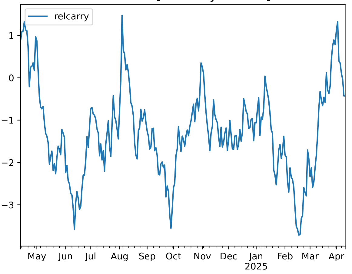
What a rogues gallery! It's quicker to list the rules that did make money or at least broke even:

- relative value skew
- relative carry
- fast relative momentum

This also explains, to an extent, why my performance isn't quite as bad as the industry; I would imagine that I have a little more allocation to this weird stuff than the typical CTA. The pure univariate momentum rules (breakout, momentum and normalised momentum) were especially bad. Even fast momentum has been crucified especially badly in the recent carnage, for obvious reasons.


Costs and slippage

I've already noted that my total slippage (diff between mid market price when I come to place an order, and where I get filled) was 0.56% of my starting capital; and commissions were 0.29%. That's an all in cost of 0.85% which is a little lower than what I usually pay; but as a % of my final capital it's 0.98%, the real number is somewhere around the 89bp - 93bp mark. Two years ago, the last time I checked I was paying 90bp of which 69bp was slippage and 21bp comissions. So slippage is down, commissions up slightly but net-net roughly similar.

Without my execution algo, if I had just traded at the market, I would have paid 1.53% in slippage; my simple algo earned 97bp and cut my slippage bill by two thirds. So that is a good thing.


Coming up

I'm not planning to do much with my futures system this year; I'm going to be busy writing a new book so let's see how it does going forward. Certainly feels like a bad year for trend following; unless or until the US economy gets tipped into recession and we get clear risk off markets. I think it unlikey we're going to get risk on until November 2028 or January 2029 :-) At least for the time being, it's not going great for me (-4% YTD), and it's going even worse for the industry generally.

Tuesday, 4 March 2025

Very.... slow... mean reversion .... and some thoughts on trading at different speeds

 Bit of a mixed bag post today. The golden thread connecting them is the idea that markets trend and mean revert at different frequencies.

- A review of the discussion around timeframes for momentum and mean reversion in 'Advanced Futures Trading Strategies', in light of this excellent recent paper (which I also discussed on the TTU podcast, here from 1:02:12 onwards).

- A mea culpa on the mean reversion strategies in 'Advanced Futures Trading Strategies'. TLDR - there is an error in the backtest and they don't work at least in the specified form.

- A new slow.... absolute mean reversion strategy inspired by a question from Paul Calluzzo on the aforementioned podcast episode.

Note: in this article I use the terms momentum and trend following interchangeably to both mean absolute momentum - not relative.


When do markets trend and mean revert?

When do markets trend? When do they not trend... perhaps even mean reverting? This is a very important question! 

You might think it would depend on the market, but actually there seem to be some fairly common patterns across many different instruments. Here is how I summarised by thoughts in my most recent book, Advanced Futures Trading Strategies (AFTS):

Multi-year horizons: Mean reversion sort of works (although the results are not statistically significant, as the value strategy in part three attests). Note: this value strategy is a relative value strategy that looks for mean reversion within asset classes. Such strategies are common in academic equity research.

Several months to one year horizon: Trend following works, but is not at it’s best (consider the slightly poorer results we get for EWMAC64 versus faster trend variations).

Several weeks to several month horizon: Trend works extremely well (consider the excellent performance of EWMAC8, EWMAC16 and EWMAC32).

Several days to one week: Trend is starting to work less well (EWMAC4 and especially EWMAC2 perform somewhat worse than slower variations, even before costs are deducted).

A few days: We might expect mean reversion to work?

Less than a day: We might expect trend to work?

Less than a second: Mean reversion works well (high frequency trading - HFT - is very profitable).      

Note that 'momentum works for months or years' and 'mean reversion / value works for years' is a very well known stylised fact which has been established in the literature for many decades; see for example this seminal paper. And given the existence of profitable CTAs with holding periods in the weekly to monthly range, it's hardly surprising that momentum works for shorter holding periods. Nor is the fact that HFT firms make a ton of money a secret.

However, in the region between high frequency trading and a horizon of a week or so I wasn't sure exactly what to expect, but I speculated that there would be a region where mean reversion would start to work (more on that later!), and I also thought trend following with holding periods in the 'few hours' range (mainly because there has been some sell side research on that). Note that since my own data is hourly at best, I couldn't really test anything with a horizon of less than about one day.

Fortunately someone came along to fill in this gap in our understanding, with this excellent paper:

"Trends and Reversion in Financial Markets on Time Scales from Minutes to Decades" by Sara A. Safari and Christof Schmidhuber

I won't summarise the paper in much detail (for example it has some interesting results around the relationship between trend strength and reversal), but they have the following pattern of results (from figure 10 in the paper):


Horizon over two years: Mean reversion works, becoming more effective at longer horizons. They used literally centuries of data to check this result. 

One week to two year horizon: Trend following works, but it's effectiveness peaks at around one year

One hour to one week horizon: Trend following works, getting gradually less effective as the time horizon shortens.

Two minute to 30 minute horizon: Mean reversion works, and is most effective at the 4-8 minute horizon


The key differences between my results and theirs only occur in my 'zone of speculation', where I was only guessing and they had actual evidence so let's go with them :-) In particular they have two 'crossing points' from when mean reversion stops working and momentum starts working (at just over two years, and somewhere between 30 minutes and one hour), giving the following broad ranges:

Horizon over two years: Mean reversion works.

One hour to two year horizon: Trend following works.

Two minute to 30 minute horizon: Mean reversion works

Whilst I had speculated that there was something more complicated going on. Even without evidence, Occams razor would suggest you should prefer their results to mine.

Another difference is that when I looked 'optimal points' for eg momentum I was concerned with Sharpe Ratio, but they are instead fitting a response function and seeing when it has the best statistical fitness. Because of the Law Of Active Management, Sharpe Ratio (loosely) scales inversely with the square root of time for a given level of prediction accuracy. So you if you are equally good at predicting one year trends, and 3 month trends, the latter will have twice the Sharpe Ratio of the former. Hence there are good reasons why my optimal SR point is different from their optimal response point; all other things being equal the optimal SR is going to be at a shorter horizon.

Combining the two pieces of research together, and thinking about what sorts of strategies we could be trading, we get this:

Horizon over two years: Mean reversion works. The optimal SR is probably quite flat for anything between three and ten years. Equity value, relative value within asset classes, and absolute mean reversion (of which more in a moment) are all nice strategies. But given their holding period you shouldn't expect high Sharpe Ratios unless you are Warren Buffett (hi Warren!). 

One to two years: Momentum will work but will be getting steadily worse as the timescale gets longer, both from a predictability perspective and a Sharpe Ratio viewpoint. Avoid.

Three months to one year horizon: Trend following works with high predictability, but is not at it’s highest Sharpe ratio due to the slow turnover. However, the advantage here is that this is a playing field that even retail punters with expensive trading costs can play in. Slower momentum strategies are all good.

Three weeks to three months horizon: Trend following probably has it's optimal Sharpe Ratio somewhere in this region, depending on the asset class. Any medium speed momentum strategies are good, and nearly all futures traders can play in this area if they avoid a few very expensive instruments.

Several days to three weeks: Trend is starting to work less well (because the improvement from trading faster is being overwhelmed by the deficit in response) and trading costs will start to bite except for the very cheapest futures (see calculation below), traded with exemplary execution. On the upside, trend following models at this speed will have the highest positive skew. Trade selectively.

A few hours to several days: Trend still just about works but but there are probably only a small number of futures where  you can overcome the bid/offer costs (although I hear costs are very low in Crypto, and there might be US traders who get zero commission able to trade highly liquid ETFs like SPY); I'd doubt though it would be worth doing. As the authors note, strong trends also tend to reverse strongly in this region (see AFTS for my own confirmation of this effect). Against that there have been the sell side papers on this subject, but they seem to rely on gamma hedging effects which may not persist. Avoid.

1 hour to a few hours: The authors in the paper note that the very weak trend effect here can't overcome the tick size effect. Avoid.

Two minute to 30 minute horizon: Mean reversion works, and is most effective at the 4-8 minute horizon from a predictive perspective; although from a Sharpe Ratio angle it's likely the benefits of speeding up to a two minute trade window would overcome the slight loss in predictability. There is no possibility that you would be able to overcome trading costs unless you were passively filled, with all that implies (see below). Automating trading strategies at this latency - as you would inevitably want to do - requires some careful handling (although I guess consistently profitable manual scalpers do exist that aren't just roleplaying instagram content creators, I've never met one). Fast mean reversion is also of course a negatively skewed strategy so you will need deep pockets to cope with sharp drawdowns. Trade mean reversion but proceed with great care.

Less than a second to two minutes: Not covered in the paper, but I would speculate that mean reversion continues to work, and the pre-cost Sharpe Ratio would also continue to improve as the horizon falls. Proceed with even more care.

Less than a second: High frequency trading works, and clearly has a very high Sharpe Ratio, but this is not for the amateur.


Notes on costs: 

The very cheapest equity index future I trade has a cost of around 0.2bp assuming we execute market orders; and vol of around 20% a year, for a SR cost of  about 1bp. Median single instrument SR on the optimal trend strategy (holding period around 3 weeks) is around 0.30. Predictability, as a regression coefficient, from the linked paper is around 6.5% at 3 weeks; and around 1.8% at 2 days (a reduction of 3.6x). Time scaling would improve the SR by 2.7x so the net effect is a 25% fall in SR to around 0.22 for a two day forecast horizon. 

If we take a third of that (my 'speed limit') or 0.22 SR for costs, then our annual cost budget is 0.07 SR or 700bp; implying we could perhaps safely trade a couple of times a day implying a two day forecast horizon (which means trading once a day) is possible. 

But the median future I get data for has a cost of around twenty times that, meaning a holding period of around two weeks is required to meet the 'speed limit'.

Do we have to pay the spread? Broadly speaking, if you are trading slowly, then you can afford to be more patient in your execution, using passive fills where possible (as I do myself). But as a fast trend follower who thinks the price is going to move away from you in the near future, it's probably harder to sit on your hands and wait. 

Alternatively if we are fast mean reverting traders then we can use passive fills by setting limits around where we think the equilibrium is. That of course runs the risk of adverse selection, but without doing this we are never going to make enough money to overcome the bid/offer if we're trading dozens of times a day. You may also be still liable to commissions unless you received exchange rebates from providing liquidity. Note since we earn the bid/offer spread from passive fills, it might be that the best instruments for this strategy are those with wider rather than narrower bid/offers.


Forgive my father, for I have sinned against the gods of backtesting...

Now in AFTS I introduce two strategies which trade mean reversion, with horizons of around a week (since I'd speculated that would work). It included a very elegant way of including limit orders to passively execute, and the second strategy introduced a very nice trend following overlay. And it looked great! But that obviously isn't consistent with the findings above.

Well gentle reader, I screwed up. As I said in my book:

"But what jumps out from this table is the Sharpe ratio. It is impressively large, and the first we have seen in this book that is over two. In my career as a quantitative trader I have always had a long standing policy: I do not trust a back tested Sharpe ratio over two. There are certainly plenty of reasons not to trust this one. 

Firstly, the historical back test period, just over ten years, is shorter than I would like. There are good reasons to suppose that the last ten years included unusual market conditions that might just have favored this strategy. Secondly, it is hard to back test a strategy deploying limit orders that effectively trades continuously using hourly data. There may well be assumptions or errors in my code that make the results look better than they really would have been."

The underlined section (not underlined in the book!) is key here; basically there was an implicit forward fill in my backtest as I calculated the equilibrium price including todays closing price (which of course I wouldn't have known in the morning). The real backtest shows basically no statistically significant return at all.

The good news is that the basic technology of this strategy should work well, at least pre-costs, with a much shorter time horizon; although for all the reasons above I haven't tried it myself (though I know others that have).


A new slow absolute mean reversion strategy

Since I'm taking away one strategy, let me replace it with another. In AFTS strategy twenty two is a 'value' strategy, which bets on mean reversion over five year periods in relative terms against an asset class index. It has crappy SR (basically zero), but positive alpha and improved overall SR when added to trend and carry strategies. 

But on a recent TTU podcast, here, Paul Calluzzo asked me if I'd ever tested absolute mean reversion. Certainly I haven't on this blog. So let's do that.

I'll use a three year return for my forecast, which is slow enough to avoid the two year point where we know momentum probably still works; whilst being quick enough to avoid the death by sqrt(T) that will reduce my SR. We go long if the return is negative so:

Forecast = Price_t-3yrs - Price_t

To avoid the turnover being excessive (this is a slow forecast!), and because we should always vol scale:

Smoothed vol scaled Forecast = EWM_64(Forecast/ EW_std_dev(returns))

Drumroll...

It's not..... great (SR -0.48), apart from perhaps a recent pickup. You could argue that as a lot of my data starts in 2013, and the first five year return occurs in 2018, that it's actually profitable for many instruments and we've just been unlucky in the instruments we've traded before. The median SR is -0.06 though which doesn't completely support that argument. 

But really it would appear that at least with this construction absolute mean reversion isn't as good as the relative mean reversion I tested in AFTS.

OK so we've dropped a strategy with an unfeasibly high backtested SR, and I've replaced it with one that has a very poor backtested SR. Unfair? Well, life isn't fair.


Summary

Good things to trade:

Horizon over two years:  Cross sectional mean reversion, but possibly not absolute mean reversion. And similar type things like equity relative value.

One to two years: Nothing*

Three months to one year horizon: Trend following of pretty much anything

Three weeks to three months horizon: Trend following; avoiding very expensive instruments.

Several days to three weeks: Trend following; only the very cheapest instruments.

One hour to several days: Nothing*

Less than a 30 minute horizon: Mean reversion - the faster the better, but only with limit orders and with great care (the faster you are, the more care needs to be taken).

* or at least not outright momentum or mean reversion

Wednesday, 1 March 2023

I got more than 99 instruments in my portfolio but butter ain't one of them - another take on instrument diversification

As those of you who follow me on the Elon Musk Daily News App will know, I received physical copies of my new book last week (exciting!). Global supply chains being what they are, you lot will have to wait until April to get your copies. Sorry.

Anyway one of the themes I touch on in the book is the truely amazing diversification that trend following strategies offer when run across multiple instruments. 

I have touched on this before (although never in detail with a complete blogpost on the subect), but I thought I would present some updated results using the data set I use in the book (102 instruments), presented with some different plots to help better grasp the intuition of what's going on. This isn't a sneak preview of stuff in the book, you'll still have to buy it :-), but goes into more detail to help understand just how amazing this effect. 

Incidentally I don't trade butter because it isn't liquid enough; less than 20 contracts a day. Maybe if I left it out of the fridge in hot weather....

(Code is here. These results are not exactly the same as in my latest book, as I'm using a different methodology)


Measuring diversification

The most intuitive way to measure diversification is a simple ratio: expected return for many things divided by the expected return for one thing.

But there is another way of measuring diversification through 'independent bets', which I was reminded of when I reread this 2018 article by the always excellent Cory Hoffstein, and also this article by Resolve (Adam Butler et al). 

Cory's article talks about the three axis of diversification: what, how and when. That article talks a great deal about 'how': diversification across trading rules in my parlance. This blogpost and the Resolve post consider 'what': diversification across instruments. You can also consider 'when': broadly speaking, diversifying across different forecast horizons or speeds of trading rules.

The maths behind the independent bet idea is simple; if you have a portfolio of N return streams (eg trading strategies running on different instruments), scaled to the same volatility (normal for trading strategies) and they are uncorrelated, then your standard deviation will reduce by sqrt(N) versus the risk of one strategy. Assuming they have the same expected mean, your Sharpe Ratio will therefore increase by sqrt(N). If you can use leverage (like a futures trader), then you can purchase higher returns with that rise in Sharpe Ratio.

Most portfolios aren't uncorrelated, so we can bring in the idea of effective independent bets. That's just the value of N with uncorrelated assets that would give you the same reduction in standard deviation that you actually get in practice. For example, if your correlation is 0.5 with two assets equally weighted, then your SR will increase by 1.15. That is the same improvement that we would get from having 1.15^2 = 1.33 independent bets. 

Similarly, if we have three assets with an average correlation of 0.5, then the SR will improve by 1.225 which is the same as having 1.5 independent bets.

A couple of wrinkles: The average correlation is a nice guide, but in the actual calculation you should use the entire correlation matrix. Also, the simple independent bets calculation assumes that all your assets are equally weighting in the zero correlation version. But in calculating the standard deviation for the uncorrelated portfolio you should use the actual weights. 

For example, with identical off diagonal correlations of 0.3 and equal weights, there are 1.88 independent bets. But consider this piece of pysystemtrade code:

from sysquant.estimators.diversification_multipliers import *
corr = correlationEstimate(np.array([[1,0.5, .3], [.5,1, .1], [.3,.1,1]]), columns=['a', 'b','c'])

a b c
a 1.0 0.5 0.3
b 0.5 1.0 0.1
c 0.3 0.1 1.0

corr.average_corr()
0.3

weights = portfolioWeights(dict(a=.45, b=.45, c=.1))

## independent bets
diversification_mult_single_period(corrmatrix=corr, weights=weights)**3
1.53

By allocating less to the more diversifying asset we have reduced the available diversification.

However in this post I will always optimise instrument weights to minimise the portfolio standard deviation using only the correlation matrix as an input, hence maximising the available diversification.

Now, there two ways to calculate diversification, eithier as a ratio of standard deviations (Sharpe Ratios) or as a number of independent bets. The first is to use the correlation matrix of returns, and weights, as I've already done. We can think of this as expected diversification benefit. In fact I do this already in my code - it's called the instrument diversification multiplier (IDM). So if take IDM^2 then that will be equal to the expected benefit, measured in units of independent bets.

The second way of measuring diversification is by looking at the realised Sharpe Ratio of the portfolio, and comparing that to the Sharpe Ratio for a single instrument. We can think of that as the realised diversification benefit. And if I square that ratio, I will again get the realised benefit measured in independent bets.

There is a third way, which is to measure the realised standard deviation of the portfolio having not applied any diversification multiplier. But assuming we are pretty good at predicting risk - and we are - this will be pretty similar to the IDM figure. 

So in summary we can measure:

  • Expected diversification ratio (equivalent to IDM)
  • Expected number of independent bets (IDM^2)
  • Realised diversification ratio (SR ratio)
  • Realised diversification as a number of independent bets


Which markets?

There is a big problem here, which is that we're comparing the diversification of one instrument with say two instruments. But which 'one instrument'? And which two instruments? We'll get different answers if we compare a portfolio of Corn and US 10 year bonds versus a portfolio with just Eurodollar, or a portfolio of Dry milk and Crude oil, versus just US 2 year.

That isn't so much of a problem with correlations, but for Sharpe Ratio which exhibits a lot of variation across instruments, it's a big problem.

The answer, is to Monte Carlo this. For each portfolio size N that we want to test we run a bunch of different random runs. Each run involves picking a random group of N markets, allocate instrument weights, and measure the resulting portfolio IDM (expected diversification) and Sharpe Ratio. Then we take the average (median) to get the values for a given N.

Incidentally I calculated instrument weights in two ways to check the robustness of my results:

  • Optimised using using correlation as an input into the optimisation, with flooring at zero and some shrinkage for stability.
  • Equal weights. I have some heterogeneity in my instruments, eg a lot of equities, so this may not be appropriate.


Long only

Let's first consider a long only portfolio. This will be identical to the trend following portfolio except it uses a constant forecast (the 'asset allocating investor in my first book').

Interestingly, the average correlation of instrument returns across the entire portfolio of 102 instruments is 0.224 (effective number of independent bets, 4.3), but the correlation of subsystem returns (basically trading each instrument, sizing positions for current volatility) is just 0.09 (number of independent bets 6.3). 

First of all let's look at the expected diversification, measured by IDM, with optimised weights. Just to give you a flavour of the monte carlo, the following plot shows the individual data points for each monte carlo, plus a median line. Notice the noise falls as we get more instruments; that's because the portfolios get more similar. At the limit when we're choosing 100 out of 103 instruments, the results are going to be fairly similar.

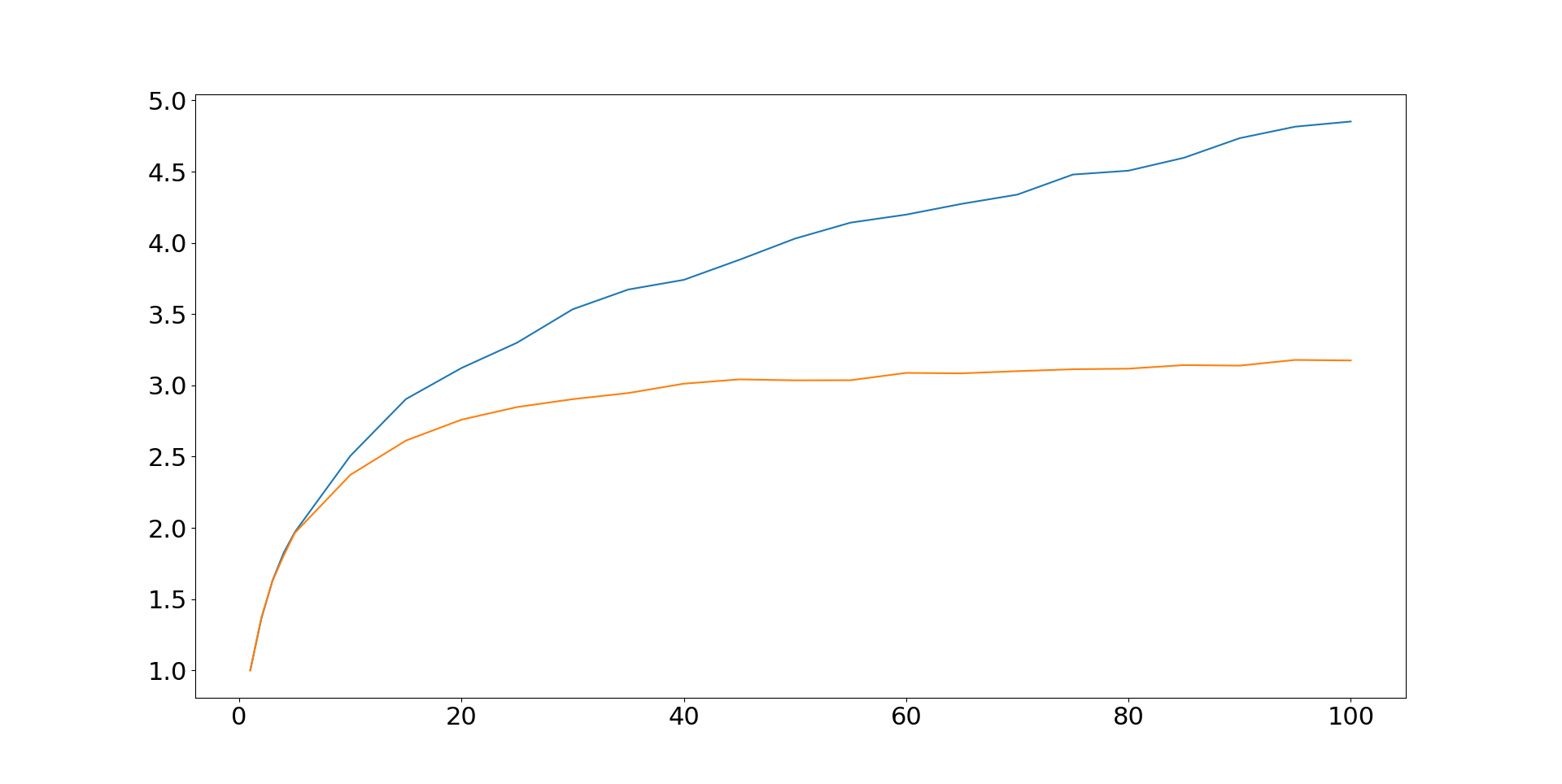
At the top end the IDM is around 4.8, which means we've got 4.8^2 = 23 independent bets.

Note: I am optimising weights in such a way that will maximise the IDM, hence the IDM's here are higher than in the book for both long only and trend following strategies.

This sounds pretty amazing, but what about the Sharpe ratio, realised diversification? To get something with a comparable y-axis we need to divide the Sharpe Ratios by the median SR for a single instrument. Here is what we get:

I've truncated this plot to make things clearer - there is a lot of noise for smaller N as you'd expect.

But the bottom line is that is rather disappointing. We only get a doubling of SR, equivalent to 4 independent bets. That's a lot less than the IDM would suggest, but then our portfolio weights have effectively been chosen to maximise the IDM (in sample!). But it's also a little short of the 6.3 independent bets that the average correlation would suggest. In fact, it's actually closer to what we'd expect from the average correlation of the raw instrument returns (0.22) before vol scaling. Vol scaling doesn't really add diversification, it just makes the relationship between returns more non linear, and hence reduces correlation.

What difference will equal rather than optimised weights make? Check out the following plot for IDM first, with just the median lines:
The blue line we've already seen, and is for optimised weights. The orange line is with equal weights. This orange is more like the classic 'diversification' graph that you see everywhere, encouraging you to believe that there is no point owning more than X stocks, where here X is perhaps 40. With equal weights the IDM tops out at ~3, or 9 independent bets.

Here are the same two lines, but this time for SR (relative to the median SR of a single instrument portfolio):

Equal weights actually comes out slightly better here, but we're still looking at only around 4.3 independent bets.

The bottom line is that the long only portfolio over promises (high IDM, between 9 and 24 independent bets depending on the weighting scheme), and under delivers (twofold SR improvement, for around 4 to 4.3 independent bets).


Trend following

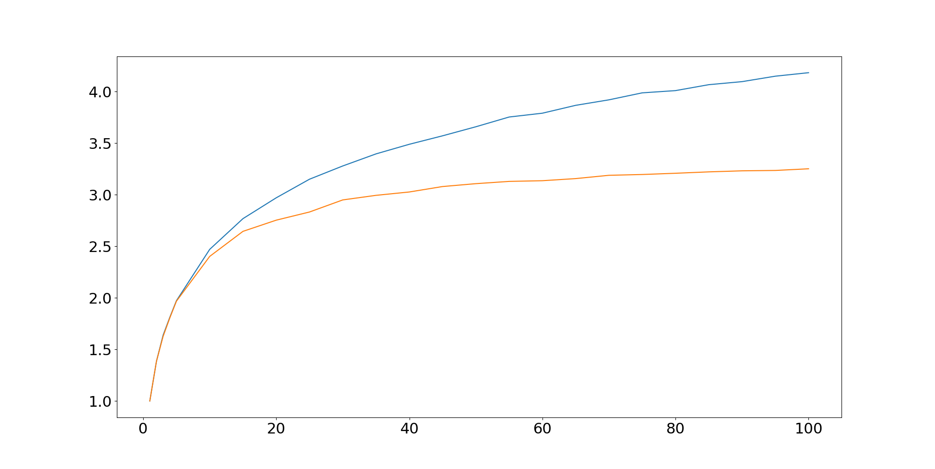
Now let's consider the same setup, but for a trend following strategy. For simplicity I just used a single trading rule, the EWMAC16,64 rule AKA the starter system from Leveraged Trading. But the results will be similar for a portfolio of such rules. First of all let's plot the IDM, for both optimised (blue) and equal weights (orange).

Pretty similar to before; if anything the diversification benefit available is a little lower than for long only strategies, despite similar average correlation of around 0.08. Using the more optimistic blue line with optimised weights it looks like our expected diversification is of the order of 4.2, equivalent to 18 independent bets.

Now for SR, again blue is with optimised weights and orange is equal weights:


For those crying 'in sample fitting' with respect to the optimised weights on the blue line, note that (a) my optimisation was purely on the correlation matrix, not the SR of the portfolio; (b) correlations are relatively stable over time for trading subsystems, and hence (c) I have got these sorts of improvements in SR for 'proper' backtests using rolling out of sample instrument weights. So I am pretty confident that the blue line is achievable. 

Looking at the blue line then, it's pretty darn good. Rather than the twofold SR improvement seen earlier, we have a relative improvement of over 4.5 times. This is actually a little higher than the improvement promised by the IDM, and hence over 20 independent bets. Even the subpar equal weight version with the orange line manages a threefold improvement, for a score of 9 independent bets.

Another important point is that it looks like the blue line here is still going, suggesting adding even more instruments could potentially boost SR further. In contrast the long only portfolio asymptotes at around 50 instruments, with further diversification not adding anything meaningful.


Summary

Whenever I have plotted these graphs before it has always been to make the point that instrument diversification is the best kind. Adding different kinds of trading rule, or trading at different speeds, or both, will boost your performance - but not by very much. You will be lucky to get two independent bets worth of diversification from this source. In contrast, we can get realised performance equivalent to over twenty independent bets from diversifying across a trend following portfolio of 100 instruments; versus just over four in a long only setup (and it would be even lower without volatility targeting!).

Unfortunately adding instruments requires more capital or doing something smart like my own dynamic optimisation technique. Diversification is a free lunch, but you still need to get to the buffet...