Showing posts with label Trend following. Show all posts

Friday, 9 January 2026

Are markets that are good for trend good just because they have also gone up a lot, or because carry, or...

I have a friend, ex-colleague and TTU co-host who runs a fixed income focused CTA. We have regular coffees (he pays, so his fund is doing ok) and one of our favourite topics for arguing debating making polite conversation about is why fixed income is so much better for trend than anything else. He's biased, but then arguably so am I; I started my career trading rates options, and we both managed AHL's fixed income portfolio (though not at the same time).

Certainly if you looked at the performance of fixed income it looks good! Consider this extract from my fourth book, tables 37 and 38:


Only vol is better, and that is just two markets. But then, bonds have been a great investment on a long only basis. The data in that book covers a period when bond prices could very easily be summarised as "number go up!". Here are tables 10 and 11 from the same book:


Bonds have the highest Sharpe Ratio on a long only basis (actually it's long only with position sizes adjusted daily for vol: a constant forecast of +10). 

But still, there must be something else going on here. Equities have also done awfully well long only (SR 0.46), but they have the worst trend following performance of all. FX has had crap SR long only, but did pretty well trend following. What's more, it will probably be useful to distinguish between different kinds of tailwind from secular up trends: 
  • Price go up (or down, since if we're trend following long/short we are cool with that, c.f. vol)
  • High Positive carry (or negative, same reasons)
Of course there are fancy ways of dealing with this, like CAPM style regressions (of which there are plenty in the book); but let's keep things simple here with some scatter plots.

What is being scattered? Well on the y-axis let's do SR of trend following, and on the x-axis the SR of the long only adjusted price return, spot price return, or cumulated carry return (the difference between spot and adjusted price). Each scattered point will represent the returns of one market over a five year period, and I colour the point to indicate the asset class. And we'll also need to do different graphs for each speed of trend following.

Messy python (requires psystemtrade)

Fast trend (momentum 8)

We would expect for faster momentum to have a relatively weak relationship. Let's see:


Yup, nothing there.


Medium trend (momentum 16)


Perhaps the start of a slope there, but not for carry.

Slow trend (momentum 64)


So adjusted prices look good, spot prices less so, and carry not much going on. Don't forget that adjusted is mechanically spot+carry, but over time that addition will make sense if they are uncorrelated. It looks like adjusted prices show clearer trends than eithier of the components do.


But is there anything special?

This doesn't tell us whether there is something special about bonds, equities or FX. Let's repeat the plots for momentum64 but without the scatter points; instead we fit a regression line to each asset class and plot that.


Now that is the money shot for this blog! We can see a clear split:
  • Bonds, FX, Metals, Vol: We can convert adjusted price drift into trend SR, with a slope of around 0.9. Note: The vol line in green is the one almost perfectly aligned to the orange line going up to SR 1.0 on the x-axis.
  • Ags, Energies, Equities: The relationship is much weaker 
What about the other two types of prices?


We can see there is a consistent effect in spot prices, but carry is much weaker. The exception is vol; much of the adjusted price downtrend in vol comes from the vol premium which is basically carry on the futures curve.

I won't do everything, but here are the adjusted price plots for the other two speeds.


Although the vol line has a worse intercept, the same pattern of the relationship is present.

Summary

To an extent, secular up(down) trends in asset prices make it easier to make profits from (slower) momentum. The effect is roughly 0.7 to 0.9 units of trend following SR for every unit of secular drift depending on the speed of trading. And it's remarkably consistent across asset classes that fall into this category: they are not energies, equities or ags. So there is nothing special about bonds; but there are two distinct types of asset classes. 

Here is another view: a distribution of trend SR returns in five year blocks by asset class for momentum64:


And combining with this plot, showing the distribution of adjusted price returns (SR) in five year blocks by asset class:


One last scatter plot of the medians SR from the above two plots:


We can say:
  • Bonds, FX and Vol did as expected, converting trends of various strengths to momentum trend SR (they lie on an imaginary line running diagonally upwards)
  • Metals, which we know is also a strong trend convertor, did even better than expected 
  • Equities is definitely an underperformer as we'd expect from a poor trend convertor.
  • Energies and Ags seems to have got lucky; though they are not great trend convertors they did better than expected (lying just above the imaginary line).

Is this trend conversion a property of the asset class, or just a fluke? I dunno. But it doesn't look like there is anything special about bonds. 


Tuesday, 7 October 2025

Is the degradation of trend following performance a cohort effect, instrument decay, or an environmental problem?

It's probably bad luck to say this, but the most recent poor performance of CTAs and trend following managers this year appears to have been reversed. My own system is up over 12% since the nadir of the summer drawdown, and is now up for year; admittedly by only by 5.5%. 

Nevetheless, it's true to say that trend following performance appears to have been degrading over the last few decades. If I can literally talk my own book (the book in question being Advanced Futures Trading Strategies - AFTS), then in one chapter I note:

Having said that, it does look like the returns from strategy nine are falling over time. The inflationary 1970s were particularly strong, with a total non-compounded return of over 500% over the decade (if we had been compounding, our returns would have been even more spectacular). We then made over 200% in each of the next three decades. But since 2010 our average return has roughly halved.

But where the better returns in the 1970's (and to a lesser extent 80's, 90's and 00's) because we had a better environment for trend following, or because we had better instruments, or because over time instrument performance decays?

Let me explain. Back in 1972 when my backtest begins, there were just a few instruments. In the first few years only 11 instruments were around, out of the 100 or so in my usual list of liquid instruments I use for testing. And they were weird: seven were agricultural commodities, two are currencies and two metals. Perhaps the better performance of trend following in the 1970's was because the instruments we had then were just better at trend following? Or, perhaps it's just that when an instrument is first traded it does very well, because there aren't many other smart people hanging around to extract 'alpha'?

So, let's see which of these three explanations is most likely.

I'm going to start with the fastest EWMAC 2,8 crossover I use. In AFTS I noted that the two fastest crossovers have suffered particularly bad degeneration in performance since about 1990. These returns are before costs, so the after cost performance would be even worse.

There are quite a few of these graphs in this format, so let me explain. Each line is a different cohort of instruments. So the blue line for example, is all the instruments that began trading in the period 1971-1980 inclusive. On the y-axis is the average SR for those instruments in the five year period beginning in the date on the x-axis. So for example, for the instruments that began trading in the first ten years, from 1981-1985 their average SR was around 0.30; a little higher than the next cohort of instruments that just came in. 

* Important note. The date an instrument starts trading is the earliest point I have data for it. It may have been trading long before then.

Let's now review three possible explanations for the reduction in trend following p&l in the fifty years or so, and see which most represents the empirical results.

First of all we have a cohort effect explanation. Instruments which enter the dataset later have worse performance, so they drag down the average performance. This would look something like this:


You can see that the older an instrument is, the better it's performance. To combat this effect we could just avoid trading newer instruments.

Next we have an instrument lifetime decay effect. Each instrument does well when it first enters the dataset, but then it's performance decays as it ages. As a result, as more instruments are old and fewer newer, and the average performance falls. An extreme version of that effect would look something like this (I've drawn the horizontal lines slightly apart for clarity, they should be on top of each other): :

To deal with this we'd have to be constantly adding new instruments that haven't yet been affected by the influx of sophisticated traders looking for alpha. This is the opposite of what we'd do with a cohort effect.

Finally we have the general enviroment effect. All instruments have roughly similar performance in each period, which gets worse over time. This would result in something a bit like this (I've drawn these lines slightly apart for clarity, they should be on top of each other): 

There is no solution here. We are buggered. We need to get out of the trend following game. Or at least hope that this is just a temporary setback; after all people have tested trend following rules over hundreds of years so a few decades of bad performance is nothing to worry about.

Looking back at the EWMAC 2,8 graph, there is no support for the cohort effect. It looks like there is some evidence of an instrument decay, most strikingly for the 1991 cohort. However this only contains 7 instruments, so it's one of the smallest cohorts, so the significance is questionable. Overall though, this does look an enviroment effect with noise. 

Let's step down the speed to EWMAC4,8:

Looks like a very similar picture. How about EWMAC8,16?
Again apart from the 1991 cohort, this looks pretty much like a gradual decline due to enviromental effects. Now let's turn to EWMAC16,64, which readers of AFTS will know is the best following of my momentum indicators:
Feels like we're watching the same film over and over again, doesn't it?

EWMAC32,128


EWMAC64,256

Not quite as clear, but we're trading very slowly now so would expect more noise.

To summarise then, it looks like the decay of momentum performance has been solely down to  general enviromental effects, rather than a cohort effect, or the decay of instrument performance. This is bad, because it means we can't do anything about it by restricting ourselves to older or newer instruments. This is good, because instrument diversification really is our best chance of being profitable traders and making the most out of a weakening signal. I wouldn't want to suggest that you should do anything different than trading all the instruments you can get your hands on.

And to reiterate, let's hope this is a temporary situation. For me personally, as someone who isn't tied into a CTA box, I'm happy to continue trying to trade as many different risk / return factors as possible.

Bonus postscript: Here's carry!

This does look a little bit more like a decaying instrument story...


Monday, 8 September 2025

PCA analysis of Futures returns for fun and profit, part deux

 In my previous post I discussed what would happen if you did the crazy thing of doing a PCA on the whole universe of futures across assets, rather than just within US equities or bonds like The Man would want you to. In this post I explore how we could do something useful with them. There is some messy code here, to run all of it you'll need psystemtrade, but you can exploit big chunks with your own data even if you don't.


The big problem: sign flipping

Before hitting some p&l generating activity, first however we need to deal with an outstanding issue from the previous post.

TLDR, most of the time factor one is 'risk on /equities are go' and factor two is global interest rates; although not always. Factor sign flipping was a problem however (thanks to people below the line for that insight). So sometimes factor one was long equities, sometimes short equities. Sometimes it was something else entirely. 

As an example, remember this plot from part one? It's the factor exposure of the S&P 500 over time for factors 1(0), 2 (1) and 3(2).

Note there are 'blips' when we have a short exposure to factor 1, mostly in the period since 2008 when we're normally long factor 1. That's clearly a temporary sign flip. We probably want to get rid of those. But there is also the long period in the early 2000's when we're persistently short factor 1. That might be a 'sign flip'; but it could also be that factor one in this period was something more interesting than just 'long equity risk'. 

A couple of ideas spring to mind here. One is just smoothing the factor weights. That would easily solve the blips; and the smooth need only be a few weeks to get rid of them. But a longer smooth, of the length needed to get rid of the other periods, would reduce the information about the factors; in particularly we'd be missing out on interesting times when something other than boring old risk on and off is driving the market.

Another bright idea I had was to reverse the sign on weights when the largest absolute value weight was negative. My expectation was that generally the largest weight on factor 1 (mostly risk on) would usually be equities, and when that factor flipped sign we'd flip it back again. However that didn't produce the expected results. If I were less lazy (and eager to get back to writing book #5), I'd probably do some research; eg I'm pretty sure the answer is somewhere in Gappy's new book but I haven't got there yet. 

In the end I decided to relax and ignore the sign flipping; I can do this because of the four ideas I outlined:

1- own the factors

2- trade the factors

3- buy assets with persistent alpha (+ve residual) 

4- mean revert the cumulative residual 

.... it's only really 1 and 2 that are affected by sign flipping. And I feel I already have things in my armoury for 1 and 2. For example my aggregate momentum signal (blogged about here, and also in my most recent book AFTS) is basically like 2, and on assets with a long bias that will also give us a chunk of 1 as well. 

<Sidebar * note to browser not actually HTML>

Arguably my relative momentum and long term mean reversion are also a bit like 3 and 4. Yet another idea is to build 'asset classes' using clustering as I did here, and then use those for the purposes of 1,2 and possibly 3 and 4. 

So we have three different ways of forming 'factors': exogenously determine asset classes, PCA, and clustering; and four different ways of trading each of them. Those won't give radically different results since clusters mostly follow asset classes, but they could be a little different.

<\Sidebar * see previous note>

But, I hear you cry, why can you flippantly ignore sign flipping when trading only the residuals? Well it's pretty simple; consider a standard APT type equation with a single PCA k and market i:

r_i_t = a_i + (b_i,k * r_k,t) +e_i,t

If we now do a sign flip, then the beta (b) will have a minus one in front of, but the market or PCA return r_m will also have a minus one in front of it. These cancel, and estimation of both the persistent bias (alpha, a_i) and the temporary error (epsilon, e_m) will be unaffected. 


Trading the alpha

So we have two basic ideas; we generate our PCA and then run regressions that look like this:

r_i_t = a_i + (b_i,k * r_k,t) + ... +e_i,t

Where there are one or more PCA k.... And then we eithier buy positive a_i and sell negative; or we sell things with recent cumulative positive e_i.

There are still many design questions to resolve here. How many PCA do we include? Too few, and we'll probably end up missing something interesting. Too many and there is a risk we'll end up without clear signals. Over what period should we estimate betas and alphas? Basically how persistent are they likely to be. Over what period should we cumulate epsilon? Are there periods in which episilon will be trending rather than mean reverting; eg assets that have outperformed their factor adjusted return will continue to do so (which will look an awful lot like buying positive alpha)?

For the PCA I'm going to keep it simple and initially use three PCA, which happens to be the most I can plot and get my head around it. I'm also going to stick to estimating my alphas and betas over a 12 month period, which is the arbitrary period I used before to estimate the PCA themselves (seems weird to use a different period). For the question of epsilon decay I will risk the wrath of the overfitting gods and do a time sensitivity analysis.

To summarise then: At the start of each month we look at the 12 months normalised returns, do a PCA, and then regress each instrument on the returns of each component. We then have an alpha intercept coefficient, and some betas (at most three, once for each PCA). We can see how predictable the alpha is of returns in the following month(s). Then for the following month we can also calculate the residual of performance vs the fitted model. We can cumulate up these residuals and see how they forecast performance.


Alpha

Let's start with the alphas. Here be a massive scatter plot:


Each point is the alpha calculated at the start of a given month for an instrument, and the normalised ex-post return for the following month. It looks like there might be a weak positive relationship there, so let's do some stats.

                           OLS Regression Results                            
==============================================================================
Dep. Variable:         ex_post_return   R-squared:                       0.006
Model:                            OLS   Adj. R-squared:                  0.006
Method:                 Least Squares   F-statistic:                     169.0
Date:                Mon, 08 Sep 2025   Prob (F-statistic):           1.62e-38
Time:                        11:46:09   Log-Likelihood:                 1910.6
No. Observations:               26311   AIC:                            -3817.
Df Residuals:                   26309   BIC:                            -3801.
Df Model:                           1                                         
Covariance Type:            nonrobust                                         
==============================================================================
                 coef    std err          t      P>|t|      [0.025      0.975]
------------------------------------------------------------------------------
Intercept      0.0052      0.001      3.735      0.000       0.002       0.008
alpha          0.3144      0.024     12.999      0.000       0.267       0.362
==============================================================================

There: we have the classic undergrad stats exercise question "Why is my t-stat big but my R squared is low?". Answer: there is something here, but it's weak. This often happens if you use a large dataset (26,000 observations here).

To show this differently, the conditional ex-post average daily return over the following month with a positive alpha is 0.02, and with a negative alpha is -0.01 (both conditional subsets are roughly half the dataset overall). The t-statistic comparing these is a hefty 10, corresponding to a p_value of the order of 10^-26. So again, alpha definitely has an effect, but is that difference really that big? Hard to tell.

But we know that low R squared are pretty common in finance, so is this a problem? To test this I tried using the alphas as a forecast, and then calculated the Sharpe Ratio of each forecast. The median across all instruments is a SR of 0.1. Remember that trend following gives us around 0.3 to 0.4 for each instrument, so this isn't especially interesting.

It might be that I would get better results from a different lookback to calculate the alphas (remember we use one year). Everything from a 1 month to a lookback of 10 years. What about using fewer, or more principal components? Remember we're going with three.  It turns out that a one year lookback is pretty optimal compared to shorter or longer; but using one PC is better than using two or more. Still the very best we can do is a one year lookback with one PC, and that gives us a SR of 0.12 which is hardly in wallet busting territory and also not significantly different from the result wih three factors.


Trading the residual

Let's turn then to trading the residuals. We're going to cumulate up residuals over various periods and see how well that predicts future returns. To avoid a forward looking forecast, the residuals are calculated on the out of sample month following the point at which the model is fitted. Otherwise the regression coefficients would be forward looking, and hence so would the forecast.

Note that because the model changes slightly each month, the coefficients used to calculate residuals will also change slightly. Such is life. But we'll keep stacking up the residuals month by month even though they are using different models.

We now have 3 knobs to twiddle on our overfitting machine; lookback and number of PCs as before, but also the number of days we sum up residuals. To keep things relatively simple I will initially sum them up using 22 days (about a month of business days). So our base case is:
  • One year lookback to do PCA and calculate coefficients
  • 3 principal components
  • 22 days summing up of residuals; our forecast is minus the summed residuals
And jumping straight to Sharpe Ratio calculation like an impatient toddler, we get a SR of -0.04. The sign is wrong, showing that positive residuals lead to more positive performance, and the effect is also v.v.v. weak.

Does increasing the residual summing period work; eg mean reversion works over longer time periods? Nope. Anything up to a year is actually worse. Going down to a week (which would be v.v.v. costly to trade) does at least push the SR into positive territory, but only just.

Dropping to one PC (which was marginally better than for alpha above), changing the lookback on the PCA, .... nothing produces useful results. This idea is an already dead donkey that has been subsequently thrown off a cliff and then burned**.

** no actual donkeys were harmed in the creation of this blog post


Back to alpha

So we had a not too promising individual SR using alpha on an instrument level, but how does that look on a portfolio level? Surprisingly, quite good. Here are the combined results for 100 instruments:


That bad boy has a SR of 0.84! Some of that is diversification, but some of it is because a more accurately calculated median SR per instrument is 0.15, higher than the 0.10 calculated earlier (because, many reasons, like buffering and what not). Still, that's an extremely high realised diversification of over 5. Let's compare it to the 'gold standard' of single momentum models, EWMAC16,64 with the same instruments:


OK not as good, even counting the different vol ewmac comes in with a SR of 1.08, but their correlation is a relatively lowly 0.3. That suggests a modest allocation to alpha persistence will earn some money. Chucking 10% of your forecast weights into alpha persistence bumps up the SR of ewmac16,64 from 1.08 to 1.12. Going to the (arguably in sample fitted) best model with one principal component improves the SR of the alpha model by itself to 1.02, but also increases the correlation with momentum; so that the joint SR with 10% in alpha persistence and 90% in ewmac produces a pretty much unchanged SR of 1.13.


Summary

Research in systematic trading tends to result in a lot of blind alleys. I thought this would be another one. Certainly the idea of mean reverting the errors, a classic from the equity stat arb crowd, doesn't really work in this context. However there does seem to be some modest performance gain to basic momentum from including a PCA derived alpha persistence model. The gain is small however, so it's debatable whether it's worth what would be quite a lot of additional work. Not a blind alley then, but not a very pleasant one to spend much time in.


Monday, 14 April 2025

Annual performance update returneth - year 11

Mad out there isn't it? Tarrifs on/off/on/partially off/on... USD/SP500/Gold/US10/Bitcoin all yoyoing like crazy. Seems a good moment to be slightly reflective.

I skipped my annual performance update last year, a little sad given it was my tenth anniversary. Mainly this is because it had become a lot of work, covering my entire portfolio. The long only stuff is especially hard, as all my analysis is driven by spreadsheets rather than nicely outputted from python. If I'm going to restart the annual performance, I'm going to do it just on my systematic futures portfolio. That's probably what most people are interested in anyway. 

This then is my 2025 performance update. As in previous years I track the UK tax year, which finishes on 5th April. That precise dating is especially important this year!! 

You can track my performance in (almost) real time, along with other information here,

TLDR: On a relative basis my performance was good, 3% long only vs -0.1% vs benchmark; -16.3% in futures vs ~-18% benchmarks. On an absolute basis, it's a mediocre year long only and my worst ever in futures.


Headline

My total portfolio performance was -1.9% last year; It would have been +3% without futures. That's a sign that this hasn't been a great year in the systematic world of futures trading. Spoiler alert - it's my worst ever. Whilst I'm not doing the full gamut of benchmarking this year, my benchmark of Vanguard 80:20 was down 0.1% (thanks to Trump), so I would have been well ahead of that if it wasn't for futures.

Everything else in this post just relates to futures.

Headline numbers, as a % of the starting capital:

MTM:        -17.8%
Interest:     2.4%
Fees:        -0.05%
Commissions: -0.29%
Slippage:    -0.56%

Net :       -16.3%

'Interest' includes dividends on 'cash like' short bond ETFs I hold to make a slightly more efficient use of my cash. Actually I ended up paying interest as I was a bit sloppy and didn't liquidate the ETFs when I lost money so ended up with negative cash balances. Given the interest rate was probably higher on the borrowing than the yield on the money market cash like funds; and given the tax disadvantage (I pay tax on dividends but can't offset losses from interest payments), this was dumb. I've now liquidated a chunk of my ETFs.

MTM - mark to market - also includes gains or losses on FX positions held to meet margin, and on the cash like ETFs. Broken down:

Pure futures:   -14.5%

Cash like ETFs:  -0.64%

FX:              -2.7%

So perhaps a better way of doing this would be to lump together all the interest, margin and ETF related flows, and call those 'cost of margin':

Futures MTM: -14.5%
Commissions:  -0.29%
Slippage:     -0.56%
Fees:         -0.05%

SUBTOTAL - PURE FUTURES: -15.3%

Cost of margin: -1.0%

Net :         -16.3%

Time series


You can see that after the peak in late April (which was also my all time HWM), we have two legs down; the first is almost recovered from; but the drawdown from mid July to the end of September is quite vicous at ~17% is probably the worst I have seen. 

Just about visible at the end of the chart is 'tariff liberation day' which has liberated me from a chunk of my money. Ouch, let's make ourselves feel better with a longer term plot

Benchmarks

My two benchmarks are the SG CTA index, and an AHL fund which like me is denominated in GBP.

Here is the raw performance:


It's not super fair as I run at a much higher vol target than the other two products, but here are some numbers:

           AHL       SG           ROB

Mean       4.5%      4.0%         12.9%

Stdev     10.7%      8.9%         16.8%

SR (rf=0)  0.42      0.45          0.76        

Those Sharpes would be lower, especially in the last couple of years, if a risk free rate was deducted.

My correlation is 0.66 with SG CTA, and 0.56 with AHL. Their joint correlation is 0.78. Perhaps because I'm not just trend following and carry. Both have been bad this year. More on that story later. To make things fairer then, let's do an insample vol adjustment so everything has the same vol:


I'm still winning, but it's a bit closer. Here are the annual figures:

          AHL SG Me

30/03/15 66.0% 51.4% 59.5%

30/03/16 -6.2% -3.7% 28.1%

30/03/17 -3.7% -12.6% 2.4%

30/03/18 8.7% -1.7% 2.0%

30/03/19 5.4% -2.7% 4.5%

30/03/20 22.0% 6.5% 33.8%

30/03/21 0.9% 11.9% -1.7%

30/03/22 -12.0% 33.1% 25.8%

30/03/23 8.3% 0.6% -7.6%

30/03/24 14.5% 24.3% 20.6%

30/04/25 -18.2% -17.9% -14.7%

Note: The reason I'm showing -14.7% here and 16.3% earlier, is that these figures are to the end of the relevant month (i.e. March 31st to March 31st), rather than the UK tax year; as I can only get monthly figures for the AHL fund.

I've highlighted in green the best performer in each year, red is the worst. You can see that, at least with my vol adjustment, it was a shocking year for the industry generally, and although this was my worst year on record, I did actually outperform (the unadjusted numbers are -12% for AHL and -10% for the CTA index so I was worse than those, but obviously would have looked even better earlier in the period).

The one stat I haven't included here is my favourite, geometric return or CAGR; mine was 12.0% vs 5.9% AHL and 6.4% SG (based on the leveraged up, vol adjusted numbers in the second graph; the figures would be worse for AHL and SG without this adjustment).

Is this fair? Well no, there are fees embedded in the AHL and SG numbers. My fees aren't in these figures, and are much higher - I charge no management fee, but my performance fee is 100% :-)


Market by market

Here are the numbers by asset class:

Equity  -6.0%
OilGas  -4.2%
FX      -2.7%
Metals  -1.5%
Bond    -1.3%
Vol     -0.5%
Ags     +3.2%

When you only make money in one sector, that's a bad year! My worst markets were: Gas-pen, MIB, China A construction, Gasoline, MSCI Taiwan, Platinum, MXP; with losses between 1.7% and 1%. My best markets were Coffee, MSCI singapore, Cotton#2 and S&P 500; with gains between 1.7% and 0.7%. So no concentration issues at least.

Because of my dynamic optimisation, the p&l explanations can be ... interesting. Coffee for example, I made 1.7%, but I only held Coffee for less than two weeks; from 31st January to 11th February 2025 (a period in which it went up rather sharply as it happens, but I missed out on the long rally that preceeded it). 

S&P 500 on the other hand, I actually traded:

That's price, position, and p&l. Nice trading. Now look at MIB, italian equities:
For some reason we only played the long side, and boy did we get chopped up.


Trading rules

Presented initially without comment, a bunch of plots showing p&l for each trading rule group (these are backtested numbers, and they are before dynamic optimisation).


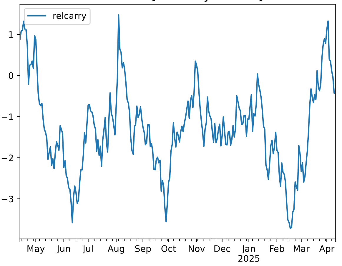
What a rogues gallery! It's quicker to list the rules that did make money or at least broke even:

- relative value skew
- relative carry
- fast relative momentum

This also explains, to an extent, why my performance isn't quite as bad as the industry; I would imagine that I have a little more allocation to this weird stuff than the typical CTA. The pure univariate momentum rules (breakout, momentum and normalised momentum) were especially bad. Even fast momentum has been crucified especially badly in the recent carnage, for obvious reasons.


Costs and slippage

I've already noted that my total slippage (diff between mid market price when I come to place an order, and where I get filled) was 0.56% of my starting capital; and commissions were 0.29%. That's an all in cost of 0.85% which is a little lower than what I usually pay; but as a % of my final capital it's 0.98%, the real number is somewhere around the 89bp - 93bp mark. Two years ago, the last time I checked I was paying 90bp of which 69bp was slippage and 21bp comissions. So slippage is down, commissions up slightly but net-net roughly similar.

Without my execution algo, if I had just traded at the market, I would have paid 1.53% in slippage; my simple algo earned 97bp and cut my slippage bill by two thirds. So that is a good thing.


Coming up

I'm not planning to do much with my futures system this year; I'm going to be busy writing a new book so let's see how it does going forward. Certainly feels like a bad year for trend following; unless or until the US economy gets tipped into recession and we get clear risk off markets. I think it unlikey we're going to get risk on until November 2028 or January 2029 :-) At least for the time being, it's not going great for me (-4% YTD), and it's going even worse for the industry generally.