I haven't posted much recently because I've been busy with other stuff, and I only post when I feel like I have something to say (the advantages of not having a paid for subscription service!). But I was compelled to post by this tweet:
CAPM doesn't work within asset classes, but it does do a decent job of explaining cross-asset class returns.https://t.co/y5beyDIh0j? pic.twitter.com/T7SDBkgoor
— Dan Rasmussen (@verdadcap) September 25, 2023
Which links to this article: https://mailchi.mp/verdadcap/asset-class-capm
... which in turn generated a fair amount of heat and light, since there are two key mistakes in the article and tweet. In truth these are a manifestation of a single mistake, which is a mis-definition of CAPM. CAPM remember says that there is only one risk factor, market risk, and excess security returns are equal to the covariance of security/market returns (Beta) multiplied by market returns. And excess returns are equal to the risk free rate.
But in the article they plot standard deviation versus mean, minus inflation. So they are confusing both inflation and the risk free rate, but also getting covariance and standard deviation mixed up. The latter error pointed out by several posters on twitter, although there is a mini argument suggesting that in the uber CAPM model with freely available leverage all securities should lie on the capital markets line, and hence have the same Sharpe Ratio, and hence all you need to do is plot excess return vs standard deviation (although again, excess return is versus the risk free rate NOT inflation!).
Anyway I thought it would be interesting to redo this plot, but correctly. After all it's an interesting topic that speaks to the benefits of diversification. TLDR: the original authors conclusion is correct (CAPM works across asset classes, but not within) even if their methods are badly flawed.
Data
I use monthly returns data pulled from my dataset of over 200 futures instruments, from which I annualise mean, standard deviation and Sharpe Ratios. As futures markets these are automatically excess returns. I have history back to 1970 for some markets, and the original plot only goes back to 1973, but for reasons that I will explain in a minute I will start my analysis in 1983. To define an asset class 'market' I start with a simple equal weighted index of all the futures that had returns in that month. Arguably I should use market cap weightings, but I don't have these to hand and in any case the results probably won't change much (since there are, eg, more US futures equity indices and the US is a big part of the global equity market). Note that this means due to diversification in theory the standard deviation of each market index will fall over time. I could correct for this, but it is not significant.
Another slightly weird thing about the original plot is that it actually splits out certain asset classes; which seems to rather undermine the argument; for example small and big equity markets, short and long term bonds (ST, LT), and different credit quality bonds.I don't have enough futures with enough history to do a split between small and big equity, nor do I have enough HY/IG bond futures to be confident the results would be meaningful, but I able to include a lot more markets and asset classes. So I have:
- Bonds (and at this stage I won't seperate these into ST/LT) - these are mostly government bonds (39 markets)
- Equities of all types (58)
- Metals (rather than just Gold in the original piece, 21)
- Energies (rather than just Oil, 20)
- Agricultural (38)
I don't include FX, since you can argue if it's really an asset class, and because it includes a mishmash of things that are bets for and against the dollar, emerging markets, and so on. And I don't include volatility, since this usually only has two markets in it (VIX and VSTOXX).
Equity indices are late to the futures trading party, and my data for these doesn't start until late 1982. So for strict comparability I remove everything before January 1983. Again, this doesn't affect the final results all that much.
Plotting Sharpe Ratio
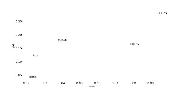
Let's first drop the incorrect definition of excess return, and plot excess mean versus standard deviation plots (to reiterate, as these are future the returns are automatically excess of the risk free rate). Note that means that everything on a straight line will have the same Sharpe Ratio.
        mean   std    sr
Ags     0.02  0.12  0.20
Bond    0.02  0.04  0.55
Equity  0.08  0.16  0.48
Metals  0.04  0.18  0.21
OilGas  0.09  0.28  0.34
Bringing in Beta
Having verified the original results after substituting the risk free rate for inflation, let's now bring in Beta. Under CAPM we'd expect that if we plotted excess mean against covariance rather than standard deviation, we'd again find a positive relationship. That should make assets with lower correlations look more attractive; that reminds me here's the correlation matrix:
        Ags  Bond  Equity  Metals  OilGas
Ags     1.00 -0.11    0.21    0.37    0.27
Bond   -0.11  1.00    0.09   -0.06   -0.14
Equity  0.21  0.09    1.00    0.26    0.12
Metals  0.37 -0.06    0.26    1.00    0.28
OilGas  0.27 -0.14    0.12    0.28    1.00
The problem of course is how to measure Beta, i.e. what is the 'market' that we are regressing our returns on. That's a hard enough problem when considering equities, but here we should really include every investable asset in the world, weighted by market cap back to 1983. I don't have those figures to hand!!
Instead I'm going to opt for another quick and dirty solution, namely to create a market index in the following proportions:
- Ags 10%
- Bonds 40%
- Equities 30%
- Metals 10%
- Oil and Gas 10%
This is based on some roughly true things; bonds and equities form most of the investable universe and there are more bonds issued than equities. And since most people are probably starting with a bonds/equities based portfolio, considering the diversification available versus something that is mostly that is probably a reasonable thing to do.
If you prefer you can do something else like risk parity (which would be about 50% bonds, with the other asset classes roughly splitting the rest), but it probably won't make that much difference.
This market index has a standard deviation of 7.4% a year, and a mean of 4.8%; it's SR of 0.64 as you would expect is superior to it's constituents.
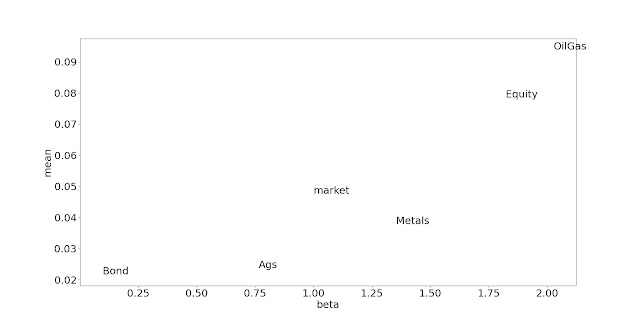
Let's have a look at the betas and alphas, also correlation with the market (corr), standard deviations and Sharpe Ratios:
          std   corr   beta     sr  alpha
Ags     0.119  0.471  0.765  0.199 -0.011
Bond    0.039  0.183  0.098  0.553  0.017
Equity  0.162  0.826  1.822  0.484 -0.008
Metals  0.176  0.566  1.353  0.215 -0.026
OilGas  0.277  0.541  2.027  0.338 -0.006
We can see that to an extent higher standard deviation also means higher beta, but not always; equities and metals have virtually the same standard deviation but equities have a higher beta because they are more correlated. There is also a weak relationship between alpha and SR.
Let's now redo the scatter plot but this time with Beta on the x-axis and adding the market portfolio:
Intra market
Now let us address the point in the post which is mentioned but briefly; the fact that CAPM doesn't work within asset classes. This is not a new finding. Indeed there is the mysterious result of Beta making an excellent counter signal ('Betting against Beta' Pedersen and Frazzini JFE 2014) at least in individual equities. It seems that lower Beta stocks have excess Alpha compared to higher Beta stocks; one story that explains that is that if Beta is synomonous with standard deviation (which as discussed, it ain't exactly), then we'd need higher leverage to hold low Beta stocks and not everyone can or wants to leverage to the hilt.
This is perhaps a more interesting study to do, since we could potentially use any positive result here as a trading signal; buying instruments within an asset class that have low Beta (or low standard deviation), and shorting those that are high Beta. Once again we run up against the definition of 'the market' in each asset class, but I will stick with the simple equal weighted across time version I have been using so far.
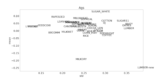
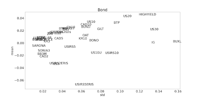
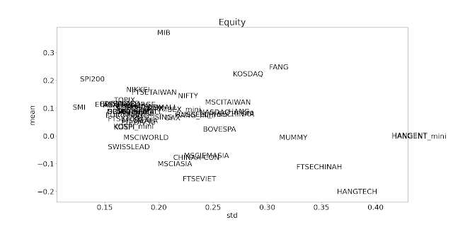
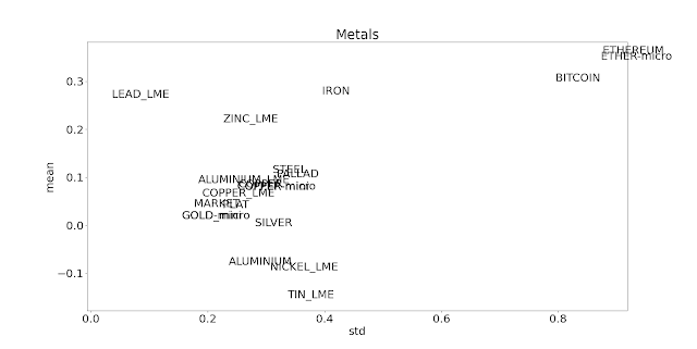
Here follows a blizzard (correct collective noun?) of plots. Firstly, here's excess mean against standard deviation (the original Sharpe Ratio plot):
With the possible exception of oil and gas, there isn't much to write home about here. It doesn't look like CAPM or Betting against Beta is particularly compelling within asset classes that contain futures.
