Few people are brave enough to put their entire net worth into a CTA fund or home grown trend following strategy (my fellow co-host on the TTU podcast, Jerry Parker, being an honorable exception with his 'Trend following plus nothing' portfolio allocation strategy). Most people have considerably less than 100% - and I include myself firmly in that category. And it's probably true that most people have less than the sort of optimal allocation that is recommended by portfolio optimisation engines.
Still it is a useful exercise to think about just how much we should allocate to trend following, at least in theory. The figure that comes out of such an exercise will serve as both a ceiling (you probably don't want any more than this), and a target (you should be aiming for this).
However any sort of portfolio optimisation based on historical returns is likely to be deeply flawed. I've covered the problems involved at length before, in particular in my second book and in this blogpost, but here's a quick recap:
- Standard portfolio optimisation techniques are not very robust
- We often assume normal distributions, but financial returns are famously abnormal
- There is uncertainty in the parameter estimates we make from the data
- Past returns distributions may be biased and unlikely to repeat in the future
As an example of the final effect, consider the historically strong performance of equities and bonds in a 60:40 style portfolio during my own lifetime, at least until 2022. Do we expect such a performance to be repeated? Given it was driven by a secular fall in inflation from high double digits, and a resulting fall in interest rates and equity discount rates, probably not.
Importantly, a regime change to lower bond and equity returns will have varying impact on a 60:40 long only portfolio (which will get hammered), a slow trend following strategy (which will suffer a little), and a fast trend following strategy (which will hardly be affected).
Consider also the second issue: non Gaussian return distributions. In particular equities have famously negative skew, whilst trend following - especially the speedier variation - is somewhat positive in this respect. Since skew affects optimal leverage, we can potentially 'eat' extra skew in the form of higher leverage and returns.
In conclusion then, some of the problems of portfolio optimisation are likely to be especially toxic when we're looking at blends of standard long only assets combined with trend following. In this post I'll consider some tricks methods we can use to alleviate these problems, and thus come up with a sensible suggestion for allocating to trend following.
If nothing else, this is a nice toy model for considering the issues we have when optimising, something I've written about at length eg here. So even if you don't care about this problem, you'll find some interesting ways to think about robust portfolio optimisation within.
Credit: This post was inspired by this tweet.
Some very messy code with hardcoding galore, is here.
The assets
Let's first consider the assets we have at our disposal. I'm going to make this a very simple setup so we can focus on what is important whilst still learning some interesting lessons. For reasons that will become apparent later, I'm limiting myself to 3 assets. We have to decide how much to allocate to each of the following three assets:
- A 60:40 long only portfolio of bonds and equities, represented by the US 10 year and S&P 500
- A slow/medium speed trend following strategy, trading the US 10 year and S&P 500 future with equal risk allocation, with a 12% equity-like annualised risk target. This is a combination of EWMAC crossovers: 32,128 and 64,256
- A relatively fast trend following strategy, trading the US 10 year and S&P 500 future with equal risk allocation, with a 12% annualised risk target. Again this is a combination of EWMAC crossovers: 8, 32 and 16,64
Now there is a lot to argue with here. I've already explained why I want to allocate seperately to fast and slow trend following; as it will highlight the effect of secular trends.
The reason for the relatively low standard deviation target is that I'm going to use a non risk adjusted measure of returns, and if I used a more typical CTA style risk (25%) it would produce results that are harder to interpret.
You may also ask why I don't have any commodities in my trend following fund. But what I find especially interesting here is the effect on correlations between these kinds of strategies when we adjust for long term secular trends. These correlations will be dampened if there are other instruments in the pot. The implication of this is that the allocation to a properly diversified trend following fund running futures across multiple asset classes will likely be higher than what is shown here.
Why 60:40? Rather than 60:40, I could directly try and work out the optimal allocation to a universe of bonds and equities seperately. But I'm taking this as exogenous, just to simplify things. Since I'm going to demean equity and bond returns in a similar way, this shouldn't affect their relative weightings.
50:50 risk weights on the mini trend following strategies is more defensible; again I'm using fixed weights here to make things easier and more interpretable. For what it's worth the allocation within trend following for an in sample backtest would be higher for bonds than for equities, and this is especially true for the faster trading strategy.
Ultimately three assets makes the problem both tractable and intuitive to solve, whilst giving us plenty of insight.
Characteristics of the underyling data
Note I am going to use futures data even for my 60:40, which means all the returns I'm using are excess returns.
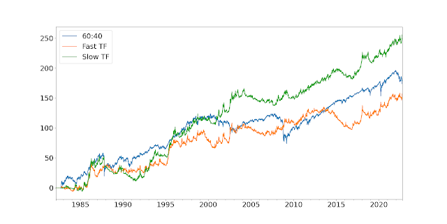
Let's start with a nice picture:
So the first thing to note is that the vol of the 60:40 is fairly low at around 12%; as you'd expect given it has a chunky allocation to bonds (vol ~6.4%). In particular, check out the beautifully smooth run from 2009 to 2022. The two trading strategies also come in around the 12% annualised vol mark, by design. In terms of Sharpe Ratio, the relative figures are 0.31 (fast trading strategy), 0.38 (long only) and 0.49 (slow trading strategy). However as I've already noted, the performance of the long only and slow strategies is likely to be flattered by the secular trends in equities and bonds seen since 1982 (when the backtest starts).
Correlations matter, so here they are:
         60:40  Fast TF  Slow TF
60:40     1.00    -0.02     0.25
Fast TF  -0.02     1.00     0.68
Slow TF   0.25     0.68     1.00
What about higher moments? The monthly skews are -1.44 (long only), 0.08 (slow) and 0.80 (fast). Finally what about the tails? I have a novel method for measuring these which I discuss in my
new book, but all you need to know is that a figure greater than one indicates a non-normal distribution. The lower tail ratios are 1.26 (fast), 1.35 (slow) and 2.04 (long only); whilst the uppers are 1.91 (fast), 1.74 (slow) and 1.53 (long only). In other words, the long only strategy has nastier skew and worst tails than the fast trading strategy, whilst the slow strategy comes somewhere in between.
Demeaning
To reiterate, again, the performance of the long only and slow strategies is likely to be flattered by the secular trends in equities and bonds, caused by valuation rerating in equities and falling interest rates in bonds.
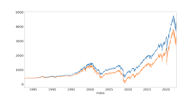
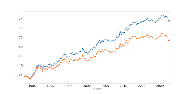
Lets take equities. The P/E ratio in September 1982 was around 9.0, versus 20.1 now. This equates to 2.0% a year in returns coming from the rerating of equities. Over the same period US 10 year bond yields have fallen from around 10.2% to 4.0% now, equating to around 1.2% a year in returns. I can do a simple demeaning to reduce the returns achieved by the appropriate amounts.
Here are the demeaned series with the original backadjusted prices. First S&P:
And for US10:
What effect does the demeaning have? It doesn't affect significantly standard deviations, skew, or tail ratios. But it does affect the Sharpe Ratio:
Original Demean Difference
Long only 0.38 0.24 -0.14
Slow TF 0.49 0.41 -0.08
Fast TF 0.31 0.25 -0.06
This is exactly what we would expect. The demeaning has a larger effect on the long only 60:40, and to a lesser extent the slower trend following.
And the correlation is also a little different:
         60:40  Fast TF  Slow TF
60:40     1.00    -0.06     0.18
Fast TF  -0.06     1.00     0.66
Slow TF   0.18     0.66     1.00
Both types of trend have become slightly less correlated with 60:40, which makes sense.
The optimisation
Any optimisation requires (a) a utility or fitness function that we are maximising, and (b) a method for finding the highest value of that function. In terms of (b) we should bear in mind the comments I made earlier about robustness, but let's first think about (a).
An important question here is whether we should be targeting a risk adjusted measure like Sharpe Ratio, and hence assuming leverage is freely available, which is what I normally do. But for an exercise like this a more appropriate utility function will target outright return and assume we can't access leverage. Hence our portfolio weights will need to sum to exactly 100% (we don't force this to allow for the possibility of holding cash; though this is unlikely).
It's more correct to use geometric return, also known as CAGR, rather than arithmetic mean since that is effectively the same as maximising the (log) final value of your portfolio (Kelly criteria). Using geometric mean also means that negative skew and high kurtosis strategies will be punished, as will excessive standard deviation. By assuming a CAGR maximiser, I don't need to worry about the efficient frontier, I can maximise for a single point. It's for this reason that I've created TF strategies with similar vol to 60:40.
I'll deal with uncertainty by using a resampling technique. Basically, I randomly sample with replacement from the joint distribution of daily returns for the three assets I'm optimising for, to create a new set of account curves (this will preserve correlations, but not autocorrelations. This would be problematic if I was using drawdown statistics, but I'm not). For a given set of instrument weights, I then measure the utility statistic (CAGR) for the resampled returns. I repeat this exercise a few times, and then I end up with a distribution of CAGR for a given set of weights. This allows us to take into account the effect of uncertainty.
Finally we have the choice of optimisation technique. Given we have just three weights to play with, and only two degrees of freedom, it doesn't seem too heroic to use a simple grid search. So let's do that.
Some pretty pictures
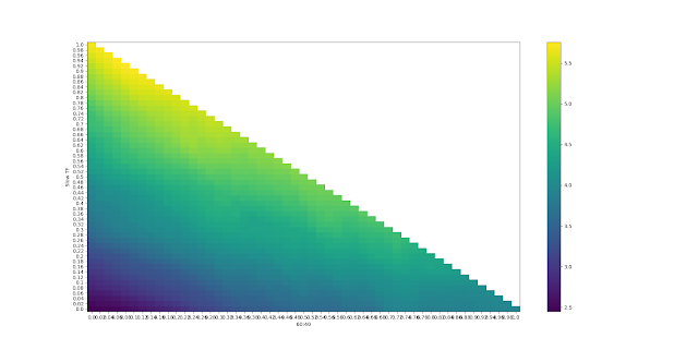
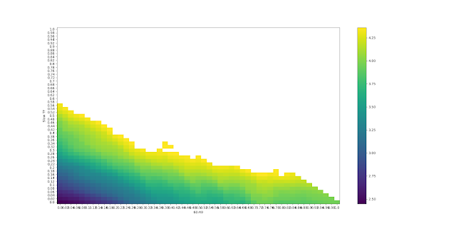
Because we only have two degrees of freedom, we can plot the results on a 2-d heatmap. Here's the results for the median CAGR, with the original set of returns before demeaning:
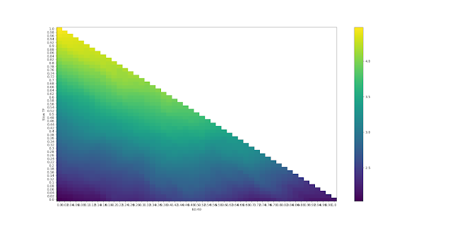
Sorry for the illegible labels - you might have to click on the plots to see them. The colour shown reflects the CAGR. The x-axis is the weight for the long only 60:40 portfolio, and the y-axis for slow trend following. The weight to fast trend following will be whatever is left over. The top diagonal isn't populated since that would require weights greater than 1; the diagonal line from top left to bottom right is where there is zero weight to fast trend following; top left is 100% slow TF and bottom right is 100% long only.
Ignoring uncertainty then, the optimal weight (brightest yellow) is 94% in slow TF and 6% in long only. More than most people have! However note that there is a fairly large range of yellow CAGR that are quite similar.
The 30% quantile estimate for the optimal weights is a CAGR of 4.36, and for the 70% quantile it's 6.61. Let's say we'd be indifferent between any weights whose median CAGR falls in that range (in practice then, anything whose median CAGR is greater than 4.36). If I replace everything that is statistically indistinguishable from the maximum with white space, and redo the heatmap I get this:
This means that, for example, a weight of 30% in long only, 34% in slow trend following, and 36% in fast trend following; is just inside the whitespace and thus is statistically indistinguishable from the optimal set of weights. Perhaps of more interest, the maximum weight we can have to long only and still remain within this region (at the bottom left, just before the diagonal line reappears) is about 80%.
Implication: We should have at least 20% in trend following.
If I had to choose an optimal weight, I'd go for the centroid of the convex hull of the whitespace. I can't be bothered to code that up, but by eye it's at roughly 40% 60/40, 50% slow TF, 10% fast TF.
Now let's repeat this exercise with the secular trends removed from the data.
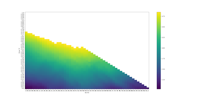
The plot is similar, but notice that the top left has got much better than the bottom right; we should have a lower weight to 60:40 than in the past. In fact the optimal is 100% in slow trend following; zilch, nil, zero, nada in both fast TF and 60:40.
But let's repeat the whitespace exercise to see how robust this result is:
The whitespace region is much smaller than before, and is heavily biased towards the top left. Valid portfolio weights that are indistinguishable from the maximum include 45% in 60:40 and 55% in slow TF (and
45% is the most you should have in 60:40 whilst remaining in this region). We've seen a shift away from long only (which we'd expect), but interestingly no shift towards fast TF, which we might have expected as it is less affected by demeaning.
The optimal (centroid, convex hull, yada yada...) is somewhere around 20% 60:40, 75% slow TF and 5% in fast TF.
Summary: practical implications
This has been a highly stylised exercise, deliberately designed to shine a light on some interesting facts and show you some interesting ways to visualise the uncertainty in portfolio optimisation. You've hopefully seen how we need to consider uncertainty in optimisation, and I've shown you a nice intuitive way to produce robust weights.
The bottom line then is that a robust set of allocations would be something like 40% 60/40, 50% slow TF, 10% fast TF; but with a maximum allocation to 60/40 of about 80%. If we use data that has had past secular trends removed, we're looking at an even higher allocation to TF, with the maximum 60/40 allocation reducing considerably, to around 45%.
Importantly, this has of course been an entirely in sample exercise. Although we've made an effort to make things more realistic by demeaning, much of the results depend on the finding that slow TF has a higher SR than 60:40, an advantage that is increased by demeaning. Correcting for this would result in a higher weight to 60:40, but also to fast TF.
Of course if we make this exercise more realistic, it will change these results:
- Improving 60:40 equities- Introducing non US assets, and allocating to individual equities
- Improving 60:40 bonds - including more of the term structure, inflation and corporate bonds,
- Improving 60:40 by including other non TF alternatives
- Improving the CTA offering - introducing a wider set of instruments across asset classes (there would also be a modest benefit from widening beyond a single type of trading rule)
- Adding fees to the CTA offering
I'd expect the net effect of these changes to result in a higher weight to TF, as the diversification benefits in going from two instruments to say 100 is considerable; and far outweights the effect of fees and improved diversification in the long only space.
huh, that's a great way to approach the question! Definitely a different result than I expected.
ReplyDeleteMy naive expectations would be 1) minimal correlation (which you found w/ 60/40 long only & long term trend), 2) similar means. So I'd maximize Sharpe by doing a 50/50 risk allocation to minimize overall volatility (w/ equal volatility targets, I guess that's 50/50 risk or cash).
I guess I can interpret the results here as a sign of long term trend just having a notably superior Sharpe than long only 60/40 in your data sample?