Another brief post this month; the deadline for the first draft of my latest book is only a couple of months away and I haven't got much free time! But I was asked an excellent question on twitter recently, which was how the various types of trading rule have contributed to my p&l this year.
TLDR: divergent eg momentum good, skew brilliant, other convergent rules poor.
In fact with my new dynamic optimisation strategy it's actually quite hard to answer that question. For example, it's plausible that I could have made all my money in one particular trading rule in a group of instruments that I don't ever take a position in. Instead, I can tell you what would have been contributed had I been trading a static portfolio without any contract rounding issues. This should be a pretty decent proxy, although generally it will over estimate what I have actually been able to achieve with my relatively modest capital.
[To get technical, it would be impossible to do this100% accurately for a static strategy unless it had (1) very large capital and (2) no buffering or other path dependency in positions]
An important question is whether we look at this performance on a weighted or unweighted basis. Weighted performance for a trading rule is basically the contribution of that performance to our aggregate p&l. The disadvantage of looking at this, is that rules with small forecast weights will be hard to see.
I have a lot of trading rules! Plotting them all in one go would be (a) messy and (b) kill my computer. Instead I set up sub-strategies, each with a subset of my trading rules, and then plotted the performance of (i) the entire account curve for that subset (which effectively weights the rules within that subset according to the forecast weights for each instrument) - these are the thick black lines, and (ii) the individual trading rules in that subset at the same risk - i.e. unweighted - this allows us to see their performance more clearly.
I've also chucked in some Sharpe ratio figures for the total (in the title of each chart) and for each rule variation (in the legend). Sharpes are a bit wild for just year to date, but there you go. Naturally, everything here is after costs. Finally, note that this data goes up to to the 4th April, so misses some poor performance over the last couple of days (I'm writing this on 10th May).
Anyway enough chat, here's some pictures. First of all, let's look at the year to date.
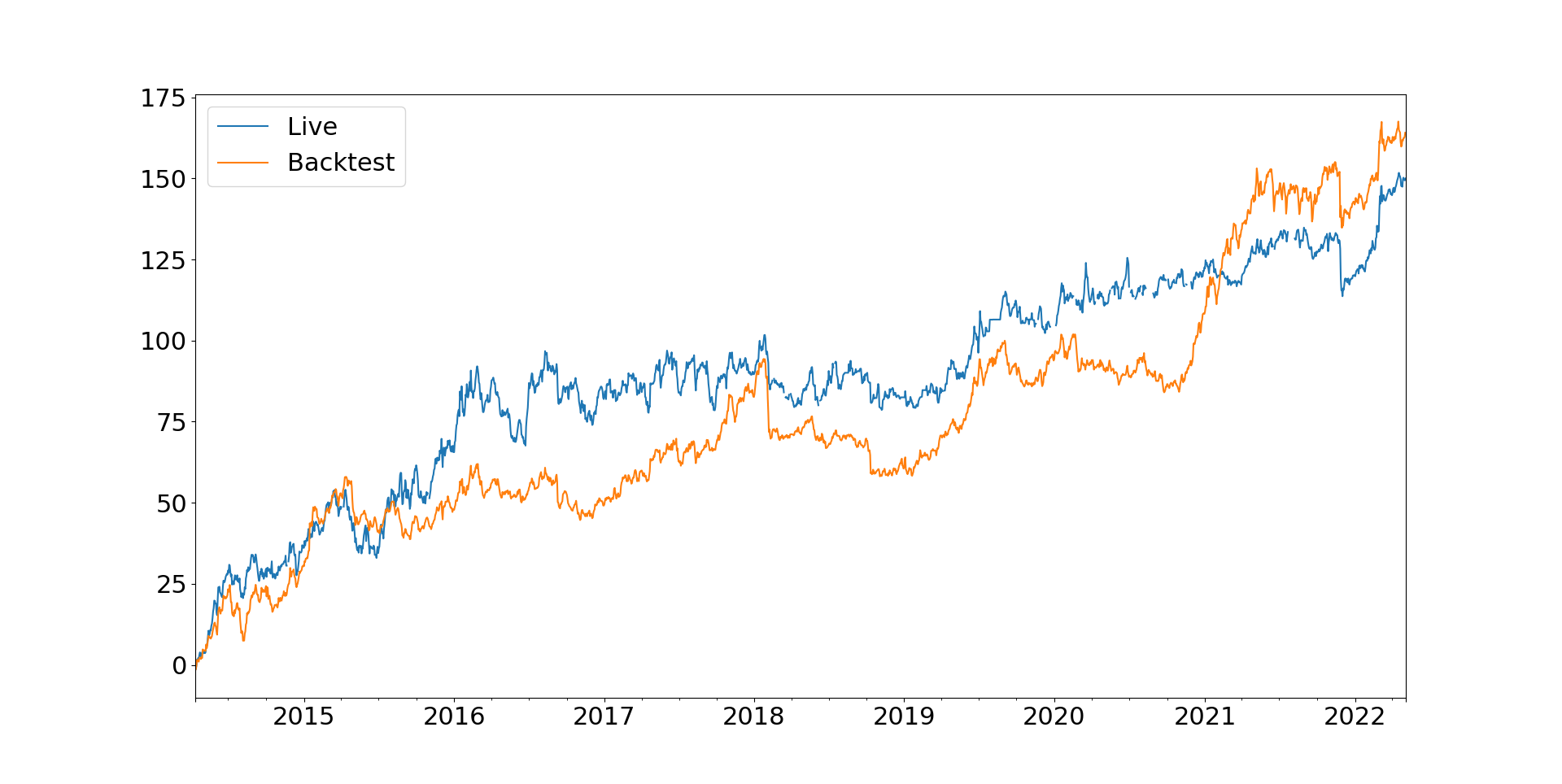
Here's my backtested performance YTD after dynamic optimisation, plus my actual performance. It's reasonably meaningful to do this, since I've run with the same strategy since November.

Looks like I got lucky with executions when the market turned against me in early March.
Now for the figures for each trading rule.
Acceleration:

Asset trend:

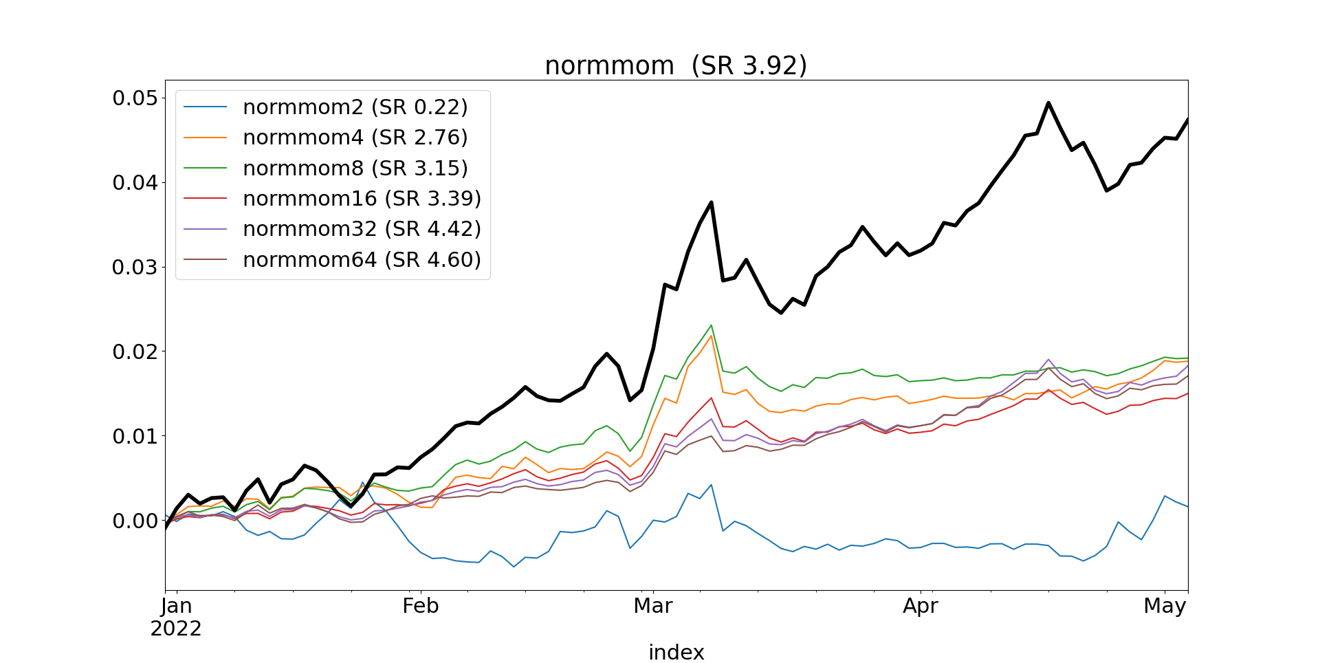
Normalised momentum:
Momentum (EWMAC):


Relative momentum

With the exception of relative momentum, all very good, but also all very similar so not much diversification there.

Relative carry (only one rule variation)

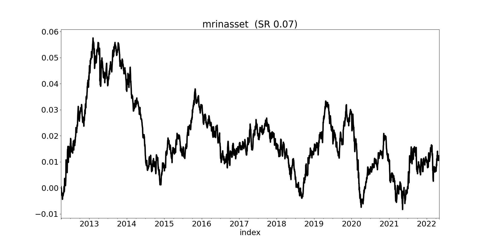
Mean reversion in asset class

Mean reversion in the wings

Skew (absolute):

Skew(relative)

Not such a good performance, apart from skew which was flipping amazing.
So year to date, very much driven by the 'divergent' trading rules.
Out of curiosity, what does live vs backtest look like since I started trading (April 2014)? Remember that prior to November 2021 I was using a rather different strategy, so they are unlikely to match precisely before that date:
Now, as we have the data, let's look at the performance by trading rule group for some other time periods.
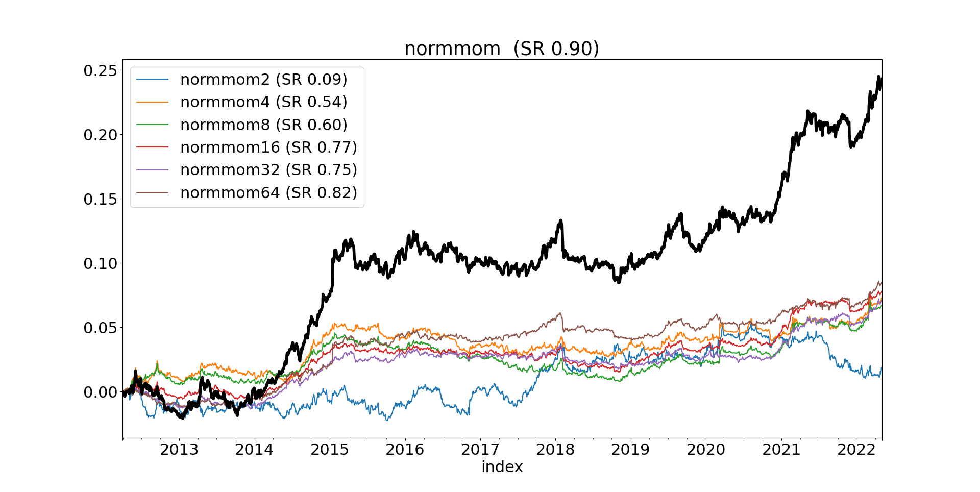
Last 10 years:


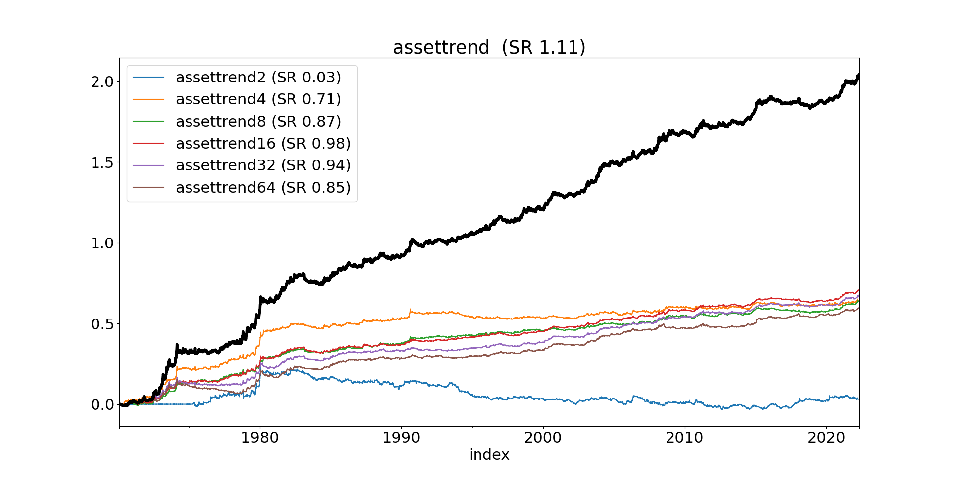
And now for the entire back test


It would be useful for new readers if you could post a link to code (or a prior post) where you describe these predictors
ReplyDeleteA very recent post https://qoppac.blogspot.com/2021/12/my-trading-system.html
DeleteHi Rob,I have a question.Is it better to use VWAP as daily price in forecast and volatility calculation,instead of daily close price(assume we have intraday data)?It seems VWAP is less noisy,but I am not sure the effect.
ReplyDeleteThanks for your great work again,your book really help me much.
Why do you want a less noisy measure
DeleteAm I correct to assume that pre-1980 (even pre-1990) consists of very few instruments? It's hard to judge the backtest without knowing how many instruments there were at any particular point in the past.
ReplyDeleteBTW I spotted a mistake - the 10 year "skewabs" chart is actually entire backtest chart.
1970's 17 instruments, 1980's 27 instruments, 1990'2 36 instruments, 2000's 57 instruments, Entire backtest 102 instruments. That's just the instruments I actually trade, there are another 40 or so which I calculate forecasts for but aren't liquid or cheap enough.
DeleteWhat happened to carry in late 1970s? It has that dip that stands out from the rest of the picture. Without looking under the hood I guess it was positioned against the trends and there were some really massive trends during that time.
DeleteThere is more on this in my new book (currently being written) but it's worth noting that carry does worse on Agricultural markets and in the 1970's half the portfolio was Ags.
Delete