Thursday, 7 May 2020

When endogenous risk management isn't enough: a simple risk overlay

"How does your risk management work?"

... is a question I'm frequently asked.

In fact this is actually a difficult question, if you were to look at my open source python backtesting project pysystemtrade, you would struggle to point at a piece of code and say "Behold! Right there, that's the risk management part alright!". The reason is that the risk management in my trading system is endogenous (from the greek, meaning 'word used to mean internally or inside by people trying to sound clever'). Risk management is something it just does without even trying.

For example, if volatility rises, then positions will be cut. If it starts to lose money on a particular position, the position will be cut. If the amount of capital deployed reduces, the position will be cut. Many of these things look like deliberate risk management, or perhaps the term 'position management' is more appropriate. But they are just a consequence of the simple building blocks that the system is built upon: inverse vol position scaling, a preponderance of trend following rules, and liberal use of the Kelly criterion.

However, these simple building blocks make some heroic assumptions. In particular they assume that asset returns follow a joint Gaussian return distribution, where co-movements are linear, and both volatility and correlations are perfectly predictable from historic data. The system also does it's risk management on a long run average basis:

The consequences of this are, to use technical language for a moment: sometimes things could get a bit scary. This post explains how, and introduces a simple risk overlay to make things slightly less scary. Essentially this overlay sits slightly outside the main system (although it runs as part of the same code base), tweaking positions when certain risk limits are hit.

This is an overlay I have already implemented in my existing trading system, so it's worked well for over  6 years. Although this new code is designed for pysystemtrade I will make the python code as stand-alone as possible so you can adapt it for your own use if you wish. It will work equally well in other trading systems, although it will be most useful in a system that works more like mine.

This is a continuation of a series I started a few years ago, but only got around to writing a couple of posts for. In the spirit of tidiness, here are the first two posts:


You don't have to read the first two posts to understand this one, but it might help especially if you don't understand exactly what I mean by edogenous risk management.

Parts of this post will be easier to follow if you've read my first book, Systematic Trading.


Realised risk


Let's start by measuring the actual risk we realised. This should average 25%, or whatever is defined in system.config.percentage_vol_target

(I have grabbed a backtest to do this which essentially reflects my live system with a subset of instruments, but you can play along with a different pysystemtrade backtest if you wish, or any series of daily returns you happen to have).

# assuming we already have a pysystemtrade system object...
returns = system.accounts.portfolio().as_percent()
returns = returns[pd.datetime(1997,1,1):]
annualised_std = returns.std()*16


(I'm only showing data since 1997, because I'm in the process of cleaning up my price data which still has a few spikes in it that aren't real.)

The average standard deviation comes out at 23.7% which is a fraction below the target of 25%, but more importantly how does this vary over time? Let's plot the daily returns:


With 23.8% annual risk, which equates to around 1.5% a day, we'd expect to see around two thirds (68%) of our returns coming in at between -1.5% and +1.5% (If our mean was zero. The mean is 0.08%, so the returns will come in between -1.42% and 1.58%, which isn't very different). 

To see more clearly, let's look at the rolling standard deviation of returns over the last 125 business days (about 6 months), and multiply by 16 to annualise:

roll_std_returns = returns.rolling(125).std()*16


You can see clearly that the 6 month rolling risk is highly variable, dipping down to 10% at some points, and up above 40% in the halcoyn days of the early 2000's.

There are two explanations for this:
  1. We are very bad at predicting our risk
  2. We are allowing our expected risk to vary a lot
... or perhaps a little bit of both.


Expected risk


It's very easy to check if our expected risk should vary a lot, by measuring our expected risk (assuming, naturally, a joint Gaussian risk model).

The code for this is a bit lengthy, so rather than cut and paste I've dropped into it's own little gist. The tricky part is converting everything into notional exposure as a percentage of capital, which allows us to use percentage returns. Incidentally, I use a 30 day span for standard deviations, and 120 days for correlations. These give a fairly good estimate, but using different values won't make a huge difference.

risk_series = get_expected_risk_for_system(system)


OK, so our expected risk is expected to vary (and I will explain why below). Another way of thinking about the problem is to see how well we did at matching expected and realised risk (basically, how good is our simple Gaussian normal risk model at forecasting risk). The plot below shows the realised returns, with one and two standard deviation bands from the expected risk distribution (ignoring the tiny mean).

threshold=pd.concat([risk_series*100/16.0, -risk_series*100/16.0],axis=1)
thresh_and_returns = pd.concat([returns, threshold], axis=1)
thresh_and_returns.columns = ['returns', '+1std','-1std']


We should see about two thirds of the returns fall within the bands, and indeed they do. Also, the bands should expand when the returns do. This happens eg in 2004. The risk model isn't perfect, because there are a few large outliers that we wouldn't expect to get with Gaussian normal returns (though some of these may be due to bad data). But it's doing a reasonable job of forecasting future risk.

Mostly our actual risk is varying because our expected risk is varying. So let's find out why.


Why does expected risk vary?


It is worth briefly revisting the calculations used to work out a position size. The position measured as a percentage of capital is a product of a lot of different numbers, but it simplifies to this:

position as % of capital = (instrument forecast / average instrument forecast)* (target risk / instrument risk) * instrument weight * IDM

Where the IDM (Instrument Diversification Multiplier) is the factor applied to positions to account for the correlation between trading subsystems (i.e. the trading strategies we run for each instrument and the returns they product, not the underlying instrument returns)

And the portfolio risk calculation is wSw', where w are the weights (basically position as % of capital) and S is the covariance matrix composed of instrument standard deviations and the correlation between instrument returns (different from that used for IDM).

In a very handwaving way, it can be shown that the current expected portfolio risk will then be equal to:

Expected risk = target risk * (relative forecast strength) * (relative correlation factor)

Relative forecast strength is a measure of how strong forecasts are relative to the average; it is equal to the forecasts for each instrument, weighted by instrument weight and divided by the average forecast (set to 10 in pysystemtrade).


All other things being equal, if your forecasts are all +20, and the average is +10, then your expected portfolio risk would be twice the average risk, or roughly twice the target risk (50% in the example I've been using).

Importantly, we want risk to vary according to forecast strength. Otherwise we'd have exactly the same risk on even if our forecasts were all +0.001, as if they were +20 (the maximum allowed under forecast capping).

(There is a school of thought that says that we want risk to remain fixed, which is how a lot of long:short hedge funds construct portfolios, but that is another blog post)

The relative correlation factor (RCF) is a bit more complicated. It is equal to the ratio between the IDM (which accounts for the average correlation across subsystem returns), and the IDM that would be appropriate given the current set of positions and current correlation between instrument returns.

So for example, if you normally trade two subsystems (say US 10 year and S&P 500) with corelation between subsystems of zero then your IDM will be equal to square root of 2: 1.414

Now imagine that for some reason your system has a long average sized position in US 10 years, and a short average sized position in S&P 500 futures, and also that the correlation between these two instruments is -1. A quick calculation shows that the expected risk here will be 2.82 times the average. If the correlation was zero, then the expected risk would be twice the average; and if the correlation was +1 then the expected risk would be zero. The relevant RCF would be 2.82/1.41, 2/1.41, and zero.

Similarly if the current position was long an average sized position in both instruments, then with a correlation of +1 the risk would be 2.8 times the average, with a correlation of zero it would be twice, and again with a correlation of -1 it would be zero. The relevant RCF again are 2.82/1.41, 2/1.41 and 0. Notice the symmetry here - we'll use this result later.

Clearly the RCF can vary quite a lot depending on what the current positions are, and the current correlation matrix. You might argue that positions and correlations of this kind are unlikely given the average correlation between subsystems is zero. They are unlikely, but they aren't impossible. In particular, correlations do vary especially in the kind of crisis we've just seen.

The RCF is more of an annoyance in terms of expected risk; we wouldn't neccessarily want our risk to be a lot higher just because the positions we happen to have on are especially toxic given todays correlation factor.

Let's plot the relative forecast strength against our expected risk to see if we can decompose how much of our risk is coming from these two components: relative forecast (which we like!), and relative correlation (which we don't like!).


def forecast__strength_for_system(system):
    list_of_instruments = system.get_instrument_list()
    forecasts = [system.combForecast.get_combined_forecast(instrument_code) 
              for instrument_code in
                list_of_instruments]
    forecasts = pd.concat(forecasts, axis=1)
    forecasts.columns = list_of_instruments
    forecasts = forecasts / system.config.average_absolute_forecast
    instrument_weights = system.portfolio.get_instrument_weights()

    weighted_forecast = instrument_weights.ffill() * forecasts.abs().ffill()
    forecast_strength = weighted_forecast.sum(axis=1)

    return forecast_strength

risk_vs_average = 100*risk_series / system.config.percentage_vol_target
forecast_strength = forecast__strength_for_system(system)

to_plot = pd.concat([risk_vs_average, forecast_strength], axis=1)
to_plot.columns = ['Expected risk', 'Forecast strength']


(I've put everything in terms relative to it's expected long average so we can plot them together)

So expected risk does indeed follow forecast strength pretty well. For example, in late 2018:


... forecast strength goes up, and expected risk follows it. However this isn't always the case. Strikingly, in the past couple of months expected risk has exploded while forecast strength has been falling. This is because the relative correlation factor has increased dramatically, most likely as correlations have got really weird in the current crisis.


Overview of the risk overlay


Now we have a better understanding of what is driving our expected risk, it's time to introduce the risk overlay. The risk overlay calculates a risk position multiplier, which is between 0 and 1. When this multiplier is one we make no changes to the positions calculated by our system. If it was 0.5, then we'd reduce our positions by half. And so on.

So the overlay acts across the entire portfolio, reducing risk proportionally on all positions at the same time. 

The risk overlay has three components, designed to deal with the following issues:

- Expected risk that is too high
- Weird correlation shocks combined with extreme positions
- Jumpy volatility (non stationary and non Gaussian vol)

Each component calculates it's own risk multipler, and then we take the lowest (most conservative) value.

That's it. I could easily make this a lot more complicated, but I wanted to keep the overlay pretty simple. It's also easy to apply this overlay to other strategies, as long as you know your portfolio weights and can estimate a covariance matrix (I'm assuming anyone who has read this far can do both of those things, or knows a person that can). You don't need the same concept of a 'forecast' for example, since forecast calculations don't enter into these.

Let's dive into the individual components.


Maximum expected risk


This component assumes that Guassian risk is a good enough model for expected risk, and it also assumes that we don't want too much of it. Specifically the risk multiplier looks like this:

risk multiplier = min(1, 2*target risk / current expected risk)

So if the current expected risk is more than twice the long run target, we'll start reducing our positions. The choice of '2' is arbitrary, and down to personal preference. However, since the combined forecast for an instrument is limited to 2.0, allowing the expected risk to be double the average seems to make sense.

From the discussion above, we'll be doing that if (a) we have very strong relative forecasts, or (b) the current correlation factor is particularly nasty. I could have made this more complex to specifically target the correlation factor, but this is simple enough to understand and explain, and works nicely on any kind of strategy with a long run risk target but varying expected risk.

How often will this kick in? We've already calculated expected risk vs target earlier:

risk_vs_average = 100*risk_series / system.config.percentage_vol_target


So now plotting the series:


There are a few times when risk goes over 2, including in recent weeks. Here is the risk multiplier:

risk_multiplier = 2/risk_vs_average
risk_multiplier[risk_multiplier>1.0]=1.0


Notice the sharp drop at the end, when expected risk balloons in the COVID-19 crisis.


Correlation risk


The maximum expected risk measure assumes that Gaussian risk is sufficient, and that we can forecast it's components (correlation, and standard deviation). Now let's relax that assumption. Correlation risk is the risk that instrument correlations will do scary unusual things, that happen to be bad for my position. If this has already happened (i.e. we have a correlation factor problem) then it will be dealt with in the expected risk calculation, that uses recent historic returns to calculate the instrument correlation. But what if it is about to happen?

There is a very simple way of dealing with this, which is that we replace the estimated correlation matrix with the worst possible correlation matrix. Then we re-estimate our expected risk, and plug it into a risk multiplier formula. Because we're shocking the correlations to the extreme, we allow expected risk to be 4 times larger than our target.

(There is no justification for this number 4, it's calibrated to target a particular point on the realised distribution of the estimate of relative risk. I talk a bit about calibration at the end of the post)

Specifically the risk multiplier looks like this:

risk multiplier = min(1, 4*target risk / current expected risk with worst possible correlation)

What is the worst possible correlation matrix? Simply, it's a matrix where all the correlations are 1. But that's only bad if all of our positions are long, right? If we had offsetting long/short positions, it would help us. You're right, which is why we also use the absolute weights when calculating the expected risk, not the normal signed weights. Note that a correlation of 1 if your weights are all long is equivalent to a correlation of -1 if your weights were long/short (we already saw this in the calculations above).

Here's a horribly hacky way (ugly! slow!) to calculate this risk multiplier (there is a better implementation in pysystemtrade, of which more later). In the gist above replace this function with this code:


def calc_risk_for_date(rolling_corr, rolling_std, index_date, value_of_positions_proportion_capital, list_of_instruments):
    std_dev = rolling_std.loc[index_date].values
    std_dev[np.isnan(std_dev)] = 0.0
    ## Use absolute weights rather than signed    
    weights = value_of_positions_proportion_capital.abs().loc[index_date].values
    weights[np.isnan(weights)]=0.0    
    cmatrix = get_corr_matrix_for_date(rolling_corr, index_date, list_of_instruments)
    # replace correlation matrix with zeros
    # yeah this is ugly and slow, but makes the point clearer    cmatrix[:] = 1.0
    sigma = sigma_from_corr_and_std(std_dev, cmatrix)

    portfolio_variance = weights.dot(sigma).dot(weights.transpose())
    portfolio_std = portfolio_variance**.5
    annualised_portfolio_std = portfolio_std*16.0
    return annualised_portfolio_std

Then we just recalculate everything: expected risk, and expected vs average:

risk_series_for_correlation = get_expected_risk_for_system(system)
risk_vs_average_for_correlation = 100*risk_series_for_correlation / system.config.percentage_vol_target

Let's plot it


Now for the risk multiplier:
risk_multiplier_for_correlation = 4/risk_vs_average_for_correlation
risk_multiplier_for_correlation[risk_multiplier_for_correlation>1.0]=1.0

This is a bit more active than the expected risk filter. Interestingly, it also shows a recent application in March 2020.

Incidentally, because of the way the system scaling works this is effectively the following constraint:

IDM*sqrt[Sum_i( k_i^2) + 2*abs(k_1*k_2*k_3... )] <=4

Where k_i = [instrument weight * forecast / average forecast] for instrument i


Proof of the above result, well for 2 assets anyway. Feel free to do this properly with matrices and stuff.

So it will only go into effect when we have a lot of large forecasts kicking off at the same time. No other inputs are relevant.


Standard deviation risk


Now let's deal with standard deviation risk. Specifically, we're concerned with a situation where we're estimating a standard deviation that is relatively low, but there's a good chance it will get a lot higher. This could be because risk is Gaussian, but varies, or because risk is non Guassian. We don't care what the cause is (and in fact it's impossible to distinguish these two explanations). We just want to deal with it.

To do this we use our standard estimate of portfolio risk, but replace our standard deviation estimates with '99vol'. This rather catchily named value* is the 99th percentile of the standard deviation estimate distribution, measured over the last 10 years. It's the standard deviation we'll get 1% of the time.

* "I've got 99 problems, but vol ain't one of them..." Sorry couldn't resist.

(Incidentally, if current vol is above the 99% point I still use the 99% point in this calculation.  In this case expected risk is likely to be very high anyway)

Once the new risk estimate has been calculated, I apply a multiplier if this comes out more than 6 times the target risk (again, no deep underlying logic for this, just a calibration)

Specifically the risk multiplier looks like this:

risk multiplier = min(1, 6*target risk / current expected risk with 99vol)


Note: Relationship to VAR. Yes, this is a bit like a 99% VAR. I prefer not to use VAR, since it confounds standard deviations and correlations.

Here's the hacky way of calculating it. Using the original gist (without the hacked function above) add one line to this other function:


def get_expected_risk_for_system(system):

    value_of_positions_proportion_capital = get_positions_as_proportion_of_capital(system)

    instrument_returns = get_instrument_returns(system)
    instrument_returns = instrument_returns.ffill().reindex(value_of_positions_proportion_capital.index)

    rolling_std = instrument_returns.ewm(span=30).std()
    rolling_corr = instrument_returns.ewm(span=120).corr()

    # new line    rolling_std = rolling_std.ffill().rolling(2500, min_periods=10).quantile(.99)

    list_of_instruments = system.get_instrument_list()
    expected_risk = calc_expected_risk_over_time(rolling_corr, rolling_std, value_of_positions_proportion_capital,
                                                 list_of_instruments)

    return expected_risk

New risk series:
risk_series_stdev = get_expected_risk_for_system(system)
risk_vs_average_for_stdev = 100*risk_series_stdev / system.config.percentage_vol_target


And the risk multiplier:

risk_multiplier_for_stdev = 6/risk_vs_average_for_stdev
risk_multiplier_for_stdev[risk_multiplier_for_stdev>1.0]=1.0

Putting them together


all_mult = pd.concat([risk_multiplier_for_stdev, risk_multiplier, risk_multiplier_for_correlation], axis=1)
joint_mult = all_mult.min(axis=1)


That's the most conservative multiplier, going back to 1997. 

The results aren't too dramatic: they shouldn't be. This is a risk overlay, to deal with corner cases and potential black swans. The vast bulk of the risk management load is being carried by the core system.


Pysystemtrade implementation


Now to implement the overlay into pysystemtrade. First of all we need some configuration options: as they'd appear in your .yaml file. Here are the defaults:

risk_overlay:
  max_risk_fraction_normal_risk: 2.0
  max_risk_fraction_correlation_risk: 4.0
  max_risk_fraction_stdev_risk: 6.0


Next you need to override the portfolio stage class with an inherited class which includes risk scaling:


## run inside pysstemtraderimport matplotlib
matplotlib.use("TkAgg")
from systems.provided.futures_chapter15.basesystem import *

## use your own config here
config = Config(
            "private.legacy_system.legacy_config_all_markets.yaml")

from systems.futures.risk_overlay import portfoliosRiskOverlay

data = csvFuturesSimData()

system = System([
    Account(), portfoliosRiskOverlay(), PositionSizing(), FuturesRawData(),
    ForecastCombine(), ForecastScaleCap(), Rules()
], data, config)
system.set_logging_level("on")

There are various new methods in the portfolio stage, such as:

system.portfolio.get_risk_multiplier()

Incidentally for efficiency the calculations work a bit different in pysystemtrade; I use weekly returns for correlations, and I only calculate a covariance matrix on a monthly basis (though I do use todays position weights, so the risk multiplier is calculated on a daily basis).


A quick test


I ran a backtest with, and without, the risk overlay to see what it looks like. Firstly here's the whole account curve:

The blue line is with the overlay, the orange line is without. This isn't unexpected; the overlay can only ever reduce risk, and so it will make less in returns unless it is lucky enough to do so only when the system is losing money. Broadly speaking the risk overlay knocks about 3% anually off both the returns and the risk.

The Sharpe Ratios are pretty close though: 0.940 with the overlay and 0.956 with it. More interestingly the overlay reduces the positive skew of the system somewhat (and this holds at all frequencies- read this to see why that's important). One argument for not applying any kind of risk control to trend following is that we lose the positive skew (see here for a relevant discussion).

The kurtosis does fall however, suggesting we are doing a good job of 'tidying up the tails'. Other measures of 'left tailedness', like the 1% quantile point are also improved. Drawdowns are a litle shallower.

If the performance penalty is too great then you can change the calibration of the risk overlay. Try not to tweak these for performance though, that is implicit fitting. Instead target something like:


  • a distributional point on the turnout of the estimated risk relative to the target risk (eg 95% point),
  •  the time you want the filter switched on for on average (eg 1% of the time),
  • the average value of the risk multiplier including when it is switched off (eg 0.99),
  •  or a minimum correlation between the system with and without the overlay (eg 0.98)


Summary


This has been an interesting journey which has hopefully given some more intuition about how the risk in CTA type strategies works. I've also introduced a simple risk overlay that can be used in a number of different strategies.

As usual questions are welcome in the comment box below.


POSTSCRIPT: We can use the maximum risk constraint above to target a fixed risk, i.e. aiming for the same ex-ante risk every day. I explore that idea in this post.


Tuesday, 14 April 2020

Trading and investing performance - year six

Time for the annual review post, as my reviews follow the UK tax year which ended on the 5th April. And what a year it has been; well 10 months or so of fairly normal stuff, followed by several weeks of stomach churning market chaos.

Previous updates can be found herehereherehere and here.

This post will follow the format of previous posts, but there will be some extra stuff related to the more recent market action in which I'll talk in some detail about what I did to handle this, and why.


Overview of my world


My investments fall into the following categories:


  • In my investment accounts:
    • 1 UK stocks
    • 2 Various ETFs, covering stocks, bonds, gold and property
    • 3 Usually some uninvested cash
  • In my trading account:
    • 4 Various ETFs, covering stocks and bonds
    • 5 A futures contract hedge against those long only ETFs in 2.1, so that the net Beta is around zero
    • 6 Futures contracts traded by my fully automated trading system
    • 7 Cash needed for futures margin, and to cover potential trading losses (there is also some cash in my investment accounts, but it's pretty much a rounding error)

Excluded from this analysis is:

  • Net property equity - my house
  • My 'cash float', roughly 6 months of household expenditure that is kept separately from my investment and trading accounts. 

For the purposes of benchmarking it makes most sense to lump my investments in the following way:


  • A: UK single stocks
    • Benchmarked against ISF, a cheap FTSE 100 ETF (FTSE 350 is probably a better benchmark but these ETFs tend to be more expensive).
  • B: Long only investments: All ETFs (in both investment and trading accounts) and UK stocks
    • Benchmarked against a cheap 60:40 fund. This is the type of top down asset allocation portfolio I deal with in my second book.
  • C: Equity neutral: The ETFs in my trading account, plus the equity hedge. 
    • Benchmark is zero.
  • D: Futures trading: Return from the futures contracts traded by my fully automated system. This is the type of portfolio I deal with in my first book, and in my third book. The denominator of performance here is the notional capital at risk in my account (usually close to, but not exactly the same as the account value).
    • Benchmarks are a similar fund run by my ex employers AHL, and the SG CTA index, adjusted for volatility.
  • E: Trading account value: This is essentially everything in my trading account, and consists of equity neutral + futures trading. 
    • No relevant benchmark.
  • F: Everything: Long only investments, plus futures hedge, plus futures trading. I include the value of any cash included in my trading or investment accounts, since if I wasn't trading I could invest this. 
    • For the benchmark here again I use a cheap 60:40 fund.

If you prefer maths, then the relationship to the first set of categories is:

A = 1
B = 1 + 2 + 4
C = 4 + 5
D = 6 + 7
E = 4 + 5 + 6 + 7 = C + D
F = 1 + 2 + 3 + 4 + 5 + 6 + 7 = B + 3 + 5 + D


Performance contribution


The figures shown are the contribution of each category to my total investment performance:

A, or 1) UK equities -3.9%
2) ETFs -11.6%
B) Long only investments -15.5%
C) Equity hedge +2.3%
D) Systematic futures trading +7.0%
E) Trading account: +6.4%
F) Total -6.2%

Here are the same figures as 'internal rates of return' - the Excel function XIRR (so you can't add these up, but they are comparable and account for flows between categories):

A) UK equities -23.1% Benchmark -24.3%
B) Long only investments -17.5%   Benchmark -10.5%
D) Systematic futures trading +39.7%  Benchmarks 8.0% and 23.4%
F) Total -6.6%   Benchmarks -10.5%

This gives you a good of where the value has been added, so let's dive in to the details.


UK Equities


This is portfolio uses a mechanical system described here  plus enforced sector diversification. Crucially there is a 30% stop loss in place on all these positions.

At the start of the year the picture looked like this:

ICP 20.98% (Inter Capital Group)
VSVS 10.79% (Vesivius)
BKG 10.59% (Berkley Group)
CEY 8.91%  (Centamin)
STOB 8.76%  (Stobart)
GOOG 8.69%  (Go ahead)
PTEC 8.66%  (Playtech)
LGEN 8.47%  (Legal and General)
HSBA 7.21%  (HSBC)
BP 6.94%  (BP)


At the end of the year, it looks like this

HMSO 100% Hammerson


What has happened here, I hear you cry? Well after doing some more research (OK I read Andreas' book) I decided to make a further tweak to my system, where I wouldn't replace stocks that had hit their stop loss if there was clear downward momentum at the index level. And indeed, that is exactly what happened.

Just for fun I decided to calculate the effect of this extra tweak, and it actually ended up losing money, but not very much (~2.5% of the starting portfolio value). The index is now trending upwards, so I am rebuilding this portfolio. More on this later.

Not shown above, but held at various times of the year were Hays HAYS, Kingfisher KGF, Elementis ELM, and Man Group EMG (my former employers).
Almost all my positions showed a total return loss during the year, ranging from -68% for Stobart (though I have been selling this position gradually for a few years, and am way ahead) to BKG and ICP which were basically flat (-1% and +1% respectively).

The bottom line for this subportfolio was an XIRR of -23.1% vs a benchmark (FTSE 100 ETF) of -24.3%. A small beat, but on a slightly longer view my UK stockpicking performance has been pretty respectable:

2016 - 2017 XIRR  29.2%, benchmark  22.7%
2017 - 2018 XIRR  18.3%, benchmark   2.2%
2018 - 2019 XIRR  -2.3%, benchmark   7.6%
2019 - 2020 XIRR -23.1%, benchmark -24.3%

Divis made up about 4.6% of the XIRR, not a surprise given my filter likes buying high yielders with sustainable dividends.


ETFs and funds


All my non UK and non equity exposure is in ETFs, with a smattering of investment trusts. As usual trading was done for tax optimisation, to generate funds for SIPP and ISA Investment, and to get the right risk exposure (discussed later). Normally this doesn't involve much trading, but I did a lot this year. See the later section on COVID-19.

I don't look at the performance of my ETF portfolio seperately, only in conjuction with UK shares.


Long only


The news here isn't great. Adding up the performance of both my stocks and ETFs, I get to an XIRR of -17.5% versus a benchmark of -10.5% (a Vanguard lifestyle fund where the bond:equity allocation is chosen to be as close as possible to my overall strategic risk allocation). That is pretty unpleasant, and there are a few reasons for it.

Firstly, I have a relatively high equity allocation in my long only portfolio, which is a bit lower once I take into account my equity short and the risk allocated to my futures trading. I should probably use a seperate benchmark for my long only portfolio, versus my entire portfolio, but life is too short. Adding on my equity short hedge performance would bring my XIRR up to 15% (and would of course make my performance in earlier years mostly worse).

Secondly, my equity allocation was higher than my strategic allocation before the crisis hit, due to favourable trends (the signal I use to adjust my equity allocation). Finally, my bond allocation at the start of the year was overweight in riskier bonds (EM and higher yielding corporates). Basically I was a 'yield hunter' unwilling to buy safe low yielding developed country government bonds, but of course in a crisis riskier bonds behave more like equities.

As an interesting footnote my systematic futures portfolio was quite happy to buy low yielding government bond futures, as these still had 'positive carry' despite their low yields.

Here's the (rather mixed) track record for my long only portfolio:

2016 - 2017 XIRR  22.3%, benchmark   17.7%
2017 - 2018 XIRR   1.3%, benchmark   1.3%
2018 - 2019 XIRR   4.0%, benchmark   7.2%
2019 - 2020 XIRR -17.5%, benchmark -10.5%


Systematic futures trading and equity hedge


The systematic futures trading system I run is effectively what you can in find in "Systematic Trading", and code-wise is an older version of the implementation in pysystemtrade.

For my trading account as a whole the breakdown looks like this (all numbers are as a % of the notional maximum capital at risk, which happens to be a bit less than the trading account value):

Hedging futures: +12.9%
Hedged stocks, total return: -16.9%

Net equity neutral: -4.0%

Futures trading:
MTM: 36.8%
Interest: 0.07%
Fees: -0.04%
Commissions: -0.73%
FX gain/loss: +3.6%

Net futures trading: +39.7%

Grand total: +35.7%

Some more statistics (futures trades only):

Profit factor: 1.69
Win/loss ratio: 1.85
Hit rate: 47.7%
Avg holding period, winners: 46 days
Avg holding period, losers: 23 days

So is this good or bad? Let's look at benchmarks.

 'Bench1' is an GBP denominated AHL fund, using monthly returns from April to March in each year, and a new benchmark 'Bench2' is the SG CTA index, with matching daily returns. Both have returns scaled up to match my volatility (I have redone this calculation so the benchmark may look different for previous years).

Remember the benchmark should only be compared against futures trading, not the equity neutral component of the portfolio.

Year:    14/15   15/16   16/17   17/18  18/19  19/20

Total:   57.2%   39.6%    0.3%    0.4%   6.1%   35.7%
Hedge:   -1.1%   16.3%   14.4%    4.1%   1.0%   -4.0%
Futures: 58.2%   23.2%  -14.0%   -3.7%   5.2%   39.7%

Bench1:  65.8%  - 9.4%   -5.3%    9.7%   5.9%   23.4%
Bench2:          -6.7%* -21.9%   -3.8%   0.7%    8.0%

* From 13th April 2015

I'm pretty pleased with that. I've beaten the index every single year, but this year I've also managed to beat my old mates at 'bench1'.


Total investment return


My total return on all my investments, including cash held for futures margin, came in at an XIRR of -6.6%. Once again Vanguard 60:40 seems an appropriate benchmark (since if I wasn't trading futures I could throw all my cash into that fund), at -10.5%. I have been saved by my futures trading, which really did come through as a diversifier.

However this is misleading, since my futures trading was actually flat in the COVID period (say from late February to early April), having made all of it's money up the end of January. So the correlation wouldn't be significantly negative once you look through to monthly performance.

Let's look at some history

2016 - 2017 XIRR 18.2%, benchmark 19.3%
2017 - 2018 XIRR  0.6%, benchmark 1.3%
2018 - 2019 XIRR  4.4%, benchmark 7.2%
2019 - 2020 XIRR -6.6%, benchmark -10.5%

Spookily the geometric return of these two series is almost identical: 3.7685% for me and 3.7688% for the benchmark.

Still a fun exercise is to compare this to the likely performance I would have had with a 100% UK equity portfolio, which is what I held in 2008 and which I guess is still pretty common. A FTSE 100 tracker would have lost 24.3, and I lost 6.6%. Where does the outperformance come from?

- A FTSE 100 tracker would have lost 24.3%
- My UK stockpicking 'skills' bought that down to 23.1%
- A geographically diversified equity ETF lwould have lost about 16%
- Adding global bonds to the mix gets you to -10.5%
- My lack of skill in global asset allocation knocked me down to -17.5%
- My equity hedge reduced that loss to -15%
- Allocating to an industry average CTA fund would have reduced the loss to about -12%
- My 'skill' in futures trading reduced the loss further to -6.6%

Or to put it in order of importance:

- Geographic diversification across stocks added ~8%
- Diversification across asset classes added ~4% (with bonds) or ~7% (with a CTA allocation)
- 'Skill' and hedges added around 3%

Diversification really is the thing to do! OK, it's not easy for everyone to run a mini CTA from home. But everyone can buy a diversified ETF portfolio.


Risk

My risk allocation has been a moving feast this year! Here it is as of April 5th, and I will discuss the changes and future direction in the next COVID-19 specific part of the post.

Cash allocation

|Asset   |Start of year|Current|
--------------------------------
|Bonds   |   22.7%     | 28.8% |
|Equity  |   65.1%     | 45.8% |
|Other   |    2.7%     |  0.2% |
|Cash    |    9.5%     | 25.2% |

"Cash" excludes money held in bank accounts which will cover ~6 months of living expenses that I do not deem part of my investment portfolio.

Risk allocation


|Asset    |Strategic|Start of year|Current|
-------------------------------------------
|Bonds    |   22%   |   12.0%     | 17.4% |
|Equity   |   50%   |   60.7%     | 50.2% |
|Futures  |   25%   |   24.7%     | 32.2% |
|Other    |    3%   |    2.5%     |  0.3% |


Yes, I have a lot of cash. This is also why my futures risk has gone up as a percentage; I have a smaller proportion of my investment portfolio in non-cash at-risk assets, but my futures risk in money terms is almost identical to last year. In real terms I've essentially de-risked the long only part of my portfolio, with a re-allocation from equities to bonds.

More on this subject in a moment.

Regional exposures (rows add up to 100%)


|      | Asia | EM   | Euro  |  UK   |  US  |
---------------------------------------------
|Bonds | 0%   | 19%  | 14%   |  17%  |  49% |
|Equity| 17%  | 32%  |  8%   |  23%  |  19% |


The global pandemic sized elephant in the room

This would normally be the end of the post, with some trite quote from Charles Dickens or Peter Mandelson. However this has not been a normal year, and the next couple of years probably won't be eithier.

It certainly seemed reasonably normal when in mid February I went on a skiing trip in Northern Italy. There were guys at the airport testing temperatures when we arrived in Milan, but nothing when we returned to the UK a week later. Some of my Chinese students came in wearing face masks, but then this hadn't been uncommon during the SARs epidemic (which killed ~800 people globally, or roughly the number that are dying every single day just in the UK from COVID19). Since then the world has completely changed, at least temporarily, and from a hard nosed economic point of view global markets have fallen by about a third, and have since rallied so they are now down 'only' 20%.

So what I have done about it? My futures trading is fully systematic, and as I've already alluded to it didn't do very much. Having made a lot of money in 2019, and then another 9.7% in January, it was flat in February, March, and (so far) April.

My UK stock portfolio has also been discussed; my stocks started hitting stops on February 27th and were not replaced in accordance with my tweaked trading rule. The earlier the stops were hit the better those trades look; all the trades I did before 7th March are in the black. Those done afterwards are mostly in the red since the stocks have since rebounded, and as I've already said this resulted in a small loss net-net amounting to about 0.4% of my total net worth.

That left me with the job of trying to manage my overall risk allocation by trading ETFs, something I do entirely manually although I am guided by the same principles that I use elsewhere. In particular I allocate to asset classes based on trends and risks; an asset class in a downtrend needs to be reduced, as does an asset class whose risk has increased. It is obvious then that I was overweight equities. The market had helped here, by reducing the value of the equities versus bonds in my portfolio (thanks market!). Still I decided I needed to do more.

On February 28th I sold US and European equity ETFs amounting to 4.5% of my investment portfolio and bought US treasury bonds. For this crisis portfolio my bond allocation was not going to be in 'dash for trash' high yielding government bonds; I needed the real diversification of gilt edged securities. The equities I was selling was with one eye on optimising capital gains tax, and with the other eye on keeping a reasonable geographic diversification.

A couple of weeks later on the 13th March I recycled some of the proceeds from selling UK shares into US treasury bill ETFs, a value amounting to about 6.6% of my portfolio. My concern here was something else; I didn't want to exceed the deposit insurance limits which I was well over in several brokerage accounts. US treasury bills are 'cash like' but do not count towards these limits.

With the same thing in mind I opened a government backed NS&I account to look after another chunk of cash. At this stage things looked pretty grim; I even took several hundred quid out of the bank in paper money in case the ATMs stopped working (a real fear in 2008). Ironically no shop will take paper money now, and instead it's sitting in an envelope inside our household safe.

Between the 16th March and 19th March I sold more equity ETFs, amounting to about 15% of my total investment portfolio, and again recycled these into a mixture of US government bonds and treasuries.

On the 20th March I called the bottom https://twitter.com/investingidiocy/status/1240650064923709440

... And I started to gradually shift my exposure back towards equities https://twitter.com/investingidiocy/status/1241009290246270976

But I'm a conservative systematic trader, so I didn't go 'all in', sadly as it looks like I was very close to spot on (just one trading day early). Total purchases of equity on the day were a relatively modest 4% of my portfolio value. The other thing I didn't want to do is buy individual equities just yet, until there was at least some updating of analyst forecasts to reflect the new normal, even if those updates are still sticking wet fingers into the air.

So instead I bought the quasi-tracker IUKD ETF as a placeholder for my UK stock exposure (which as a happy by product of this crisis, I was going to be able to consolidate in a single tax-sheltered brokerage account), as well as European equity ETFs which were on particularly attractive yields.

I continued to buy through the 25th, 26th and 27th March, first using cash and then rotating out of US government bond and T-bill holdings. Total purchases amounted to some 21% of my portfolio value.

With the crisis situation I decided to start monitoring my risk in real time and occasionally posted it on twitter. This gives a numerical picture of the story above:

|      | April 2019 |  12th March| 17th March| 20th March|  5th April |
=======================================================================
|Bonds |    23%     |    26%     |     53%   |     54%   |    29%     | 
|Equity|    65%     |    44%     |     26%   |     27%   |    46%     |
|Cash  |    12%     |    30%     |     21%   |     19%   |    25%     |


Overall all my trading activity since 27th February has made ... well enough that my XIRR would have been -8.1% rather than -6.6% (and that includes a small loss from UK equity trading). But it has been a lot of trading. I turned over more than 100% of my portfolio in just over a month. And the figures updated to today probably aren't as good, as the market has continued to rebound.


What next?


Now at least some of the dust has settled, it's worth having a long hard look at where my portfolio currently stands and to judge if it's correct, and what my plan will be for the current tax year. It's very easy to make a bullish or a bearish case for the stock market right now, and I won't bore you with these as I am sure you have heard it all.

If there are bargains to be found, it's probably mostly amongst individual stocks; large sell offs producing large dispersions variations in price, not all of which are justified. Here I limit myself to holding stocks in the UK to avoid any hassles with tax, and because of the availability of filters that suit my choice of metrics. My UK equity portfolio is just 11% of my total portfolio, compared to 18% a year ago, and almost all of that is in ETFs so there is plenty of space here.

So after month end, once some data was available, I decided to start rebuilding my UK equity portfolio. Only the first of these purchases, Hammerson, is included in the year end figures above. It dropped by a quarter in value the day after I bought it, but now shows a modest profit.

Now a large number of stocks are passing my filter, but I am wary of going 'all in' and trying to bottom fish whilst risk levels are still elevated and trends are showing a mixed picture (decidedly up in the short term, still down in the long term).

My rule about sector diversification is more important than ever here; a huge number of housebuilders look great value, but they are probably more exposed than average to the bear case and so you would not want to exclusively own this sector.I decided to invest a proportion of my target portfolio every week in the stock that shows the best value, initially limiting myself to one stock per sector, with an eye to eventually holding about 20 - 25 stocks. I will miss out on some bargains by averaging in like this, but will hopefully pick up a some stocks that are currently overvalued, and will obviously benefit if the current rally turns out to be a false dawn.

At the moment I am using cash for this, but at some point I will sell the 'placeholder' IUKD ETFs and also do a modest reallocation from bonds. It will take about 6 months to fully re-invest this sub-portfolio.

Outside of the UK, my first thoughts involve investing at least some of my remaining unproductive cash. Some of my year end cash was earmarked for ISA funding and has now been transferred.

A chunk of my cash sits in my futures trading account and is required for margin payments. One positive side effect of the crash is that I've reduced the size of my equity holdings in this account (and the hedge against them); something I couldn't do before without incurring CGT. The account is now a 'purer' futures account, with very little p&l coming from the equity + hedge component.

This does mean there is more cash in this account than before, although this doesn't reduce my overall risk. Some of this is now invested in 'cash like' treasury bill ETFs (which is what most CTAs do with excess cash), but I am limited to how much I can do of this since the broker currently limits the ability to borrow against these if I need more futures margin. I will have to be more proactive about managing this, if I have larger futures positions I may need to sell down the ETF holding and vice versa. For now my positions are quite small and I can put quite a bit more into 'cash like' ETFs.

The rest of this investment will be directed into equity ETFs, with a close eye on diversification. In particular, I'm pretty seriously underweight European equity so it's likely that will be amongst my first investments.

After all that activity it's likely my risk allocation will look something like this:

Cash allocation

|Asset   |Start of year|Current| Target |
=========================================
|Bonds   |   22.7%     | 28.8% |  33.7% |
|Equity  |   65.1%     | 45.8% |  57.6% |
|Other   |    2.7%     |  0.2% |   0.2% |
|Cash    |    9.5%     | 25.2% |   8.5% |


Risk allocation

|Asset    |Strategic|Start of year|Current| Target |
====================================================
|Bonds    |   22%   |   12.0%     | 17.4% |  17.5% |
|Equity   |   50%   |   60.7%     | 50.2% |  54.4% |
|Futures  |   25%   |   24.7%     | 32.2% |  28.1% |
|Other    |    3%   |    2.5%     |  0.3% |   0.2% |


This does not seem a particularly bad allocation considering the huge amount of uncertainty that is still around at the moment. I can see myself increasing my equity allocation further if the positive trend continues.


Summary


It has been an interesting year and a pretty rocky few weeks, but I'm pleased with how I've navigated it. As someone who lives off their investments, capital preservation is more important than making big swings with the bat and knocking the ball out of the ground. I don't know what is going to happen next, and I don't profess to, and my portfolio reflects that.

Thursday, 2 April 2020

How fast should we trade?

This is the final post in a series aimed at answering three fundamental questions in trading:


  • How fast should we trade? (this post)
Understanding these questions will allow you to avoid the two main mistakes made when trading: taking on too much risk and trading too frequently. Incidentally, systematic traders can add another list to that sin: overfitting. But that is a topic too large to be covered in a single post, and I've written about it enough elsewhere in the blog.

As with the other two posts this topic is covered in much more detail in my two books on trading: "Systematic Trading" and "Leveraged Trading"; although there is plenty of new material in this post as well. If you want more information, then it might be worth investing in one of those books. "Leveraged Trading" is an easier read if you're relatively new to trading.

The timing of my posts about risk has turned out to be perfect, with the Coronavirus currently responsible for severe market movements as well as thousands of deaths. It's less obvious why trading too frequently is a problem. The reason is costs. Taking on too much risk will lead to a fast blowup in your account. Trading too often will result in high costs being paid, which means your account will gradually bleed to zero. As I write this, I notice for the first time how often we use metaphors about losing money which relate to death. For obvious reasons I will try and avoid these for the rest of the post.

Incidentally, I'm not going to post anything about 'trading and investing through the Coronavirus'. I have put a few bits and pieces on twitter, but I don't feel in the mood for writing a long post about exploiting this tragedy for financial gain.

Neithier will I be writing anything about the likely future path of markets from here. As you know, I don't feel that making predictions about price movements is something I'm especially good at. I leave that to my trading systems. Finally, I won't be doing any analysis of the models used for predicting Coronavirus deaths. I leave that to epidemiologists.

I will however be posting my normal annual update on performance after the UK tax year ends in a few days time. And I will probably, at some point in the future, write a post reviewing what has happened. But not yet.


Overview


How fast should we trade? We want to maximise our expected returns after costs. That's the difference between two things:


  • Our pre-cost returns
  • Our costs

The structure of this post is as follows: Firstly I'll discuss the measurement and forecasting of trading costs. Then I will discuss how expected returns are affected by trading speed. Finally I will talk about the interaction between these two quantities, and how you can use them to decide how quickly to trade.


Types of costs


There are many different kinds of costs involved in trading. However there are two key categories:


  • Holding costs
  • Trading costs

Holding costs are costs you pay the whole time you have a position on, regardless of whether you are trading it. Examples of holding costs include brokerage account fees, the costs of rolling futures or similar derivatives, interest payments on borrowing to buy shares, funding costs for FX positions, and management fees on ETFs or other funds.

Trading costs are paid every time you trade. Trading costs include brokerage commissions, taxes like UK stamp duty, and the execution costs (which I will define in more detail below). 

Some large traders also pay exchange fees, although these are normally included as part of the brokerage commission. Other traders may receive rebates from exchanges if they provide liquidity.

The basic formula for calculating costs then is:

Total cost per year = Holding cost + (Trading cost * Number of trades)


Execution costs


Most types of costs are pretty easy to define and forecast, but execution costs are a little different. Firstly a definition: the execution cost for a trade is the difference between the cost of trading at the mid-price, and the actual price traded at.

So for example if a market is 100 bid, 101 offer, then the mid-price is just the average of those: 100.5

Some people calculate the mid price as a weighted average, using the volume on each side as the weight. Another term for this cost is market impact.

If we do a market order, and our trade is small enough to be met by the volume at the bid and offer, then our execution cost will be exactly half the spread. If our order is too large, then our execution cost will be larger.

Who actually earns the execution cost you pay? Judging by his smile, it's this guy

Broadly speaking, we can estimate execution costs or measure them from actual trading. You can estimate costs by looking at the spreads in the markets you trade, or using someone elses estimates.

A nice paper with estimates for larger traders is this paper by Frazzini et al, check out figure 4. You can see that someone trading 0.1% of the market volume in a day will pay about 5bp (0.05%) in execution costs. Someone trading 0.2% of the volume will pay 50% more, 7.5bp (0.075%).

When estimating costs, there are a few factors you need to bear in mind. Firstly, the kind of trading you are doing. Secondly, the size of trading.

  • Smaller traders using market orders: Assume you pay half the spread
  • Smaller traders using limit orders or execution algos: You can pay less, but  (I pay about a quarter of the spread on average, using a simple execution algo)
  • Larger traders: Will pay more than half the spread, and will need to acccount for their trading volume.
You can use execution algos (which mix limit and market orders) if you are trading reasonably slowly. You can use limit orders if you're trading a mean reversion type strategy of any speed, with the limits placed around your estimate of fair value (though you may want to implement stop-losses, using market orders). If you are trading a fast trend following strategy, then you're going to have to use market orders.

If you're trading very quickly, then assuming a constant cost of trading is probably unrealistic since the market will react to your order flow and this will significantly change your costs. In this case I'd suggest only using figures from actual trades.

There are other ways to reduce costs, such as smoothing your position or using buffering. If you are trading systematically you can incorporate these into your back-test to see what effect they have on your cost estimates.


Linear and non-linear


An important point here is that smaller traders, to all intents and purposes, face fixed execution costs per trade. If they double the number of trades they do, then their trading costs will also double. Smaller traders have linear trading costs. 

Holding costs will be unaffected by trading, and other costs eg commissions may not increase linearly with trade size and frequency, but this is a reasonable approximation to make.

But larger traders face increasing trading costs per trade. If they do larger size or or more trades, their costs per trade will increase (eg from 5bp to 7.5bp in the figures given in the Frazzini paper above). If they double the number of trades they do their execution costs will more than double; using the figures above they will increase be a factor of 3: twice because they are doing double the number of trades, and then by another 50% as the cost per trade is increasing. Larger traders have non linear trading costs.

Normalisation of costs

What units should we measure costs in? Should it be in pips or basis points? Dollars or as a percentage of our acount value?

For many different reasons I think the best way to measure costs is as a return adjusted for risk. Risk is measured, as in previous posts, as the expected annualised standard deviation of returns.

Suppose for example that we are buying and selling 100 block shares priced at $100 each. The value of each trade is $10,000. We work out our trading costs at $10 per trade, which is 0.1%. The shares have a standard deviation of 20% a year. So each trade will cost us 0.1 / 20 = 0.005 units of risk adjusted return. Notice how similar this is to the usual measure of risk adjusted returns, the Sharpe Ratio. We are effectively measuring costs as a negative Sharpe Ratio.

We don't include a risk free rate in this calculation, as otherwise we'd end up cancelling it out when we subtract costs as a Sharpe Ratio from pre-cost returns measured in the same units.

Why does this make sense? Well, it makes it easier to compare trading costs across different instruments, account sizes, and time periods. Trading costs measured in dollar terms look very high for a large futures contract like the S&P 500, but they're actually quite low. Because of the COVID-19 crisis, spreads in most markets are pretty wide at the moment, but this means costs in risk adjusted terms are actually pretty similar. 

It also relates to how we scale positions in the second post of this series. Since we scale positions according to the risk of an instrument, it makes sense to scale costs accordingly.


Estimating the number of trades


Let's return to the basic formula above: 

Total cost per year = Holding cost + (Trading cost * Number of trades)

We're going to need to calculate the expected number of trades. How to do this?

  • We can infer it from the size of our stop-loss relative to volatility, defined in the first post as X (this works no matter what kind of trader you are)
  • Systematic Traders: We can get it from a backtest
  • Systematic Traders: We can use some heuristics based on the kind of trading system we are running

You can find heuristics for different trading systems in both of my books on trading; in this post I'm going to focus on the stop loss method as it's simpler, applies to all traders, and is consistent with the methodology I'm using in the other posts.

Here's the table you need:

Fraction of volatility 'X'    Average trades per year

0.025                                97.5
0.05                                 76.5
0.1                                  46.9
0.2                                  21.4
0.3                                  11.9
0.4                                   7.8
0.5                                   5.4
0.6                                   4.0
0.7                                   3.1
0.8                                   2.4
0.9                                   2.1
1.0                                   1.7


We will use the data in this table later when we try and work out how fast we should be trading.


Trading cost calculations: example


We know have enough information to work out how the trading costs for a given instrument and stop loss fraction.

In my book, "Leveraged Trading", I include examples for all the main types of traded instruments (futures, spot FX, spread bets, CFDs and stock/ETF trading). Here however there isn't really enough space, so I'm just going to focus on my favourite: futures.

As I started out life as a fixed income trader, let's consider the costs of the Eurodollar future. Eurodollars are relatively pricey to trade for a future, but still cheaper than the products most retail investors prefer like CFDs, spread bets and spot FX.

Each contract index point is worth $2500 and the current price of the June 2023 I hold is $99.45 (but that may change!). So each contract has a current notional value of 2500*99.45 = $248,625. My broker charges $1 per contract in commission, and the spread is 0.005 of a point wide (except on the front contract: but don't trade that!).

To trade one contract as a small trader with a market order will cost half of the spread: 0.5*0.005*$2500 = $6.25 plus the commission of a $1 = $7.25. That is 0.0029% of the notional value. There are no taxes or further fees due. It doesn't matter how many contracts we trade, it will always cost 0.0029% of the notional value per trade.

What about holding costs? Each contract has to be rolled quarterly. It's usually possible to do the roll as a calendar spread rather than two seperate trades. This reduces risk, but also means it will cost the same as a regular trade in execution cost (though we will pay two lots of commission). So each roll trade will cost $6.25 plus $2 = $8.25, or 0.00332% of the notional value. Four lots of that per year adds up to 0.0132% in holding costs.

Let's convert these into risk adjusted terms. The risk of Eurodollars is currently elevated, but in more normal times it averages about 0.5% a year. So the execution cost will be 0.0029/0.5 = 0.0058 and the holding cost is 0.0132/0.5 = 0.026. Both in units of Sharpe Ratio.

Here's our formula again:

Total cost per year = Holding cost + (Trading cost * Number of trades)

Total cost per year = 0.026 + (0.0058 * Number of trades)

We could now plug in a value of X into the table above, for example if we used X=0.5 -> 5.4 trades per yer:

Total cost per year = 0.026 + (0.0058 *5.4) = 0.058


Pre-cost returns: Theory


Let us now turn our attention to pre-cost returns. How are these affected by trading speed? Naively, if we double the number of trades we do in a given timeframe, can we double our profits?

We can't double our profits, but they should increase. Theoretically if we double the number of trades we do we will increase our profits  by the square root of 2: 1.414 and so on. This is down to something called The Law Of Active Management. This states that your 'information ratio' will be proportional to the square root of the number of uncorrelated bets that you make. If we make some assumptions then we can boil this down to your return (or Sharpe Ratio) being proportional to the square root of the number of trades you make in a given time frame.


Pre-cost returns: Practice


LAM is a theory, and effectively represents an upper bound on what is possible. In practice it's extremely unlikely that LAM will always hold. Take for example, the Sage of Omaha.
Ladies and Gentlemen, I give you Mr Warren Buffet.

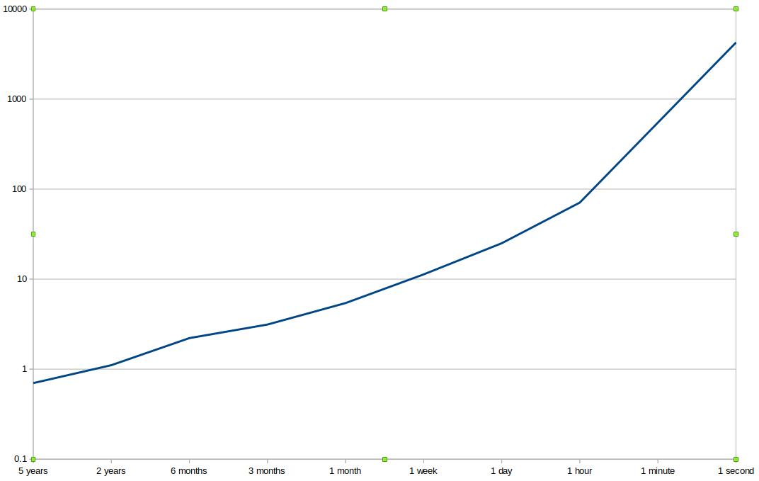
His information ratio is around 0.7 (which is exceptionally good for a long term buy and hold investor), and his average holding period is... well a long time but let's say it's around 5 years. Now under the Law of Active Management what will Warren's IR be if he shortens his holding period and trades more?

X-Axis: Holding Period. Y-Axis: Information ratio


Shortening it to 2 years pushes it up to just over 1.0; pretty good and probably achievable. Then things get silly and we need a log scale to show what's going on. By the time Warren is down to a one week holding period his IR of over 10 put's him amongst the best high frequency trading firms on the planet, despite holding positions for much longer.

When the graph finishes with a holding period of one second, still well short of HFT territory, Warren has a four figure IR. Nice, but very unlikely.

This is a silly example, so let's take a more realistic (and relevant) one. The average Sharpe Ratio (SR) for an arbitrary instrument achieved by the slowest moving average crossover rule I use, MAV 64,256, is around 0.28. It does 1.1 trades per year. What if I speed it up by using shorter moving averages, MAV 32,128 and so on? What does the LAM say will happen to my SR, and what actually happens.

X-axis: Moving average rule N,4N. Y-axis Sharpe Ratio pre-costs

If I turn the dial all the way and start trading a MAC 2,8 (far left off the graph) the LAM says the Sharpe should be a stonking 1.68. The reality is a very poor 0.07. Momentum just doesn't work so well at shorter timeframes, although it does consistently well between MAC8 and MAC64. You can't just increase the speed of a trading rule and expect to make more money; indeed you may well make less.


Net returns


We are now finally ready to put pre-cost returns together with costs and see what they can tell us about optimal trading speeds. For now, I will stick with using a set of moving average rules and the costs of trading Eurodollar futures. Later in the post I'll discuss how you can set stop-losses correctly in the presence of trading costs.

Let's take the graph above, but now subtract the costs of trading Eurodollar futures using the formula from earlier:

Total cost per year = 0.026 + (0.0058 * Number of trades)

The number of trades for each trading rule will come from backtests, but there are also values in both of my trading books that you can use.

X-Axis: Moving average rule, Y-axis Sharpe Ratio before and after costs


The faster rules look even worse now and actually lose money. For this particular trading rule the question of how fast we can trade is clear: as slow as possible. I recommend keeping at least 3 variations of moving average in your system for adequate diversification, but the fastest two variations are clearly a waste of money.

Important: I am comparing the average SR pre-cost across all instruments with the costs just for Eurodollar. I am not using the backtested Sharpe Ratios for Eurodollar by itself, which as it happens are much higher than the average due to secular trends in interest rates. This avoids overfitting.

These results are valid for smaller traders with linear costs. Just for fun, let's apply an institutional level of non linear costs. We assume that costs per trade increase by 50% when trading volume is doubled:

X-Axis: Moving average rule, Y-axis Sharpe Ratio with LAM holding before and after costs for larger traders

I'm only showing the LAM here; the actual figures are much worse. Even if we assume that LAM is possible (which it isn't!), then speeding up will stop working at some point (here it's at around MAC16). This is because pre-cost returns are improving with square root of frequency, but costs are increasing more than linearly.


Net returns when returns are uncertain


So far I've treated pre-cost returns and costs as equally predictable. But this isn't the case. Pre-cost returns are actually very hard to predict for a number of reasons. Regular readers will know that I live to quantify this issue by looking at the amount of statistical variation in my estimates of Sharpe Ratio or returns.

Let's look at the SR for the various speeds of trading rules, but this time add some confidence intervals. We won't use the normal 95% interval, but instead I'll use 60%. That means I can be 20% confident that the SR estimate is above the lower confidence line. I also assume we have 20 years of data to estimate the SR:

X-axis: Moving average variations. Y-axis: Actual Sharpe Ratio pre-costs, with 60% confidence bounds applied

Notice that although the faster crossovers are kind of rubbish, the confidence intervals still overlap fairly heavily, so we can't actually be sure that they are rubbish.

Now let's add costs. We can treat these as perfectly forecastable with zero sampling variance, and compared to returns they certainly are:

X-axis: Moving average variations. Y-axis: Actual Sharpe Ratio net of costs, with 80% confidence bounds applied

Once we apply costs there is much clearer evidence that the fastest crossover is significantly worse than the slowest. It also looks like we can be reasonably confident (80% confident to be precise) that all the slower crossovers have an expected SR of at least zero.


A rule of thumb


All of the above stuff is interesting in the abstract, but it's clearly going to be quite a lot of work to apply it in practice. Don't panic. I have a heuristic; I call it my speed limit:


SPEED LIMIT: DO NOT SPEND MORE THAN ONE THIRD OF YOUR EXPECTED PRE-COST RETURNS ON COSTS

How can we use this in practice? Let's rearrange:


Total cost per year = Holding cost + (Trading cost * Number of trades)


(speed limit) Max cost per year = Expected SR / 3

Expected SR / 3 =  Holding cost + (Trading cost * Max number of trades)

Max number of trades = [(Expected SR / 3) - Holding cost] / Trading cost

Specifically for Eurodollar:

Total cost per year = 0.026 + (0.0058 * Number of trades)
Max number of trades = [(Expected SR / 3) - 0.026] / 0.0058

The expected SR varies for different trading rules, but if I plug it into the above formula I get the red line in the plot below:

X axis: Trading rule variation. Y-axis: Blue line: Actual trades per year, Red line: Maximum possible trades per year under speed limit

The blue line shows the actual trades per year. When the blue line is above the red we are breaking the speed limit. Our budget for trading costs and thus trades per year is being exceeded, given the expected SR. Notice that for the very fastest rule the speed limit is actually negative; this is because holding costs alone are more than a third of the expected SR for MAC2.

Using this heuristic we'd abandon the two fastest variations; whilst MAC8 just sneaks in under the wire.  This gives us identical results to the more complicated analysis above.


Closing the circle: what value of X should I use?!


The speed limit heuristic is awfully useful for systematic traders who can accurately measure their expected number of trades and . But what about traders who are using a trading strategy that they can't or won't backtest? All is not lost! If you're using the stoploss method I recommended in the first post of this series, then you can use the table I included earlier to imply what value of X you should have, based on how often you can trade given the speed limit.

For trading a single instrument I would recommend using a value for expected Sharpe Ratio of around 0.24 (roughly in line with the slower MAC rules). 

Max number of trades = [(Expected SR / 3) - Holding cost] / Trading cost
Max number of trades = [0.08 - Holding cost] / Trading cost

Let's look at an example for Eurodollars:

Max number of trades = [0.08 - 0.026] / 0.0058 = 9.3

From the table above:

Fraction of volatility 'X'    Average trades per year

...                                   ...
0.3                                  11.9
0.4                                   7.8
0.5                                   5.4
...                                   ...


This implies that the maximum value for 'X' in our stop loss is somewhere between 0.3 and 0.4; I suggest using 0.4 to be conservative. That equates to 7.8 trades a year, with a holding period of about 6 to 7 weeks.

Important: You also need to make sure your stop loss is consistent with your forecast horizon. For discretionary traders, if you're expecting to trade once a month make sure your trading is based on expected price movements over the next few weeks. For systematic traders, make sure you use a trading rule that has an expected holding period which matches the stoploss holding period.


Summary


I've gone through a lot in the last few posts, so let's quickly summarise what you now know how to do:


  • The correct way to control risk using stop losses: trailing stops as a fraction of annualised volatility ('X')
  • How to calculate the correct position size using current volatility, expected performance, account size, strength of forecast and number of positions.
  • The correct value of 'X' given your trading costs


Knowing all this won't guarantee you will be a profitable trader, but it will make it much more likely that you won't lose money doing something stupid!